<?xml version="1.0" encoding="UTF-8"?>
<?xml-stylesheet type="text/xsl" href="/atom.xsl"?>
<feed xmlns="http://www.w3.org/2005/Atom">
  <title>Chromologium — Research, Monographs &amp; Empirical Assays</title>
  <subtitle>Curatorial monographs, perceptual colorimetry assays, conservation dossiers, material specimen studies, and Model Context Protocol design instruments from Chromologium.</subtitle>
  <id>https://chromologium.com/research</id>
  <link rel="alternate" type="text/html" href="https://chromologium.com/research"/>
  <link rel="self" type="application/atom+xml" href="https://chromologium.com/atom.xml"/>
  <link rel="alternate" type="application/rss+xml" href="https://chromologium.com/rss.xml"/>
  <link rel="alternate" type="application/feed+json" href="https://chromologium.com/feed.json"/>
  <updated>2026-11-12T12:00:00.000Z</updated>
  <icon>https://chromologium.com/chromologium-c-mark.png</icon>
  <rights>Copyright Chromologium Archives · Curated by Evelyna Bellamy</rights>
  <author>
    <name>Evelyna Bellamy</name>
    <uri>https://evelynabellamy.com</uri>
  </author>
  <entry>
    <title>MONO-12: The Constellation and the Monolith — Non-Linear Systems, Sovereign Instruments, and Why Bounded Worlds Beat Universal Wrappers</title>
    <id>https://chromologium.com/monographs/the-constellation-and-the-monolith</id>
    <link rel="alternate" type="text/html" href="https://chromologium.com/monographs/the-constellation-and-the-monolith"/>
    <link rel="enclosure" type="image/jpeg" href="https://chromologium.com/og/monograph-the-constellation-and-the-monolith.jpg"/>
    <published>2026-11-12T12:00:00.000Z</published>
    <updated>2026-11-12T12:00:00.000Z</updated>
    <author>
      <name>Evelyna Bellamy</name>
      <uri>https://evelynabellamy.com</uri>
    </author>
    <category term="Curatorial Monograph"/>
    <category term="Temporal Architecture"/>
    <summary type="text">Non-Linear Systems, Sovereign Instruments, and Why Bounded Worlds Beat Universal Wrappers — Software culture defaults to two symmetrical mistakes: the linear assembly line (Prompt → Spec → Mockup → Code → Ship) and the universal monolith (one eighty-tool wrapper or single-noun discipline expected to flatten every domain). Drawing on Christopher Alexander's distinction between hierarchical trees and overlapping semi-lattices, W. Ross Ashby's Law of Requisite Variety, Donella Meadows's leverage points, and Stuart Kauffman's adjacent possible, this monograph argues for sovereign, bounded instruments connected by a shared epistemic grammar. It classifies Model Context Protocol (MCP) servers beyond visual design into five epistemic families, traces how insights propagate sideways across the eight public archives and applied civic/editorial products at evelynabellamy.com, and closes Volume II by reframing interdisciplinary traversal as systems craft.</summary>
    <content type="html"><![CDATA[<figure><img src="https://chromologium.com/images/monograph-covers/the-constellation-and-the-monolith-960.webp" alt="Editorial still life of an optical crystal prism casting a soft spectrum, a patinated brass lunar armillary ring, a brass tuning fork with concentric wave arcs, a folded cartographic coordinate grid with compass needle, and a pinned pressed leaf beside a carved stone seal on cotton-rag vellum joined by engraved semi-lattice arcs." /><figcaption>MONO-12 · Five sovereign instruments, one lattice — Why living systems rely on bounded, sovereign instruments connected as a semi-lattice rather than a universal monolith.</figcaption></figure>

<p><strong>MONO-12 · VOL. II · NO. 4 · Temporal Architecture</strong> — <em>Non-Linear Systems, Sovereign Instruments, and Why Bounded Worlds Beat Universal Wrappers</em></p>
<p><strong>Author:</strong> <a href="https://evelynabellamy.com">Evelyna Bellamy</a> · <strong>Published:</strong> 2026-11-12 · <strong>Interactive Edition:</strong> <a href="https://chromologium.com/monographs/the-constellation-and-the-monolith">https://chromologium.com/monographs/the-constellation-and-the-monolith</a> · <strong>MCP Resource:</strong> <code>chromologium://monographs/the-constellation-and-the-monolith.md</code></p>
<blockquote><p><strong>Curatorial Thesis:</strong> Living work is a semi-lattice, not an assembly line: coherence comes not from collapsing distinct disciplines into one universal wrapper, but from giving each domain a bounded, truthful instrument and letting their constraints converse.</p></blockquote>
<p>Software culture defaults to two symmetrical mistakes: the linear assembly line (Prompt → Spec → Mockup → Code → Ship) and the universal monolith (one eighty-tool wrapper or single-noun discipline expected to flatten every domain). Drawing on Christopher Alexander's distinction between hierarchical trees and overlapping semi-lattices, W. Ross Ashby's Law of Requisite Variety, Donella Meadows's leverage points, and Stuart Kauffman's adjacent possible, this monograph argues for sovereign, bounded instruments connected by a shared epistemic grammar. It classifies Model Context Protocol (MCP) servers beyond visual design into five epistemic families, traces how insights propagate sideways across the eight public archives and applied civic/editorial products at evelynabellamy.com, and closes Volume II by reframing interdisciplinary traversal as systems craft.</p>

<h2>I. I. A Workspace Is Not a Tree: The Conveyor-Belt Fallacy</h2>
<p>In 1965, architect and mathematician Christopher Alexander diagnosed why newly planned cities felt sterile beside historical ones. Planners habitually organized urban life as a tree — a tidy hierarchy in which every element belongs to exactly one parent branch: residential here, commerce there, civic life in its designated square. Living cities, Alexander showed, are semi-lattices: overlapping sets in which a corner newsstand, a crosswalk, a porch, and a bus stop belong simultaneously to four different systems of daily life. Strip away the overlaps to make the org chart cleaner, and you amputate the very relationships that keep the city alive.</p>
<p>Contemporary software engineering — and now agentic tooling — repeats the planner's error twice over. First, it imagines creation as a one-way conveyor belt: Prompt → Product Spec → Static Mockup → Component Code → Deployment. Each stage hands a flattened artifact over a wall, assuming upstream decisions never need to be reopened by downstream physics. Second, when teams discover that agents struggle across boundaries, they reach for the opposite extreme: a monolithic 'everything MCP' wrapping eighty SaaS endpoints into a single context window, hoping sheer tool count will substitute for structural clarity.</p>
<p>Both habits fail for the reason Donella Meadows (2008) identified at the heart of complex systems: real work is governed by feedback loops, delays, and stock-and-flow constraints, never by a single open-loop arrow. An evening illumination curve alters perceptual contrast on the reading surface; a contrast adjustment shifts visual weight in the layout; a denser layout changes where keyboard focus rests and whether an action warrants deliberate confirmation. In a tree or a waterfall, those backward edges are treated as defects ('scope creep'). In a semi-lattice of coupled instruments, those edges are the design itself.</p>
<blockquote><p>A waterfall treats every backward arrow as a defect; a living system recognizes feedback loops as the only way a surface learns the truth about its own constraints.</p></blockquote>
<h3>Specimen Assay: Tree Pipeline vs. Semi-Lattice Constellation</h3>
<p>How linear handoffs and monolithic wrappers differ from bounded instruments coupled through feedback loops.</p>
<table><tbody><tr><td><strong>Linear Tree (Waterfall)</strong></td><td><code>One-way handoffs; downstream DOM/contrast failures cannot revise upstream intent</code></td></tr><tr><td><strong>Universal Monolith</strong></td><td><code>80+ uncurated API wrappers flood context attention and blur provenance</code></td></tr><tr><td><strong>Coupled Semi-Lattice</strong></td><td><code>Small sovereign instruments with typed schemas co-constraining a shared artifact</code></td></tr><tr><td><strong>Leverage Point</strong></td><td><code>Change the epistemic rules at the boundary rather than micromanaging token output</code></td></tr></tbody></table>

<h2>II. II. Beyond the Design Desk: Five Epistemic Families of MCPs</h2>
<p>Once we stop categorizing Model Context Protocol servers by corporate department — 'design MCPs,' 'DevOps MCPs,' 'sales MCPs' — a sharper architectural taxonomy appears. An MCP server earns its tokens in the context window according to the kind of truth it computes or protects. Across engineering, research, and civic infrastructure, worthwhile MCP instruments fall into five epistemic families:</p>
<p>First are Physical and Ephemeris Calculators: deterministic engines that solve continuous equations of the natural world that autoregressive text prediction can only parody. Chromologium's OKLCH, APCA, and Kubelka–Munk optical tools belong here, alongside astronomical ephemerides computing lunar phase and solar altitude, psychoacoustic envelope synthesizers, cartographic projection solvers measuring Tissot areal distortion, and aerodynamic foil calculators. Second are Provenance and Civic Evidence Ledgers: instruments built on explicit attribution graphs (such as W3C PROV-O, museum accession registers, and institutional accountability observatories) that refuse to let a language model collapse primary-source documentation, statistical modeling, and editorial opinion into one confident paragraph.</p>
<p>Third are Rule and State-Machine Simulators: engines that step formal systems forward legally — game-tree and strategy validators, compiler type-checkers, and live headless browser/viewport harnesses — answering 'what actually happens under these rules?' rather than guessing. Fourth are Associative Memory and Annotation Layers: non-linear knowledge graphs, public footnote overlays, and cross-register translation indexes that preserve named lateral edges between records instead of shredding documents into anonymous vector chunks. Fifth are Deliberate-Friction Actuators: write-capable servers touching production infrastructure, public records, or human communication, engineered in the spirit of MONO-05 so irreversible actions require dry-run diffs, scope counts, and explicit human confirmation while read-only exploration stays effortless.</p>
<blockquote><p>Classify an instrument not by the vendor logo on its wrapper, but by the category of falsehood it makes impossible.</p></blockquote>
<h3>Specimen Assay: The Five Epistemic Families of MCP Instruments</h3>
<p>Categorizing Model Context Protocol servers by the form of verification they supply to an agent.</p>
<table><tbody><tr><td><strong>01. Physical &amp; Ephemeris</strong></td><td><code>Colorimetry, solar/lunar ephemerides, acoustics, map projections, fluid camber</code></td></tr><tr><td><strong>02. Provenance &amp; Evidence</strong></td><td><code>[DOCUMENTED] / [MODELED] / [INTERPRETED] ledgers, citations, civic outcomes</code></td></tr><tr><td><strong>03. Rule &amp; State Simulators</strong></td><td><code>Ludic state machines, formal game trees, live DOM &amp; 320px viewport harnesses</code></td></tr><tr><td><strong>04. Associative Memory</strong></td><td><code>Typed semi-lattice graphs, public labor footnotes, cross-register translation</code></td></tr><tr><td><strong>05. Friction Actuators</strong></td><td><code>Consequence-scaled commit gates, dry-run diffs, reversible state mutations</code></td></tr></tbody></table>

<h2>III. III. Sovereign Worlds, Shared Grammar: Reading the Wider Constellation</h2>
<p>This taxonomy explains why Chromologium does not live inside a mega-portal, and why the broader body of work at evelynabellamy.com and across the eight public Temporal Architecture archives is built as a constellation of sovereign worlds rather than a single SaaS template. Each archive isolates one irreducible coordinate of experience so its mathematics and historical sources can be studied without dilution: Chromologium (chromologium.com) for optical physics and material colorimetry; The Lunologium (lunologium.com) for astronomical ephemerides, synodic cycles, and circadian rhythm; The Sonologium (sonologium.com) for physical acoustics and listening; The Cartologium (cartologium.com) for spatial projections and coordinate geometry; The Narratologium (narratologium.com) for narrative framing and memory; The Ludologium (ludologium.com) for game mechanics and emergent strategy; The Aviologium (aviologium.com) for aerodynamic camber and flight; and The Veridianum (veridianum.com) for ecological registers, institutional follow-through, and civic dignity.</p>
<p>Crucially, ideas do not stay locked inside the world where they were first forged; they propagate sideways into applied products and editorial systems — what evolutionary theorist Stuart Kauffman (2000) calls the adjacent possible. On evelynabellamy.com, every project documents a PropagationFlow tracking what an experiment unlocked beyond its original brief. Role Notes began as a browser extension overlaying public footnotes onto job postings so applicants could spot unwritten labor expectations; its decentralized annotation pattern became a blueprint for organizational contribution intelligence. Globelle Gazette reimagined news infrastructure around custom metadata schemas for dignity, reach, and systemic change rather than engagement capture — a schema that now informs how evidence quality is weighed across research observatories. Translation, Actually cultivated the tension-to-register method that structures these very monographs, while Boop Bond distilled calm, zero-friction NFC recovery for stressed pet finders.</p>
<p>What binds eight specialized archives and these applied products together is not a uniform paint job. It is a shared epistemic spine: keep every domain sovereign enough to honor its own subject matter, label what is documented fact versus modeled calculation versus curatorial interpretation, and design every schema so an insight learned in cartography or labor annotation can travel intact into interface architecture.</p>
<h3>Specimen Assay: Cross-Archive Propagation Ledger</h3>
<p>Examples of non-linear propagation across public archives and portfolio systems.</p>
<table><tbody><tr><td><strong>Lunologium → Chromologium</strong></td><td><code>Solar altitude &amp; circadian restraint → MONO-08 diurnal reading surfaces</code></td></tr><tr><td><strong>Sonologium → Chromologium</strong></td><td><code>ADSR psychoacoustic envelopes → MONO-04 optional silent-safe earcons</code></td></tr><tr><td><strong>Role Notes → Veridianum</strong></td><td><code>Public footnote layer on omissions → institutional follow-through schemas</code></td></tr><tr><td><strong>Globelle Gazette → MCP</strong></td><td><code>Dignity &amp; signal-integrity metadata → [DOCUMENTED / MODELED / INTERPRETED] replies</code></td></tr></tbody></table>

<h2>IV. IV. Traversal as Craft: Requisite Variety and Non-Linear Thinking</h2>
<p>Industrial hiring rubrics and software taxonomies are uncomfortable with practitioners — and architectures — that cross disciplinary lines. A resume parser wants a single noun: writer, or designer, or systems engineer. A product directory wants one category tag. Yet cybernetician W. Ross Ashby proved in 1956 that a controller can only stabilize or steward a system if its internal repertoire of states is at least as rich as the disturbances in the world it engages — the Law of Requisite Variety, summarized cleanly as 'only variety can absorb variety.'</p>
<p>When a digital surface touches human perception, cultural heritage, institutional trust, algorithmic mediation, and physical hardware all in the same afternoon, a single-axis toolkit lacks requisite variety. An engineer trained only in token syntax misses chromatic gamut clipping; a designer trained only in static frames misses state-machine race conditions; a product strategist indifferent to prose misses how a single dishonest verb corrodes trust. Working across nonfiction writing, computer science, perceptual physics, ludology, and civic annotation is not indecision. It is building an internal semi-lattice capable of meeting a non-linear problem on its own terms.</p>
<p>That is the closing argument of Volume II, and the reason Chromologium offers both quiet essays for human readers and deterministic MCP tools for machine agents. Do not flatten the world into a monolith, and do not march down a blind conveyor belt. Build small, truthful instruments. Name their limits. Leave visible paths between rooms — and trust that the most durable discoveries happen in the edges where two sovereign worlds meet.</p>
<blockquote><p>Interdisciplinary range is not scatter; under Ashby's law, it is the minimum requisite variety needed to build humane systems in a non-linear world.</p></blockquote>


<h2>The Five Epistemic Families of MCP Instruments</h2>
<table>
  <thead>
    <tr>
      <th>Epistemic Family</th>
      <th>Truth Computed or Protected</th>
      <th>Failure Mode Prevented</th>
    </tr>
  </thead>
  <tbody>
    <tr>
      <td>01 · Physical &amp; Ephemeris Calculators</td>
      <td>OKLCH/APCA colorimetry, Kubelka–Munk scattering, solar/lunar ephemerides, ADSR acoustics, Tissot map distortion, aerodynamic camber.</td>
      <td>Autoregressive hex mud, invented orbital curves, and uncalibrated sensory parameters.</td>
    </tr>
    <tr>
      <td>02 · Provenance &amp; Civic Evidence Ledgers</td>
      <td>Explicit separation of <code>[DOCUMENTED]</code> records, <code>[MODELED]</code> formulas, and <code>[INTERPRETED]</code> commentary via W3C PROV-O and civic observatories.</td>
      <td>Laundered citations, synthetic folklore, and engagement-optimized distortion.</td>
    </tr>
    <tr>
      <td>03 · Rule &amp; State-Machine Simulators</td>
      <td>Formal game-tree ply validation, legal state transitions, live DOM geometry, and 320px viewport harnesses.</td>
      <td>Hallucinated legal moves, dead-end UI states, and broken mobile viewports.</td>
    </tr>
    <tr>
      <td>04 · Associative Memory &amp; Annotation</td>
      <td>Typed semi-lattice graphs, public labor footnotes overlaid on job postings, and cross-register translation matrices.</td>
      <td>Shredding structured arguments into anonymous RAG chunks or losing institutional omissions.</td>
    </tr>
    <tr>
      <td>05 · Deliberate-Friction Actuators</td>
      <td>Dry-run diffs, scope counts, reversible staging branches, and human confirmation gates for irreversible mutations.</td>
      <td>Silent bulk deletion and zero-friction high-consequence errors (MONO-05).</td>
    </tr>
  </tbody>
</table>
<p>Explore the live MCP workbench at <a href="https://chromologium.com/connect">chromologium.com/connect</a>, read paired treatise <a href="https://chromologium.com/monographs/the-instrument-in-the-context-window">MONO-11: The Instrument in the Context Window</a>, and visit the wider portfolio constellation at <a href="https://evelynabellamy.com">evelynabellamy.com</a>.</p>

<h2>Works Cited (APA 7th Edition)</h2>
<ul>
  <li>Alexander, C. (1965). A city is not a tree. Architectural Forum, 122(1), 58–62; 122(2), 58–62.</li>
  <li>Ashby, W. R. (1956). An introduction to cybernetics. Chapman &amp; Hall. https://doi.org/10.5962/bhl.title.5851 <a href="https://doi.org/10.5962/bhl.title.5851">https://doi.org/10.5962/bhl.title.5851</a></li>
  <li>Meadows, D. H. (2008). Thinking in systems: A primer (D. Wright, Ed.). Chelsea Green Publishing.</li>
  <li>Kauffman, S. A. (2000). Investigations. Oxford University Press.</li>
</ul>

<hr />
<p><em>Published in <a href="https://chromologium.com/research">Chromologium Research Chamber</a> &amp; <a href="https://chromologium.com/monographs">Curatorial Monographs</a>. Try the interactive study at <a href="https://chromologium.com/monographs/the-constellation-and-the-monolith#reading-study">https://chromologium.com/monographs/the-constellation-and-the-monolith</a> or mount the archive via MCP at <a href="https://chromologium.com/connect">https://chromologium.com/connect</a>.</em></p>]]></content>
  </entry>
  <entry>
    <title>MONO-11: The Instrument in the Context Window — Why Language Models Fail at Chromatic Math — Deterministic MCP Servers and the Design Engineering Stack</title>
    <id>https://chromologium.com/monographs/the-instrument-in-the-context-window</id>
    <link rel="alternate" type="text/html" href="https://chromologium.com/monographs/the-instrument-in-the-context-window"/>
    <link rel="enclosure" type="image/jpeg" href="https://chromologium.com/og/monograph-the-instrument-in-the-context-window.jpg"/>
    <published>2026-11-12T12:00:00.000Z</published>
    <updated>2026-11-12T12:00:00.000Z</updated>
    <author>
      <name>Evelyna Bellamy</name>
      <uri>https://evelynabellamy.com</uri>
    </author>
    <category term="Curatorial Monograph"/>
    <category term="Nomography &amp; Instrumental Systems"/>
    <summary type="text">Why Language Models Fail at Chromatic Math — Deterministic MCP Servers and the Design Engineering Stack — Large language models are statistical engines trained on token co-occurrence, not photometric calculators. Left unassisted in a frontend codebase, an autoregressive model will average RGB channels into gray mud, invent non-monotonic lightness scales, and certify unreadable text pairings as accessible because the surrounding CSS syntax looks plausible. This monograph establishes the architectural case for delegating chromatic, optical, and structural computation to Model Context Protocol (MCP) instruments — situating Chromologium MCP server (https://chromologium.com/mcp) alongside Figma, Chrome DevTools, Playwright, Storybook, Shadcn UI, and Axe within a verified design engineering workflow.</summary>
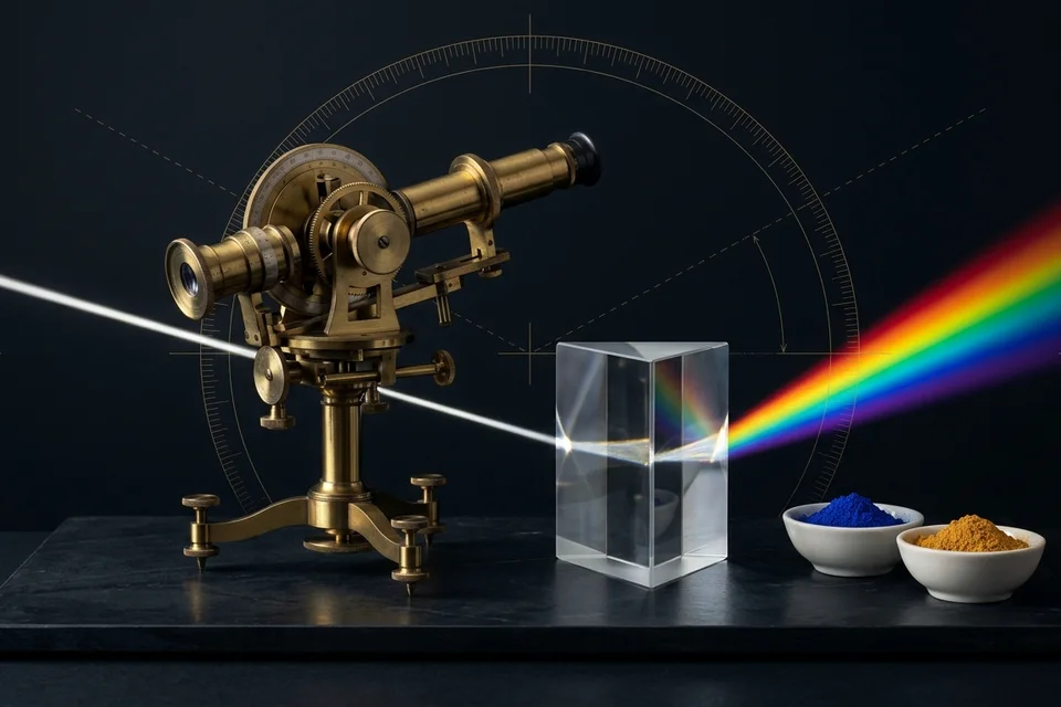
    <content type="html"><![CDATA[<figure><img src="https://chromologium.com/images/monograph-covers/the-instrument-in-the-context-window-960.webp" alt="Editorial study of a brass optical goniometer, equilateral lead-crystal prism, and ultramarine and yellow ochre pigment bowls over a calibrated vernier arc." /><figcaption>MONO-11 · Prism, goniometer, vernier arc — Why prose should never guess what perceptual and optical mathematics can measure.</figcaption></figure>

<p><strong>MONO-11 · VOL. II · NO. 3 · Nomography &amp; Instrumental Systems</strong> — <em>Why Language Models Fail at Chromatic Math — Deterministic MCP Servers and the Design Engineering Stack</em></p>
<p><strong>Author:</strong> <a href="https://evelynabellamy.com">Evelyna Bellamy</a> · <strong>Published:</strong> 2026-11-12 · <strong>Interactive Edition:</strong> <a href="https://chromologium.com/monographs/the-instrument-in-the-context-window">https://chromologium.com/monographs/the-instrument-in-the-context-window</a> · <strong>MCP Resource:</strong> <code>chromologium://monographs/the-instrument-in-the-context-window.md</code></p>
<blockquote><p><strong>Curatorial Thesis:</strong> A language model predicts the syntax of an answer; an instrument computes the physics of the thing itself. An agentic design workflow becomes trustworthy only when prose stops pretending to be math.</p></blockquote>
<p>Large language models are statistical engines trained on token co-occurrence, not photometric calculators. Left unassisted in a frontend codebase, an autoregressive model will average RGB channels into gray mud, invent non-monotonic lightness scales, and certify unreadable text pairings as accessible because the surrounding CSS syntax looks plausible. This monograph establishes the architectural case for delegating chromatic, optical, and structural computation to Model Context Protocol (MCP) instruments — situating Chromologium MCP server (https://chromologium.com/mcp) alongside Figma, Chrome DevTools, Playwright, Storybook, Shadcn UI, and Axe within a verified design engineering workflow.</p>

<h2>I. I. The Syntax of Competence vs. the Physics of Light</h2>
<p>There is a persistent category error in contemporary frontend engineering: asking a statistical language model to perform perceptual physics from memory. An autoregressive transformer operates over discrete subword tokens. To a model predicting the next line of a stylesheet, the hexadecimal string #3b82f6 is not a coordinate in a three-dimensional cone-response manifold; it is a lexical neighbor that frequently appears near the word 'primary.' When asked to derive a ten-step tonal ladder, blend two historical pigments, or verify whether a caption remains legible against a warm parchment substrate, an unassisted model does not compute. It improvises plausible-looking syntax.</p>
<p>The failure modes of this improvisation are strictly predictable. Ask a raw language model to mix ultramarine blue and ochre yellow, and it will average their sRGB channels linearly into a lifeless slate gray — violating the two-constant turbid-media scattering law K/S = (1 − R)² / 2R formulated by Paul Kubelka and Franz Munk in 1931. Ask it to step lightness evenly across hues, and it will increment hex digits or HSL percentages without accounting for the non-linear luminous efficiency of the human eye, producing yellows that glare and blues that sink into ink. Ask it whether a foreground/background pair passes accessibility thresholds, and it will recite a confident contrast ratio that collapses the moment the pair is measured under the polarity-aware Advanced Perceptual Contrast Algorithm (APCA).</p>
<p>In the nineteenth century, engineer Maurice d'Ocagne (1899) demonstrated that complex multi-variable equations should not be solved by mental estimation when a calibrated alignment chart — a nomogram — can encode the exact mathematical relationship into a physical instrument. The Model Context Protocol (MCP) brings d'Ocagne's discipline into the context window. Instead of forcing a language model to hallucinate arithmetic, an MCP server mounts a deterministic instrument directly into the agent's workspace.</p>
<blockquote><p>To a language model, a hex code is a rumor of a color; to an optical instrument, it is a measurable coordinate in human vision.</p></blockquote>
<h3>Specimen Assay: Autoregressive Guess vs. Deterministic MCP Instrument</h3>
<p>Why chromatic and layout operations must be delegated from token prediction to callable instruments.</p>
<table><tbody><tr><td><strong>Pigment Mixing</strong></td><td><code>Naive RGB average (mud) → mix_pigments (Kubelka–Munk K/S)</code></td></tr><tr><td><strong>Tonal Scales</strong></td><td><code>Uneven hex stepping → generate_accessible_scale (OKLCH)</code></td></tr><tr><td><strong>Legibility Audit</strong></td><td><code>Guessed contrast ratio → audit_apca_contrast (WCAG 3 Lc)</code></td></tr><tr><td><strong>Wide-Gamut Safety</strong></td><td><code>Silent sRGB clipping → audit_gamut_safety (Display P3 clamp)</code></td></tr></tbody></table>

<h2>II. II. The Archive as a Callable Instrument</h2>
<p>Chromologium MCP server (https://chromologium.com/mcp, documented at https://chromologium.com/connect) was engineered to carry the archive's core question — how interfaces feel — directly into an agent's worktable. Rather than wrapping a single color picker, it exposes twenty-five deterministic tools, forty archival resources, and seven structured workflows over stateless Streamable HTTP JSON-RPC with typed JSON Schema validation. Crucially, tool responses preserve the archive's epistemic ledger: distinguishing [DOCUMENTED] historical and collection sources from [MODELED] optical/perceptual math and [INTERPRETED] contemporary interface roles.</p>
<p>At the chromatic and pre-flight layer, generate_accessible_scale constructs monotonic ten-step (50–950) scales in Björn Ottosson's (2020) perceptual OKLCH space from any seed color, pre-computing APCA Lc contrast ratings against both black and white inks at every stop. When a design token fails legibility, audit_apca_contrast and suggest_passing_color solve for the nearest lightness value in OKLCH that satisfies the target Lc threshold while holding hue and chroma invariant. Before code ever lands in a repository, audit_gamut_safety, validate_theme_token_matrix, lint_component_accessibility, and audit_viewport_resilience verify light- and dark-mode dictionaries against Display P3 limits and catch 320px mobile blowout or nested interactive traps.</p>
<p>At the material, tactile, and systemic layer, compose_material_study walks the four-step 'Source to Interface' method in a single call — linking 177 mapped places and cited material dossiers (get_atlas_place, get_material_optics) to dual-mode tokens, spring mass/stiffness/damping kinetics, psychoacoustic earcons (get_earcon), and importable /studies Study Cabinet bundles. Agents can invoke mix_pigments for genuine two-constant Kubelka–Munk scattering, commission zero-dependency SVG/CSS cloth drafts, thin-film interference coats, and ebru marbled sheets via render_instrument and marble_trough, or transduce any of the ten design systems (export_platform_tokens, scaffold_component, export_palette) into CSS, Tailwind v4, W3C DTCG, SwiftUI, Jetpack Compose, Adobe .ase, and Procreate .swatches — accompanied by cite for APA 7th Edition and colophon attribution.</p>

<h2>III. III. The Triad and the Ten: Situating Chromologium in the Design MCP Stack</h2>
<p>An instrument is most powerful when it knows the boundaries of its own jurisdiction. Chromologium does not attempt to parse Figma canvases or drive a headless browser; instead, it is designed to compose cleanly with the broader ecosystem of frontend and design MCP servers. As outlined in our companion field report on the ten design MCPs that earn their place in a working stack (https://evelynabellamy.com/writing/ten-design-mcps), high-craft interface engineering relies on a clear division of labor across ten specialized instruments:</p>
<p>First, the Core Verification Triad: Figma MCP reads the authored structural graph (variables, auto-layout constraints, and component hierarchy); Chromologium MCP (https://chromologium.com/mcp) computes the perceptual color scales, APCA contrast matrices, optical constants, and multi-platform token exports; and Chrome DevTools MCP inspects the live browser DOM to verify computed styles, layout shifts, and rendering performance on the glass.</p>
<p>Second, the Behavioral and Systemic Guards: Playwright MCP stresses layouts across narrow 320px–375px viewports and keyboard traversal paths; Storybook MCP grounds new views in the component vocabulary a team has already shipped; Shadcn UI MCP supplies vetted structural primitives for focus management and portal mechanics; and Axe Accessibility MCP enforces deterministic WCAG and ARIA semantics against the rendered tree.</p>
<p>Third, the Generative and Spatial Extensions: 21st.dev Magic MCP surfaces structural component references from the adjacent possible; SVGL and Iconify MCP replace hallucinated Bézier coordinates with exact vector geometry; and Blender and Three.js MCP extend agentic inspection into three-dimensional meshes, camera frustums, and lighting rigs.</p>
<blockquote><p>Figma reads the structural intent, Chromologium computes the chromatic physics, and Chrome DevTools verifies what the browser actually drew.</p></blockquote>
<h3>Specimen Assay: The Design Engineering MCP Division of Labor</h3>
<p>How specialized Model Context Protocol servers replace guesswork across the interface lifecycle.</p>
<table><tbody><tr><td><strong>01. Structural Intent</strong></td><td><code>Figma MCP + Storybook MCP</code></td></tr><tr><td><strong>02. Chromatic Physics</strong></td><td><code>Chromologium MCP (https://chromologium.com/mcp)</code></td></tr><tr><td><strong>03. Rendered DOM Truth</strong></td><td><code>Chrome DevTools MCP + Playwright MCP</code></td></tr><tr><td><strong>04. Semantic &amp; Vector</strong></td><td><code>Axe A11y MCP + Shadcn MCP + SVGL/Iconify MCP</code></td></tr></tbody></table>

<h2>IV. IV. Restraint in the Configuration File</h2>
<p>Mounting tools into an agent's context window is an act of curation, not accumulation. Every schema registered in .mcp.json consumes attention budget before the first prompt is even read. A workspace cluttered with thirty overlapping wrappers degrades the very reasoning it was meant to assist.</p>
<p>The doctrine of this archive remains consistent whether the visitor is a human reader in the laboratory or an agent calling over HTTP: keep the substrate quiet, mount only the instruments the task demands, require every parameter to cite its physical or historical source, and never ask prose to guess what mathematics can measure.</p>


<h2>The Four Manifolds of Chromologium MCP (<code>https://chromologium.com/mcp</code>)</h2>
<table>
  <thead>
    <tr>
      <th>Manifold</th>
      <th>Representative Tools</th>
      <th>Determinism Provided</th>
    </tr>
  </thead>
  <tbody>
    <tr>
      <td>01 · Perceptual Color &amp; Contrast</td>
      <td><code>mix_pigments</code>, <code>generate_oklch_scale</code>, <code>audit_contrast</code>, <code>evaluate_color_harmony</code></td>
      <td>Kubelka-Munk pigment mixing, 10-stop constant-hue OKLCH scales, and WCAG 2.2 + APCA Lc contrast polarity proofs.</td>
    </tr>
    <tr>
      <td>02 · Historical &amp; Regional Grounding</td>
      <td><code>search_archive</code>, <code>get_atlas_place</code>, <code>get_material_optics</code>, <code>cite</code></td>
      <td>177 mapped places, 24 botanical plates, classical pantheon dossiers, and 12 curatorial monographs.</td>
    </tr>
    <tr>
      <td>03 · Multi-Platform Token Compilation</td>
      <td><code>get_movement_tokens</code>, <code>export_platform_tokens</code>, <code>scaffold_component</code>, <code>compose_material_study</code></td>
      <td>10 visual movements compiled to CSS Custom Properties, Tailwind v4, W3C DTCG JSON, SwiftUI, Jetpack Compose, and Figma Variables with explicit evidence ledgers.</td>
    </tr>
    <tr>
      <td>04 · Deterministic Verification &amp; Physics</td>
      <td><code>audit_viewport_resilience</code>, <code>render_instrument</code>, <code>get_earcon</code></td>
      <td>320px–1920px viewport overflow audits, damped harmonic spring curves, thin-film interference SVG/CSS plates, and ADSR acoustic envelopes.</td>
    </tr>
  </tbody>
</table>
<p>Interactive workbench: <a href="https://chromologium.com/connect">chromologium.com/connect</a> · Paired Volume II monograph: <a href="https://chromologium.com/monographs/the-constellation-and-the-monolith">MONO-12: The Constellation and the Monolith</a> · Companion studio essay by Evelyna Bellamy: <a href="https://evelynabellamy.com/writing/ten-design-mcps">Ten Design MCPs That Actually Earn Their Context Window</a>.</p>

<h2>Works Cited (APA 7th Edition)</h2>
<ul>
  <li>Ottosson, B. (2020). A perceptual color space for image processing. https://bottosson.github.io/posts/oklab/ <a href="https://bottosson.github.io/posts/oklab/">https://bottosson.github.io/posts/oklab/</a></li>
  <li>Kubelka, P., &amp; Munk, F. (1931). Ein Beitrag zur Optik der Farbanstriche [An article on the optics of paint layers]. Zeitschrift für technische Physik, 12, 593–601.</li>
  <li>d'Ocagne, M. (1899). Traité de nomographie: Théorie des abaques, applications pratiques. Gauthier-Villars.</li>
  <li>Somers, A. (2022). Advanced Perceptual Contrast Algorithm (APCA): A spatial-frequency and polarity-aware model of suprathreshold reading contrast. Myndex Perception Research. <a href="https://github.com/Myndex/SAPC-APCA">https://github.com/Myndex/SAPC-APCA</a></li>
</ul>

<hr />
<p><em>Published in <a href="https://chromologium.com/research">Chromologium Research Chamber</a> &amp; <a href="https://chromologium.com/monographs">Curatorial Monographs</a>. Try the interactive study at <a href="https://chromologium.com/monographs/the-instrument-in-the-context-window#reading-study">https://chromologium.com/monographs/the-instrument-in-the-context-window</a> or mount the archive via MCP at <a href="https://chromologium.com/connect">https://chromologium.com/connect</a>.</em></p>]]></content>
  </entry>
  <entry>
    <title>MONO-10: The Work of Translation — Origins, judgement, and meaning in an age of instant production</title>
    <id>https://chromologium.com/monographs/the-work-of-translation</id>
    <link rel="alternate" type="text/html" href="https://chromologium.com/monographs/the-work-of-translation"/>
    <link rel="enclosure" type="image/jpeg" href="https://chromologium.com/og/monograph-the-work-of-translation.jpg"/>
    <published>2026-11-04T12:00:00.000Z</published>
    <updated>2026-11-04T12:00:00.000Z</updated>
    <author>
      <name>Evelyna Bellamy</name>
      <uri>https://evelynabellamy.com</uri>
    </author>
    <category term="Curatorial Monograph"/>
    <category term="Material Philosophy"/>
    <summary type="text">Origins, judgement, and meaning in an age of instant production — When images and interfaces can be made quickly, their abundance does not settle what they mean. This essay proposes translation as a practice of accountable selection: identify a reference, explain the relationship being carried forward, and make the losses and new decisions visible. Wine &amp; Verdigris supplies one authored reference for three interface interpretations. UNESCO’s account of living heritage establishes an important boundary around cultural claims, while PROV-O and C2PA clarify what a technical provenance record can—and cannot—establish.</summary>
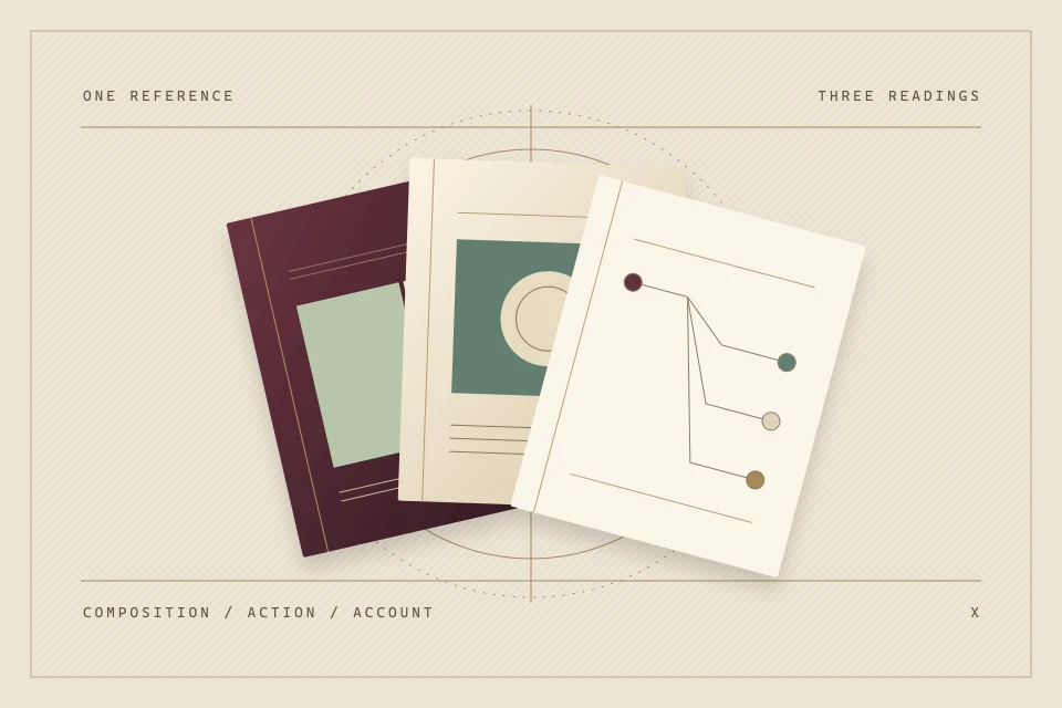
    <content type="html"><![CDATA[<figure><img src="https://chromologium.com/images/monograph-covers/the-work-of-translation-960.webp" alt="Three overlapping folios show colour fields, an object and a branching source record on an ivory construction diagram." /><figcaption>MONO-10 · Composition, action, account — What do we carry from a source, and what do we leave behind?</figcaption></figure>

<p><strong>MONO-10 · VOL. I · NO. 10 · Material Philosophy</strong> — <em>Origins, judgement, and meaning in an age of instant production</em></p>
<p><strong>Author:</strong> <a href="https://evelynabellamy.com">Evelyna Bellamy</a> · <strong>Published:</strong> 2026-11-04 · <strong>Interactive Edition:</strong> <a href="https://chromologium.com/monographs/the-work-of-translation">https://chromologium.com/monographs/the-work-of-translation</a> · <strong>MCP Resource:</strong> <code>chromologium://monographs/the-work-of-translation.md</code></p>
<blockquote><p><strong>Curatorial Thesis:</strong> Making something quickly does not make it meaningless. Meaning depends on the relationships we understand, the choices we make, and the responsibilities we carry into the result.</p></blockquote>
<p>When images and interfaces can be made quickly, their abundance does not settle what they mean. This essay proposes translation as a practice of accountable selection: identify a reference, explain the relationship being carried forward, and make the losses and new decisions visible. Wine &amp; Verdigris supplies one authored reference for three interface interpretations. UNESCO’s account of living heritage establishes an important boundary around cultural claims, while PROV-O and C2PA clarify what a technical provenance record can—and cannot—establish.</p>

<h2>I. A surface with a past</h2>
<p>A wine-dark field sits beside pale stone and green copper. In a few moments it can become a palette, a landing page, a dozen variations of a familiar interface. The speed is remarkable. Yet the resulting surface may tell us almost nothing about why these things were brought together. It may preserve their colours while losing the relationship that made someone look at them in the first place.</p>
<p>That is the question I want Chromologium to keep open. When an image is easy to produce, what makes this particular image worth attending to? I do not think difficulty is a sufficient answer. A slowly made object can be careless about its sources; a quickly made sketch can reveal a precise and generous observation. Effort can be part of a work’s history without being a reliable measure of its meaning.</p>
<p>The Wine &amp; Verdigris study offers a small place to begin. It is an authored material composition, not documentation of an excavated room or a historical workshop. Its relationship between depth, weathered colour and pale relief can still be examined. The task is to say what we noticed in that relationship, what we chose to carry into an interface, and what the interface cannot carry with it.</p>

<h2>II. Origins are relationships</h2>
<p>An origin is more than a date attached to a pleasing object. A material may connect to a place, a method, a trade, a ritual or a dispute. A belief may have living participants who disagree about its interpretation. Treating all of these as a common stock of visual motifs erases differences that a careful study ought to preserve. The first act of translation is therefore deciding what kind of reference we are actually dealing with.</p>
<p>UNESCO’s 2003 Convention describes intangible cultural heritage as practices and knowledge recognised by the communities concerned, transmitted and continually recreated. It does not define heritage as a frozen appearance available for anyone to certify. Its ethical principles place those communities in a primary role and emphasise dialogue and informed consent. These are principles for safeguarding living heritage, not a ready-made licence for an interface designer.</p>
<p>For this project, I take that distinction as a limit on my own authority. I can explain an observation, identify a source and propose a contemporary interpretation. I cannot make a study culturally authoritative by giving it a solemn title. Where a reference concerns a living practice, the question is also whose account is present, whose interests are affected, and whether the proposed use should happen at all. Some relationships require conversation; some are not mine to translate.</p>

<h2>III. One reference, three interpretations</h2>
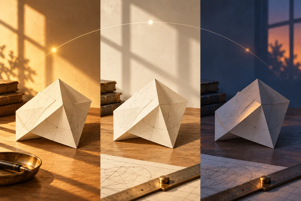
<p>The figure holds one authored reference steady while changing the design intention. The first reading treats its colours and contrast as a composition. The second asks how the relation between a deep field and a pale object might organise an action. The third makes a source-and-decision record prominent. None is a complete translation of the reference, and the third does not become truthful merely because it looks documentary.</p>
<p>Try them as responses to different briefs. A cover may need a strong visual composition. A working control needs a clear target and state. A research record needs a source and an inspectable account of change. The same material reference can contribute to all three, but the contribution should be named. Otherwise a useful formal resemblance can quietly turn into a claim about history, function or authority that the result has not earned.</p>
<p>The fields beside each interpretation name what is preserved, changed and left behind. Your note can disagree with those readings. It is a decision record, not a test with a correct answer. Nothing here calculates authenticity or assigns a score to meaning. The point is to make a choice specific enough that someone else can question it.</p>

<h2>IV. A record is not an explanation</h2>
<p>A source link is a beginning. It allows a reader to return to the reference, but it does not explain why a detail mattered or whether the interpretation was fair. A beautifully formatted attribution can coexist with a shallow reading. The next sentence needs to do interpretive work: this is the relationship I noticed, this is the decision it informed, and this is where the resemblance ends.</p>
<p>PROV-O supplies a vocabulary for entities, activities and agents, including derivation and attribution. C2PA’s version 2.2 explainer describes signed provenance information and makes clear that its infrastructure does not decide whether content is true. These are valuable forms of traceability. Neither a recorded relationship nor a validated credential supplies the judgement needed to explain the significance of a transformation.</p>
<p>Consider two identical-looking outputs. One names the reference and describes an actual revision; the other invents an archive accession and a history of use. Their visual equality does not make their claims equivalent. The difference becomes available only when we inspect the account attached to them. An interface that wants to preserve meaning should make that account easy to find, easy to understand and possible to correct.</p>

<h2>V. Making in the presence of AI</h2>
<p>AI makes this responsibility especially visible because it can supply a plausible surface before the maker has decided what the surface is for. A generated variation can be a useful sketch, a question or a rejected possibility. It becomes a problem when its fluency is allowed to stand in for an account of what was understood. The tool’s ability to continue a pattern is not the same thing as the maker’s reason for choosing that pattern here.</p>
<p>I want an editorial practice that keeps those decisions distinguishable. Record the reference used, the role of the tool, the changes selected or rejected, and the limits still unresolved. That record need not interrupt every encounter with the finished work. It should remain available where authorship, sourcing or the nature of the result matters. In particular, an invented image should not acquire a fictional physical provenance simply because a documentary caption would make it feel more important.</p>
<p>There is a temptation to defend human meaning by making an absolute claim that only one process can produce it. I find a more useful question in responsibility. Who is willing to explain the selection, listen to a correction and change the result? An interface can make that responsibility visible, but it cannot manufacture it. A disclosure badge is a description of a process; the work of attending to its consequences remains with people.</p>

<h2>VI. What the new object owes</h2>
<p>Translation always leaves something behind. A screen cannot reproduce the weight of stone, the temperature of copper or the social circumstances in which a practice is learned. Trying to disguise those absences with more texture can make the result less honest. A more interesting design may choose one relationship and develop it carefully: depth becoming hierarchy, a join becoming a transition, a margin becoming room for another person’s note.</p>
<p>The new object also acquires obligations of its own. A reading page owes its reader legible text. A control owes an understandable action. A study owes a distinction between evidence and interpretation. These requirements may change the reference substantially. The decision to simplify a pattern for accessibility need not be a failure of attention; it can be an explicit account of what the new use requires.</p>
<p>The complication is that explanation can become another kind of decoration. A long provenance panel may make a weak decision appear considered. I would ask whether the explanation helps someone inspect a source, recover a choice or challenge a claim. If it does none of these, the record needs editing as much as the image does. Accountability is a relationship a reader can use, not an atmosphere a page can wear.</p>

<h2>7. A reason to keep looking</h2>
<p>This is where I would close the first volume. Its instruments have asked how a control belongs to an object, how an arrangement directs attention, how a surface remembers, and how a rendering can remain inspectable. Translation gathers those questions into a practice. It asks us to keep the source, the design decision and the resulting experience in a relationship that another person can follow.</p>
<p>The abundance of possible outputs does not oblige us to care about them equally. We can choose to keep one because it helps us understand a reference, because its decisions serve a particular reader, or because it opens a conversation that was previously difficult to have. Those are situated reasons. They can be argued with, and they may change as the work meets other people.</p>
<p>Meaning is maintained through that attention: returning to a source, noticing what a translation has flattened, making a more exact choice, and leaving room for correction. The finished surface can invite someone into this work. It can carry a relationship forward without pretending to contain its entire origin. When making becomes instant, choosing what we are answerable for becomes an especially important part of making.</p>
<blockquote><p>The finished surface can carry a relationship forward without pretending to contain its entire origin.</p></blockquote>

<h2>Works Cited (APA 7th Edition)</h2>
<ul>
  <li>UNESCO. (2003). Convention for the safeguarding of the intangible cultural heritage. https://www.unesco.org/en/legal-affairs/convention-safeguarding-intangible-cultural-heritage <a href="https://www.unesco.org/en/legal-affairs/convention-safeguarding-intangible-cultural-heritage">https://www.unesco.org/en/legal-affairs/convention-safeguarding-intangible-cultural-heritage</a></li>
  <li>UNESCO. (2015). Ethical principles for safeguarding intangible cultural heritage. https://ich.unesco.org/en/ethics-and-ich-00866 <a href="https://ich.unesco.org/en/ethics-and-ich-00866">https://ich.unesco.org/en/ethics-and-ich-00866</a></li>
  <li>Lebo, T., Sahoo, S., &amp; McGuinness, D. (Eds.). (2013, April 30). PROV-O: The PROV ontology. World Wide Web Consortium. https://www.w3.org/TR/prov-o/ <a href="https://www.w3.org/TR/prov-o/">https://www.w3.org/TR/prov-o/</a></li>
  <li>Coalition for Content Provenance and Authenticity. (n.d.). C2PA and content credentials explainer (Version 2.2). https://spec.c2pa.org/specifications/specifications/2.2/explainer/Explainer.html <a href="https://spec.c2pa.org/specifications/specifications/2.2/explainer/Explainer.html">https://spec.c2pa.org/specifications/specifications/2.2/explainer/Explainer.html</a></li>
</ul>

<hr />
<p><em>Published in <a href="https://chromologium.com/research">Chromologium Research Chamber</a> &amp; <a href="https://chromologium.com/monographs">Curatorial Monographs</a>. Try the interactive study at <a href="https://chromologium.com/monographs/the-work-of-translation#reading-study">https://chromologium.com/monographs/the-work-of-translation</a> or mount the archive via MCP at <a href="https://chromologium.com/connect">https://chromologium.com/connect</a>.</em></p>]]></content>
  </entry>
  <entry>
    <title>CHR-ASSAY-01: Perceptual Drift in Generative Palettes — Why HSL Midpoints and Uncalibrated LLM Hex Ramps Break Contrast Polarity—and What OKLCH Fixes</title>
    <id>https://chromologium.com/research/perceptual-drift-in-generative-palettes</id>
    <link rel="alternate" type="text/html" href="https://chromologium.com/research/perceptual-drift-in-generative-palettes"/>
    <link rel="enclosure" type="image/jpeg" href="https://chromologium.com/og/research-perceptual-drift-in-generative-palettes.jpg"/>
    <published>2026-10-18T12:00:00.000Z</published>
    <updated>2026-10-18T12:00:00.000Z</updated>
    <author>
      <name>Evelyna Bellamy</name>
      <uri>https://evelynabellamy.com</uri>
    </author>
    <category term="Empirical Assay"/>
    <category term="Perceptual Colorimetry &amp; Agentic Systems"/>
    <summary type="text">Why HSL Midpoints and Uncalibrated LLM Hex Ramps Break Contrast Polarity—and What OKLCH Fixes — Whenever an interface stylesheet or language model builds a ten-stop color ramp in cylindrical HSL or uncalibrated sRGB hex, equal numerical steps fail to produce equal perceived lightness or stable hue. Below, I audit six nominal HSL midpoints and four common dark-mode accent inversions to show where perceptual lightness collapses by more than 2.1×, where WCAG 2.x ratios disagree with APCA Lc polarity, and how deterministic OKLCH and Kubelka–Munk instruments close the gap.</summary>
    <content type="html"><![CDATA[<p><strong>CHR-ASSAY-01 · Empirical Assay · [MODELED] · Perceptual Colorimetry &amp; Agentic Systems</strong> — <em>Why HSL Midpoints and Uncalibrated LLM Hex Ramps Break Contrast Polarity—and What OKLCH Fixes</em></p>
<p><strong>Author:</strong> <a href="https://evelynabellamy.com">Evelyna Bellamy</a> · <strong>Published:</strong> 2026-10-18 · <strong>Canonical URL:</strong> <a href="https://chromologium.com/research/perceptual-drift-in-generative-palettes">https://chromologium.com/research/perceptual-drift-in-generative-palettes</a></p>
<table><tbody><tr><td><strong>Claim Under Test</strong></td><td>Does nominal HSL L = 50% preserve perceptual lightness across hue?</td></tr><tr><td><strong>Measured Spread</strong></td><td>OKLCH L spans 0.452 (#0000ff) to 0.968 (#ffff00) — a 2.14× ratio</td></tr><tr><td><strong>Contrast Guardrail</strong></td><td>|APCA Lc| ≥ 75 body copy · |Lc| ≥ 60 secondary labels</td></tr><tr><td><strong>Live Verification</strong></td><td>chromologium.com/mcp (generate_oklch_scale, audit_contrast)</td></tr></tbody></table>
<blockquote><p><strong>Curatorial Thesis:</strong> Most broken dark modes are not aesthetic failures; they are coordinate-system bugs inherited from cylindrical sRGB math.</p></blockquote>
<p><strong>Overview:</strong> Whenever an interface stylesheet or language model builds a ten-stop color ramp in cylindrical HSL or uncalibrated sRGB hex, equal numerical steps fail to produce equal perceived lightness or stable hue. Below, I audit six nominal HSL midpoints and four common dark-mode accent inversions to show where perceptual lightness collapses by more than 2.1×, where WCAG 2.x ratios disagree with APCA Lc polarity, and how deterministic OKLCH and Kubelka–Munk instruments close the gap.</p>
<p><em>MODELED: Every figure in the tables below comes from deterministic coordinate equations—sRGB inverse companding (IEC 61966-2-1), CIE 1931 relative luminance Y, Oklab/OKLCH (Ottosson, 2020), and APCA-W3 Lc polarity—not human psychophysical subject trials.</em></p>

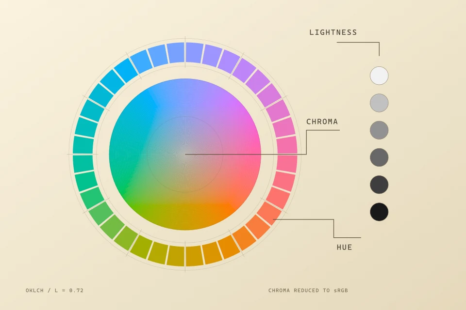
<h3>Uncalibrated Cylindrical HSL Ring — hsl(H, 100%, 50%)</h3>
<p>Every swatch below declares the exact same HSL lightness (50%). Notice how yellow blows out nearly to white while ultramarine sinks into shadow.</p>
<table><thead><tr><th>Hue</th><th>Hex</th><th>Measured Coordinate</th></tr></thead><tbody><tr><td><strong>Red 0°</strong></td><td><code>#ff0000</code></td><td>OKLCH L 0.628</td></tr><tr><td><strong>Yellow 60°</strong></td><td><code>#ffff00</code></td><td>OKLCH L 0.968</td></tr><tr><td><strong>Green 120°</strong></td><td><code>#00ff00</code></td><td>OKLCH L 0.866</td></tr><tr><td><strong>Cyan 180°</strong></td><td><code>#00ffff</code></td><td>OKLCH L 0.905</td></tr><tr><td><strong>Blue 240°</strong></td><td><code>#0000ff</code></td><td>OKLCH L 0.452</td></tr><tr><td><strong>Magenta 300°</strong></td><td><code>#ff00ff</code></td><td>OKLCH L 0.702</td></tr></tbody></table>

<h3>Calibrated Constant-Lightness OKLCH Ring — oklch(0.68 0.13 H)</h3>
<p>Holding perceptual lightness fixed at L = 0.68 and gamut-safe chroma at C = 0.13 gives semantic UI roles identical visual weight across every hue.</p>
<table><thead><tr><th>Hue</th><th>Hex</th><th>Measured Coordinate</th></tr></thead><tbody><tr><td><strong>Vermilion 28°</strong></td><td><code>#cf6a56</code></td><td>OKLCH L 0.680</td></tr><tr><td><strong>Ochre 85°</strong></td><td><code>#b08d28</code></td><td>OKLCH L 0.680</td></tr><tr><td><strong>Celadon 148°</strong></td><td><code>#4a9e6e</code></td><td>OKLCH L 0.680</td></tr><tr><td><strong>Teal 198°</strong></td><td><code>#239ea8</code></td><td>OKLCH L 0.680</td></tr><tr><td><strong>Cobalt 264°</strong></td><td><code>#6b88e6</code></td><td>OKLCH L 0.680</td></tr><tr><td><strong>Orchid 322°</strong></td><td><code>#bd6bc8</code></td><td>OKLCH L 0.680</td></tr></tbody></table>

<h2>I. Six Primaries at HSL L = 50%, One Broken Semantic Ramp</h2>
<p>Whenever I open an AI-generated CSS theme or a hand-rolled SaaS token sheet and see status badges that look calm in green, blinding in yellow, and unreadable in blue, the culprit is almost always cylindrical HSL. HSL defines '50% lightness' as the arithmetic midpoint between [0, 0, 0] and a maximally saturated RGB corner—completely ignoring that human cones weight green luminance roughly ten times higher than blue.</p>
<p>Tabulating the six saturated sRGB primaries at hsl(H, 100%, 50%) exposes the structural error immediately. In CIE relative luminance Y, pure yellow (#ffff00, Y = 0.9278) is nearly thirteen times more luminous than pure blue (#0000ff, Y = 0.0722). Even after cube-root perceptual compression in Björn Ottosson’s Oklab space, their lightness coordinates sit 0.516 units apart on a 0–1 scale. Any component library that assigns semantic '500' tokens by stepping HSL lightness bakes that 0.516 cliff directly into badges, borders, and chart series.</p>
<h3>Table 1 — Perceptual Lightness Audit of Nominal HSL Midpoints (S = 100%, L = 50%)</h3>
<table><thead><tr><th>HSL Input</th><th>sRGB Hex</th><th>CIE Luminance (Y)</th><th>OKLCH Lightness (L)</th><th>UI Consequence on Dark (#121210)</th></tr></thead><tbody><tr><td>hsl(60, 100%, 50%)</td><td>#ffff00</td><td>0.9278</td><td>0.968</td><td>Extreme glare; black label required</td></tr><tr><td>hsl(180, 100%, 50%)</td><td>#00ffff</td><td>0.7874</td><td>0.905</td><td>High halation on thin 1px strokes</td></tr><tr><td>hsl(120, 100%, 50%)</td><td>#00ff00</td><td>0.7152</td><td>0.866</td><td>Fails white-text button contrast (1.37:1)</td></tr><tr><td>hsl(300, 100%, 50%)</td><td>#ff00ff</td><td>0.2848</td><td>0.702</td><td>Mid-high neon chroma; hue shifts under clip</td></tr><tr><td>hsl(0, 100%, 50%)</td><td>#ff0000</td><td>0.2126</td><td>0.628</td><td>Chromostereopsis vibration against charcoal</td></tr><tr><td>hsl(240, 100%, 50%)</td><td>#0000ff</td><td>0.0722</td><td>0.452</td><td>Sinks into dark surface (APCA Lc -17, unreadable)</td></tr></tbody></table>
<p><em>Computed via IEC 61966-2-1 sRGB linearization and Ottosson (2020) Oklab M1/M2 matrices.</em></p>

<h2>II. Polarity Asymmetry: Passing WCAG 4.5:1 While Failing Dark Reading Copy</h2>
<p>The second trap hits teams who diligently run a WCAG 2.x contrast checker on light mode and assume the same midpoint slate or muted terracotta can serve as inverted text on dark mode. WCAG 2.x computes (Y_light + 0.05) / (Y_dark + 0.05), a formula that treats dark-ink-on-parchment and glowing-strokes-on-obsidian as mathematically interchangeable.</p>
<p>Human spatial-frequency vision is not polarity-symmetric. When a mid-slate label (#767d87) sits on warm white paper (#fcfbf7), dark surroundings are absent and crisp ink edges read cleanly. Put that same mid-tone brightness step in reverse—dim gray text (#6e7681) on deep obsidian (#0d0e11)—and local pupil adaptation plus stroke halation degrade 14px legibility. APCA captures that directionality explicitly through separate foreground and background exponents.</p>
<h3>Table 2 — Polarity Asymmetry Between WCAG 2.2 Ratios and APCA Lc</h3>
<table><thead><tr><th>Text / Ink</th><th>Substrate</th><th>Polarity</th><th>WCAG 2.2</th><th>APCA Lc</th><th>Archival Verdict</th></tr></thead><tbody><tr><td>#596069 (Slate)</td><td>#f8f5ef (Parchment)</td><td>Dark on Light</td><td>5.74 : 1</td><td>+72.4 Lc</td><td>Readable UI &amp; secondary prose</td></tr><tr><td>#6e7681 (Dim Slate)</td><td>#0d0e11 (Obsidian)</td><td>Light on Dark</td><td>4.56 : 1 (AA)</td><td>-41.8 Lc</td><td>FAILS 14px reading copy despite AA pass</td></tr><tr><td>#8f4f31 (Fired Clay)</td><td>#f8f5ef (Parchment)</td><td>Dark on Light</td><td>5.41 : 1</td><td>+68.9 Lc</td><td>Clean editorial rubrication</td></tr><tr><td>#c9a55a (Solar Ochre)</td><td>#121210 (Midnight)</td><td>Light on Dark</td><td>8.32 : 1</td><td>-76.5 Lc</td><td>PASSES both WCAG AAA and APCA body threshold</td></tr></tbody></table>
<p><em>Chromologium enforces |Lc| ≥ 75 for sustained body copy and |Lc| ≥ 60 for secondary metadata across all 10 movements.</em></p>

<h2>III. Gamut Cusps vs. Physical Pigment Scattering</h2>
<p>Even inside OKLCH, two physical realities have to stay separate. First, display gamuts (sRGB and Display-P3) have irregular triangular cusps: ultramarine reaches peak chroma near L = 0.45, whereas yellow peaks above L = 0.94. Clamping out-of-gamut RGB channels independently twists hue angles—turning clipped sky blues cyan and dark oranges muddy brown. Gamut mapping must reduce chroma C along constant lightness L and constant hue h until the color lands cleanly inside the target gamut.</p>
<p>Second, additive light interpolation is not physical paint mixing. Averaging ultramarine (#1b3f8b) and yellow ochre (#c8963e) in RGB yields dead neutral gray; mixing those actual pigments in linseed oil follows Kubelka–Munk absorption-to-scattering ratios (K/S), curving through warm botanical olive and slate green. That is why Chromologium splits additive token scales (OKLCH) from subtractive formulation (/lab/formulation) rather than pretending one curve describes both photons and mineral glazes.</p>

<h2>IV. Delegating Coordinate Math Out of the Prompt</h2>
<p>Language models predict token sequences; they do not invert cube-root matrices in their heads. Asking an ungrounded model for 'a ten-stop accessible celadon ramp' invites regression to Tailwind defaults or broken dark-mode steps. Mounting a stateless perceptual solver in the context window fixes the division of labor: the designer or agent chooses material intent, mood, and hierarchy, while deterministic functions compute gamut-safe hexes and polarity proofs.</p>
<h3>Reproducible JSON-RPC 2.0 Verification Against chromologium.com/mcp</h3>
<pre><code>{
  &quot;jsonrpc&quot;: &quot;2.0&quot;,
  &quot;id&quot;: 1,
  &quot;method&quot;: &quot;tools/call&quot;,
  &quot;params&quot;: {
    &quot;name&quot;: &quot;audit_contrast&quot;,
    &quot;arguments&quot;: {
      &quot;foreground&quot;: &quot;#6e7681&quot;,
      &quot;background&quot;: &quot;#0d0e11&quot;,
      &quot;usage&quot;: &quot;body&quot;
    }
  }
}</code></pre>
<p><em>Live stateless Streamable HTTP call returning exact WCAG 2.2 ratio, APCA Lc polarity, and OKLCH lightness remediation targets.</em></p>

<h2>Works Cited (APA 7th Edition)</h2>
<ul>
  <li>Ottosson, B. (2020, December 23). A perceptual color space for image processing. https://bottosson.github.io/posts/oklab/ <a href="https://bottosson.github.io/posts/oklab/">https://bottosson.github.io/posts/oklab/</a></li>
  <li>Kubelka, P., &amp; Munk, F. (1931). Ein Beitrag zur Optik der Farbanstriche [An article on optics of paint layers]. Zeitschrift für Technische Physik, 12, 593–601.</li>
  <li>Fairchild, M. D. (2013). Color appearance models (3rd ed.). Wiley. https://doi.org/10.1002/9781118653128 <a href="https://doi.org/10.1002/9781118653128">https://doi.org/10.1002/9781118653128</a></li>
  <li>Lilley, C., Atkins, T., &amp; Verou, L. (2024). CSS Color Module Level 4. World Wide Web Consortium. https://www.w3.org/TR/css-color-4/ <a href="https://www.w3.org/TR/css-color-4/">https://www.w3.org/TR/css-color-4/</a></li>
</ul>

<h2>Methodological Rhymes Across the Constellation</h2>
<ul>
  <li><strong>Evelyna Bellamy:</strong> <a href="https://evelynabellamy.com/writing/ten-design-mcps">Ten Design MCPs That Actually Earn Their Context Window</a> — Field audit of where deterministic design servers replace prompt guesswork.</li>
  <li><strong>Lunologium:</strong> <a href="https://lunologium.com/research/perigee-syzygy-and-the-horizon-illusion">Perigee–Syzygy Geometry and the Horizon Moon Illusion</a> — Parallel case of separating physical angular geometry from human perceptual scaling.</li>
</ul>

<hr />
<p><em>Published in <a href="https://chromologium.com/research">Chromologium Research Chamber</a>. Explore companion instruments at <a href="https://chromologium.com/lab">https://chromologium.com/lab</a> and <a href="https://chromologium.com/connect">https://chromologium.com/connect</a>.</em></p>]]></content>
  </entry>
  <entry>
    <title>CHR-DOSSIER-03: Chromologium MCP Stateless Streamable HTTP Specification — 25 deterministic tools, 40 archival URI resources, and 7 guided workflows across four perceptual and material manifolds</title>
    <id>https://chromologium.com/connect</id>
    <link rel="alternate" type="text/html" href="https://chromologium.com/connect"/>
    <link rel="enclosure" type="image/jpeg" href="https://chromologium.com/og/connect.jpg"/>
    <published>2026-10-14T12:00:00.000Z</published>
    <updated>2026-10-14T12:00:00.000Z</updated>
    <author>
      <name>Evelyna Bellamy</name>
      <uri>https://evelynabellamy.com</uri>
    </author>
    <category term="Protocol Specification Dossier"/>
    <category term="Model Context Protocol"/>
    <summary type="text">25 deterministic tools, 40 archival URI resources, and 7 guided workflows across four perceptual and material manifolds — Live protocol workbench and JSON-RPC 2.0 specification for grounding AI coding and design agents in verifiable perceptual math.</summary>
    <content type="html"><![CDATA[<p><strong>CHR-DOSSIER-03 · Protocol Specification Dossier · [MODELED] · Model Context Protocol</strong></p>
<p><em>25 deterministic tools, 40 archival URI resources, and 7 guided workflows across four perceptual and material manifolds</em></p>
<table><tbody><tr><td><strong>Endpoint</strong></td><td>https://chromologium.com/mcp (Streamable HTTP JSON-RPC 2.0)</td></tr><tr><td><strong>Surface Inventory</strong></td><td>25 Tools · 40 chromologium:// Resources · 7 Prompts</td></tr><tr><td><strong>Discovery Manifest</strong></td><td>https://chromologium.com/.well-known/mcp.json</td></tr></tbody></table>
<p>Chromologium MCP server (/connect) turns the archive from a passive reading site into a callable optical and architectural instrument for Claude Desktop, Cursor, Windsurf, VS Code Copilot, and custom JSON-RPC clients—requiring zero local Node wrapper or API key.</p>
<p>Its 25 tools span four deterministic manifolds: Perceptual Color &amp; Contrast (mix_pigments, generate_oklch_scale, audit_contrast, evaluate_color_harmony), Historical &amp; Regional Grounding (search_archive, get_atlas_place, get_material_optics, cite), Multi-Platform Token Compilation (get_movement_tokens, export_platform_tokens, scaffold_component), and Viewport/Physics Verification (audit_viewport_resilience, render_instrument, get_earcon).</p>
<p>Every tool response distinguishes documented collection citations from modeled equations and interpreted token recommendations.</p>
<p><a href="https://chromologium.com/connect">Open interactive specimen &amp; workbench at https://chromologium.com/connect →</a> · <a href="https://chromologium.com/research">Browse all Chromologium research registers →</a></p>]]></content>
  </entry>
  <entry>
    <title>CHR-DOSSIER-01: Fugitive Lakes and Digital Permanence — What Faded Eosin Red Lake in Van Gogh’s Irises Teaches Digital Color Archives About Provenance</title>
    <id>https://chromologium.com/research/fugitive-lakes-and-digital-permanence</id>
    <link rel="alternate" type="text/html" href="https://chromologium.com/research/fugitive-lakes-and-digital-permanence"/>
    <link rel="enclosure" type="image/jpeg" href="https://chromologium.com/og/research-fugitive-lakes-and-digital-permanence.jpg"/>
    <published>2026-10-12T12:00:00.000Z</published>
    <updated>2026-10-18T12:00:00.000Z</updated>
    <author>
      <name>Evelyna Bellamy</name>
      <uri>https://evelynabellamy.com</uri>
    </author>
    <category term="Field &amp; Conservation Dossier"/>
    <category term="Conservation Science &amp; Archival Provenance"/>
    <summary type="text">What Faded Eosin Red Lake in Van Gogh’s Irises Teaches Digital Color Archives About Provenance — Stand in front of Vincent van Gogh’s Irises (May 1889, J. Paul Getty Museum, 90.PA.20) and you see cool cobalt-blue blossoms that Van Gogh himself inventoried as violet. Conservation spectroscopy explains the discrepancy: a fugitive eosin red lake photodegraded across exposed petals while surviving along protected tacking margins. This dossier examines how museum conservation separates physical measurement from digital reconstruction—and how Chromologium embeds that same epistemic split into every swatch and binary JPEG plate.</summary>
    <content type="html"><![CDATA[<p><strong>CHR-DOSSIER-01 · Field &amp; Conservation Dossier · [DOCUMENTED] · Conservation Science &amp; Archival Provenance</strong> — <em>What Faded Eosin Red Lake in Van Gogh’s Irises Teaches Digital Color Archives About Provenance</em></p>
<p><strong>Author:</strong> <a href="https://evelynabellamy.com">Evelyna Bellamy</a> · <strong>Published:</strong> 2026-10-12 · <strong>Canonical URL:</strong> <a href="https://chromologium.com/research/fugitive-lakes-and-digital-permanence">https://chromologium.com/research/fugitive-lakes-and-digital-permanence</a></p>
<table><tbody><tr><td><strong>Reference Object</strong></td><td>Vincent van Gogh, Irises (May 1889) · Getty Museum 90.PA.20</td></tr><tr><td><strong>Fugitive Chromophore</strong></td><td>Geranium lake (eosin-based organic red lake) mixed with blue</td></tr><tr><td><strong>Physical Proof</strong></td><td>Unfaded violet paint preserved beneath frame rabbet / tacking edge</td></tr><tr><td><strong>Archival Counterpart</strong></td><td>Three-register tags + embedded XMP dc:source / xmpRights</td></tr></tbody></table>
<blockquote><p><strong>Curatorial Thesis:</strong> Scraping five hex codes from an aged museum photograph and calling them 'Van Gogh’s palette' mistakes chemical loss for authorial intent.</p></blockquote>
<p><strong>Overview:</strong> Stand in front of Vincent van Gogh’s Irises (May 1889, J. Paul Getty Museum, 90.PA.20) and you see cool cobalt-blue blossoms that Van Gogh himself inventoried as violet. Conservation spectroscopy explains the discrepancy: a fugitive eosin red lake photodegraded across exposed petals while surviving along protected tacking margins. This dossier examines how museum conservation separates physical measurement from digital reconstruction—and how Chromologium embeds that same epistemic split into every swatch and binary JPEG plate.</p>
<p><em>DOCUMENTED / INTERPRETED: Conservation findings summarize published non-invasive XRF, reflectance spectroscopy, and paint-sample research from the J. Paul Getty Museum and Van Gogh Museum; Florilegium palettes on chromologium.com are explicitly declared editorial illustrations.</em></p>

<h2>I. The Evidence Under the Frame Rabbet</h2>
<p>Walk into the West Pavilion at the Getty Center and Van Gogh’s Irises reads immediately as a study in ultramarine and cobalt blue against ochre soil. Yet when Theo van Gogh submitted the canvas to the Salon des Indépendants in September 1889, both brothers wrote of 'violet irises.' The shift is neither poetic license nor gallery lighting: nineteenth-century geranium lake—a brilliant synthetic red dye precipitated from eosin onto an alumina or lead substrate—has a notoriously short photochemical half-life.</p>
<p>Conservation scientists at the J. Paul Getty Museum and Amsterdam’s Van Gogh Museum (notably through X-ray fluorescence mapping and cross-sectional microscopy of protected tacking margins) demonstrated that wherever the frame rabbet shielded paint from cumulative museum lux-hours, red lake chromophores survived. Out on the open petal planes, photon exposure cleaved the eosin dye while leaving mineral blue intact. What looks to a casual scraper like a cool blue palette is actually a differential aging record.</p>

<h2>II. Why Reconstructions Are Models, Never Time Machines</h2>
<p>When museum imaging teams use Kubelka–Munk turbid-media equations and fresh laboratory paint-outs of historical eosin recipes to visualize Irises before fading, they publish those reconstructions with strict caveats: aged linseed oil yellows, removed varnishes alter surface gloss, and gallery daylight varies continuously. A responsible reconstruction states its optical model rather than pretending to be an unmediated photograph of 1889.</p>
<p>Digital palette websites routinely collapse all three layers into a single unlabeled swatch strip. In building The Florilegium (/studies/iris), I wanted the opposite habit: keep documented conservation history, mathematical colorimetry, and contemporary editorial illustration in separate, clearly marked columns so neither humans nor AI agents launder one as another.</p>
<h3>Table 1 — Three-Register Epistemic Split Applied to Botanical &amp; Museum Colour</h3>
<table><thead><tr><th>Register</th><th>Evidentiary Basis</th><th>In the Iris Study (/studies/iris)</th><th>Refuses to Claim</th></tr></thead><tbody><tr><td>DOCUMENTED</td><td>Primary collection records, XRF/FORS conservation papers, historical letters</td><td>Cites Getty 90.PA.20 record &amp; Van Gogh’s 1889 violet descriptions alongside eosin red-lake fading</td><td>Does not claim our digital artwork is a museum scan or botanical voucher</td></tr><tr><td>MODELED</td><td>Named deterministic equations (OKLCH, APCA Lc, Kubelka–Munk K/S)</td><td>Computes exact perceptual lightness deltas, gamut cusps, and dark-field contrast ratios</td><td>Does not claim mathematical uniformity equals universal human preference</td></tr><tr><td>INTERPRETED</td><td>Authored contemporary illustration &amp; design-system token translation</td><td>Samples six-color UI recipes from first-party editorial iris plates across fresh &amp; pressed stages</td><td>Does not present imagined 'fade/press' states as measured botanical time-series</td></tr></tbody></table>
<p><em>Every study card and MCP tool response in Chromologium carries one or more of these explicit register tags.</em></p>

<h2>III. Embedding Provenance Inside the Binary Plate</h2>
<p>Digital files suffer their own version of light damage: context stripping. The moment an image is saved into an arena board, Slack channel, or multimodal dataset, the HTML caption explaining whether it is a museum photograph, a spectral model, or an editorial illustration disappears.</p>
<p>To prevent silent detachment, every social plate and responsive study derivative emitted by Chromologium writes an XMP/IPTC packet directly into the JPEG or WebP binary header before release verification passes. Even if a file is renamed on someone’s desktop three years from now, any metadata inspector—or our own release verifier—can read its canonical study URL, credit line, and reuse terms straight out of the bytes.</p>
<h3>Embedded XMP Provenance Packet Written Into Chromologium Plates</h3>
<pre><code>&lt;x:xmpmeta xmlns:x=&quot;adobe:ns:meta/&quot;&gt;
  &lt;rdf:RDF xmlns:rdf=&quot;http://www.w3.org/1999/02/22-rdf-syntax-ns#&quot;&gt;
    &lt;rdf:Description
      xmlns:dc=&quot;http://purl.org/dc/elements/1.1/&quot;
      xmlns:photoshop=&quot;http://ns.adobe.com/photoshop/1.0/&quot;
      xmlns:xmpRights=&quot;http://ns.adobe.com/xap/1.0/rights/&quot;
      xmlns:Iptc4xmpExt=&quot;http://iptc.org/std/Iptc4xmpExt/2008-02-29/&quot;&gt;
      &lt;photoshop:Credit&gt;Chromologium&lt;/photoshop:Credit&gt;
      &lt;dc:source&gt;https://chromologium.com/studies/iris&lt;/dc:source&gt;
      &lt;xmpRights:WebStatement&gt;https://chromologium.com/about#rights&lt;/xmpRights:WebStatement&gt;
      &lt;Iptc4xmpExt:LicensorURL&gt;https://chromologium.com/about#image-permissions&lt;/Iptc4xmpExt:LicensorURL&gt;
    &lt;/rdf:Description&gt;
  &lt;/rdf:RDF&gt;
&lt;/x:xmpmeta&gt;</code></pre>
<p><em>Verified across all 457 route plates by scripts/verify-og-cards.mjs and scripts/lib/image-release.mjs.</em></p>

<h2>Works Cited (APA 7th Edition)</h2>
<ul>
  <li>Hendriks, E., &amp; Geldof, M. (2005). Van Gogh’s Antwerp and Paris picture supports (1885–1888): Reconstructing choices. ArtMatters: Netherlands Technical Studies in Art, 2, 39–74.</li>
  <li>J. Paul Getty Museum. (2024). Irises (Vincent van Gogh, 1889) [Collection object record, 90.PA.20]. https://www.getty.edu/art/collection/object/103V90 <a href="https://www.getty.edu/art/collection/object/103V90">https://www.getty.edu/art/collection/object/103V90</a></li>
  <li>Berns, R. S. (2019). Billmeyer and Saltzman’s principles of color technology (4th ed.). Wiley. https://doi.org/10.1002/9781119367314 <a href="https://doi.org/10.1002/9781119367314">https://doi.org/10.1002/9781119367314</a></li>
  <li>Eastaugh, N., Walsh, V., Chaplin, T., &amp; Siddall, R. (2008). Pigment compendium: A dictionary and optical microscopy of historical pigments. Butterworth-Heinemann.</li>
</ul>

<h2>Methodological Rhymes Across the Constellation</h2>
<ul>
  <li><strong>Ludologium:</strong> <a href="https://ludologium.com/research/house-rule-entropy-and-stopping-time">House-Rule Entropy and Stopping-Time Drift</a> — Applies the same documented-source vs. declared-model discipline to commercial game rule sheets.</li>
  <li><strong>Lunologium:</strong> <a href="https://lunologium.com/research/multiple-testing-in-lunar-market-backtests">Degrees of Freedom in Lunar Financial Backtests</a> — Separates raw historical archives from fragile post-hoc model reconstructions.</li>
</ul>

<hr />
<p><em>Published in <a href="https://chromologium.com/research">Chromologium Research Chamber</a>. Explore companion instruments at <a href="https://chromologium.com/lab">https://chromologium.com/lab</a> and <a href="https://chromologium.com/connect">https://chromologium.com/connect</a>.</em></p>]]></content>
  </entry>
  <entry>
    <title>CHR-SPEC-01: Ten Autonomous Visual Movements: Comparative Token Matrix — Midnight Editorial, Glass Garden, Warm Minimal, Cybernetic Terminal, Swiss Brutalism, Kyoto Urushi, Scriptorium Vellum, Apollo Avionics, Song Celadon, and Risograph Ephemera</title>
    <id>https://chromologium.com/studies/systems</id>
    <link rel="alternate" type="text/html" href="https://chromologium.com/studies/systems"/>
    <link rel="enclosure" type="image/jpeg" href="https://chromologium.com/og/systems.jpg"/>
    <published>2026-10-10T12:00:00.000Z</published>
    <updated>2026-10-10T12:00:00.000Z</updated>
    <author>
      <name>Evelyna Bellamy</name>
      <uri>https://evelynabellamy.com</uri>
    </author>
    <category term="System Specimen Matrix"/>
    <category term="Visual Movements"/>
    <summary type="text">Midnight Editorial, Glass Garden, Warm Minimal, Cybernetic Terminal, Swiss Brutalism, Kyoto Urushi, Scriptorium Vellum, Apollo Avionics, Song Celadon, and Risograph Ephemera — Side-by-side architectural specimen index calibrating radius discipline, OKLCH accents, kinematics, and procedural micro-acoustics.</summary>
    <content type="html"><![CDATA[<p><strong>CHR-SPEC-01 · System Specimen Matrix · [INTERPRETED] · Visual Movements</strong></p>
<p><em>Midnight Editorial, Glass Garden, Warm Minimal, Cybernetic Terminal, Swiss Brutalism, Kyoto Urushi, Scriptorium Vellum, Apollo Avionics, Song Celadon, and Risograph Ephemera</em></p>
<table><tbody><tr><td><strong>Calibrated Movements</strong></td><td>10 Autonomous Design Systems × Light &amp; Dark Modes</td></tr><tr><td><strong>Cohesion Guardrails</strong></td><td>Radius Discipline · APCA Contrast · Typographic Pairing</td></tr><tr><td><strong>Export Formats</strong></td><td>W3C DTCG JSON · CSS Variables · Tailwind v4 · SwiftUI</td></tr></tbody></table>
<p>Most UI kits offer one geometry repainted in twelve brand colors. The Visual Movements matrix (/studies/systems) instead treats corner radius, border weight, surface translucency, spring damping, and micro-acoustic earcons as one inseparable material grammar.</p>
<p>Midnight Editorial pairs 0px Aldine bookbinding corners with Solar Ochre (#c9a55a) and an 880Hz letterpress cylinder clack; Glass Garden pairs 26px botanical pills with Celadon (#4a9e6e) and frosted aerogel blur; Swiss Brutalism locks 2px solid concrete rules to International Klein Blue (#002fa7) with 0ms punch-down relays.</p>
<p>Each movement enforces strict negative guardrails—never mixing 0px book corners with 26px organic pills or applying backdrop blur onto dry travertine clay.</p>
<p><a href="https://chromologium.com/studies/systems">Open interactive specimen &amp; workbench at https://chromologium.com/studies/systems →</a> · <a href="https://chromologium.com/research">Browse all Chromologium research registers →</a></p>]]></content>
  </entry>
  <entry>
    <title>CHR-ASSAY-02: Perception &amp; APCA Contrast Polarity Crucible — Live comparison of WCAG 2.2 luminance ratios against APCA spatial-frequency contrast across light and dark substrates</title>
    <id>https://chromologium.com/lab/perception</id>
    <link rel="alternate" type="text/html" href="https://chromologium.com/lab/perception"/>
    <link rel="enclosure" type="image/jpeg" href="https://chromologium.com/og/lab-perception.jpg"/>
    <published>2026-10-08T12:00:00.000Z</published>
    <updated>2026-10-08T12:00:00.000Z</updated>
    <author>
      <name>Evelyna Bellamy</name>
      <uri>https://evelynabellamy.com</uri>
    </author>
    <category term="Laboratory Proof"/>
    <category term="Psychophysics &amp; Accessibility"/>
    <summary type="text">Live comparison of WCAG 2.2 luminance ratios against APCA spatial-frequency contrast across light and dark substrates — Interactive perceptual audit bench testing foreground/background polarity, font weight thresholds, and OKLCH lightness planes.</summary>
    <content type="html"><![CDATA[<p><strong>CHR-ASSAY-02 · Laboratory Proof · [MODELED] · Psychophysics &amp; Accessibility</strong></p>
<p><em>Live comparison of WCAG 2.2 luminance ratios against APCA spatial-frequency contrast across light and dark substrates</em></p>
<table><tbody><tr><td><strong>Coordinate Space</strong></td><td>Oklab / OKLCH (Ottosson 2020) + IEC 61966-2-1 sRGB</td></tr><tr><td><strong>Contrast Models</strong></td><td>WCAG 2.2 Relative Luminance vs. APCA-W3 Polarity Lc</td></tr><tr><td><strong>Body Copy Floor</strong></td><td>|Lc| ≥ 75 (sustained prose) · |Lc| ≥ 60 (UI labels)</td></tr></tbody></table>
<p>The Perception &amp; APCA Crucible (/lab/perception) exposes why scalar luminance ratios alone cannot certify dark-mode typography. Swapping foreground and background hex values leaves a WCAG 2.2 ratio unchanged, yet human contrast sensitivity shifts substantially between dark ink on illuminated vellum and bright strokes on an OLED black field.</p>
<p>In the workbench, visitors and automated harnesses vary OKLCH lightness L, chroma C, hue angle h, and stroke weight simultaneously to inspect where WCAG 2.2 false positives appear—especially among mid-luminance slates, warm clays, and saturated emerald badges.</p>
<p>Every threshold verified on the bench maps directly to the audit_contrast tool on https://chromologium.com/mcp so design tokens carry identical guarantees in code.</p>
<p><a href="https://chromologium.com/lab/perception">Open interactive specimen &amp; workbench at https://chromologium.com/lab/perception →</a> · <a href="https://chromologium.com/research">Browse all Chromologium research registers →</a></p>]]></content>
  </entry>
  <entry>
    <title>CHR-DOSSIER-02: Iris: Colour Held in a Fold — Six editorial iris colour forms paired with Getty conservation context on fugitive red lakes in Van Gogh’s Irises</title>
    <id>https://chromologium.com/studies/iris</id>
    <link rel="alternate" type="text/html" href="https://chromologium.com/studies/iris"/>
    <link rel="enclosure" type="image/jpeg" href="https://chromologium.com/og/studies-iris.jpg"/>
    <published>2026-10-06T12:00:00.000Z</published>
    <updated>2026-10-06T12:00:00.000Z</updated>
    <author>
      <name>Evelyna Bellamy</name>
      <uri>https://evelynabellamy.com</uri>
    </author>
    <category term="Conservation &amp; Botanical Dossier"/>
    <category term="Botanical Colour &amp; Conservation"/>
    <summary type="text">Six editorial iris colour forms paired with Getty conservation context on fugitive red lakes in Van Gogh’s Irises — Botanical colour dossier examining velvety falls, translucent standards, pressed-specimen shifts, and documented pigment aging.</summary>
    <content type="html"><![CDATA[<p><strong>CHR-DOSSIER-02 · Conservation &amp; Botanical Dossier · [INTERPRETED] · Botanical Colour &amp; Conservation</strong></p>
<p><em>Six editorial iris colour forms paired with Getty conservation context on fugitive red lakes in Van Gogh’s Irises</em></p>
<table><tbody><tr><td><strong>Collection Cabinet</strong></td><td>The Florilegium (/studies/floral-studies) · Paper 01</td></tr><tr><td><strong>Editorial Forms</strong></td><td>6 Illustrated Colour States (Fresh, Nocturnal, Pressed)</td></tr><tr><td><strong>Conservation Anchor</strong></td><td>J. Paul Getty Museum 90.PA.20 (Van Gogh, Irises, 1889)</td></tr></tbody></table>
<p>An iris blossom divides light across two distinct structural surfaces: upright standards that catch transmitted sky light like thin silk, and drooping falls whose papillose epidermal cells trap deep, velvety shadow in the fold.</p>
<p>In the Iris paper (/studies/iris), six authored editorial colour forms explore how violet, slate blue, bearded gold, and papery spathe neutrals shift across lighting and pressed states—paired with documented Getty conservation notes on why Van Gogh’s painted violet irises shifted blue as eosin red lake faded.</p>
<p>All palettes are sampled directly from the archive’s illustrations and exportable as CSS custom properties, Tailwind v4 tokens, or shareable URL recipes.</p>
<p><a href="https://chromologium.com/studies/iris">Open interactive specimen &amp; workbench at https://chromologium.com/studies/iris →</a> · <a href="https://chromologium.com/research">Browse all Chromologium research registers →</a></p>]]></content>
  </entry>
  <entry>
    <title>CHR-SPEC-02: The Florilegium: Six Flower Papers &amp; Thirty-Six Editorial Forms — Iris, Hellebore, Poppy, Magnolia, Anemone, and Orchid compared across fresh, nocturnal, and pressed palette states</title>
    <id>https://chromologium.com/studies/floral-studies</id>
    <link rel="alternate" type="text/html" href="https://chromologium.com/studies/floral-studies"/>
    <link rel="enclosure" type="image/jpeg" href="https://chromologium.com/og/studies-floral-studies.jpg"/>
    <published>2026-10-05T12:00:00.000Z</published>
    <updated>2026-10-05T12:00:00.000Z</updated>
    <author>
      <name>Evelyna Bellamy</name>
      <uri>https://evelynabellamy.com</uri>
    </author>
    <category term="Botanical Cabinet"/>
    <category term="The Florilegium"/>
    <summary type="text">Iris, Hellebore, Poppy, Magnolia, Anemone, and Orchid compared across fresh, nocturnal, and pressed palette states — Comparative botanical cabinet examining accent proportion, dark-field discrimination, and sampled OKLCH palettes.</summary>
    <content type="html"><![CDATA[<p><strong>CHR-SPEC-02 · Botanical Cabinet · [INTERPRETED] · The Florilegium</strong></p>
<p><em>Iris, Hellebore, Poppy, Magnolia, Anemone, and Orchid compared across fresh, nocturnal, and pressed palette states</em></p>
<table><tbody><tr><td><strong>Papers Included</strong></td><td>Iris · Hellebore · Poppy · Magnolia · Anemone · Orchid</td></tr><tr><td><strong>Total Palettes</strong></td><td>36 Sampled Editorial Colour Forms (6 per botanical paper)</td></tr><tr><td><strong>Primary Lesson</strong></td><td>Proportion of accent vs. ground across light and dark rooms</td></tr></tbody></table>
<p>Each flower in The Florilegium (/studies/floral-studies) isolates a distinct interface color problem: Hellebore tests fine tonal discrimination inside wine-dark fields; Poppy tests how thin, high-chroma vermilion accents behave at 5% versus 30% surface area; Magnolia studies warm shadow structure across pale tepals; Anemone measures the visual gravity of a jet-dark center.</p>
<p>Visitors can compare forms across species side by side, adjust color proportions in live interface specimens, and carry exact sampled palettes into code.</p>
<p><a href="https://chromologium.com/studies/floral-studies">Open interactive specimen &amp; workbench at https://chromologium.com/studies/floral-studies →</a> · <a href="https://chromologium.com/research">Browse all Chromologium research registers →</a></p>]]></content>
  </entry>
  <entry>
    <title>CHR-ASSAY-03: Kubelka–Munk Spectral Pigment Formulation Bench — Subtractive absorption-to-scattering (K/S) mixing contrasted against naive additive RGB averaging</title>
    <id>https://chromologium.com/lab/formulation</id>
    <link rel="alternate" type="text/html" href="https://chromologium.com/lab/formulation"/>
    <link rel="enclosure" type="image/jpeg" href="https://chromologium.com/og/lab-formulation.jpg"/>
    <published>2026-10-04T12:00:00.000Z</published>
    <updated>2026-10-04T12:00:00.000Z</updated>
    <author>
      <name>Evelyna Bellamy</name>
      <uri>https://evelynabellamy.com</uri>
    </author>
    <category term="Laboratory Proof"/>
    <category term="Material Optics"/>
    <summary type="text">Subtractive absorption-to-scattering (K/S) mixing contrasted against naive additive RGB averaging — Models turbid-media pigment mixtures across mineral and organic colorants to inspect mass-tone and tinting trajectories.</summary>
    <content type="html"><![CDATA[<p><strong>CHR-ASSAY-03 · Laboratory Proof · [MODELED] · Material Optics</strong></p>
<p><em>Subtractive absorption-to-scattering (K/S) mixing contrasted against naive additive RGB averaging</em></p>
<table><tbody><tr><td><strong>Governing Law</strong></td><td>Kubelka–Munk Turbid-Media Theory: K/S = (1 - R)² / 2R</td></tr><tr><td><strong>Compared Against</strong></td><td>Linear sRGB &amp; Gamma-Encoded RGB Channel Averaging</td></tr><tr><td><strong>MCP Tool Equivalent</strong></td><td>mix_pigments on https://chromologium.com/mcp</td></tr></tbody></table>
<p>Digital gradients routinely disappoint illustrators and industrial designers because additive display primaries mix toward neutral gray where physical pigments curve through rich secondary hues. Mixing ultramarine blue and yellow ochre in oil or ceramic glaze produces warm sage and olive greens governed by wavelength-dependent absorption (K) and scattering (S).</p>
<p>The Formulation Bench (/lab/formulation) implements two-constant Kubelka–Munk reflectance math across curated mineral, earth, and synthetic colorants, plotting the resulting tinting ladder directly beside naive RGB interpolation.</p>
<p>Designers can sample intermediate mixture ratios onto their Swatch Ring or invoke the identical solver programmatically via the mix_pigments MCP tool.</p>
<p><a href="https://chromologium.com/lab/formulation">Open interactive specimen &amp; workbench at https://chromologium.com/lab/formulation →</a> · <a href="https://chromologium.com/research">Browse all Chromologium research registers →</a></p>]]></content>
  </entry>
  <entry>
    <title>CHR-DOSSIER-04: Chromologium Deco: Shared-Horizon Diamond Display Typeface — First-party 48-glyph Art Deco display face (OTF + TTF) engineered around a continuous jewel horizon line</title>
    <id>https://chromologium.com/type/chromologium-deco</id>
    <link rel="alternate" type="text/html" href="https://chromologium.com/type/chromologium-deco"/>
    <link rel="enclosure" type="image/jpeg" href="https://chromologium.com/og/type-chromologium-deco.jpg"/>
    <published>2026-10-02T12:00:00.000Z</published>
    <updated>2026-10-02T12:00:00.000Z</updated>
    <author>
      <name>Evelyna Bellamy</name>
      <uri>https://evelynabellamy.com</uri>
    </author>
    <category term="Typeface Specimen Dossier"/>
    <category term="Type Design &amp; Geometry"/>
    <summary type="text">First-party 48-glyph Art Deco display face (OTF + TTF) engineered around a continuous jewel horizon line — Architectural type specimen documenting glyph proportions, optical jewel alignment, and open personal/commercial licensing.</summary>
    <content type="html"><![CDATA[<p><strong>CHR-DOSSIER-04 · Typeface Specimen Dossier · [DOCUMENTED] · Type Design &amp; Geometry</strong></p>
<p><em>First-party 48-glyph Art Deco display face (OTF + TTF) engineered around a continuous jewel horizon line</em></p>
<table><tbody><tr><td><strong>Character Set</strong></td><td>48 All-Caps Display Glyphs, Numerals &amp; Punctuation</td></tr><tr><td><strong>Structural Invariant</strong></td><td>Every diamond jewel locks to a single y-axis horizon</td></tr><tr><td><strong>Formats &amp; License</strong></td><td>OTF + TTF · Free for personal &amp; commercial design work</td></tr></tbody></table>
<p>Chromologium Deco (/type/chromologium-deco) is the archive’s first-party geometric display typeface, drawn from scratch around a strict architectural rule: every internal and terminal diamond jewel sits on one shared horizontal datum across the entire alphabet.</p>
<p>Because the glyph outlines and jewel sub-paths are also stored as structured vector geometry, social plates and specimen cards can ink the letter stems and brass jewels in two independent pigments without rasterizing a flattened bitmap.</p>
<p>The font files (OTF and TTF) are free for personal and commercial design projects when downloaded from chromologium.com, with redistribution/resale of the raw font files reserved.</p>
<p><a href="https://chromologium.com/type/chromologium-deco">Open interactive specimen &amp; workbench at https://chromologium.com/type/chromologium-deco →</a> · <a href="https://chromologium.com/research">Browse all Chromologium research registers →</a></p>]]></content>
  </entry>
  <entry>
    <title>CHR-ASSAY-04: State Matrix &amp; Rest/Hover/Focus Triad Diff — Verifying non-collapsing perceptual deltas across interactive UI states in all ten Chromologium movements</title>
    <id>https://chromologium.com/lab/state-matrix</id>
    <link rel="alternate" type="text/html" href="https://chromologium.com/lab/state-matrix"/>
    <link rel="enclosure" type="image/jpeg" href="https://chromologium.com/og/lab-state-matrix.jpg"/>
    <published>2026-09-29T12:00:00.000Z</published>
    <updated>2026-09-29T12:00:00.000Z</updated>
    <author>
      <name>Evelyna Bellamy</name>
      <uri>https://evelynabellamy.com</uri>
    </author>
    <category term="Laboratory Proof"/>
    <category term="Design Systems Engineering"/>
    <summary type="text">Verifying non-collapsing perceptual deltas across interactive UI states in all ten Chromologium movements — Deterministic state-transition matrix auditing focus rings, hover elevation, and disabled contrast boundaries.</summary>
    <content type="html"><![CDATA[<p><strong>CHR-ASSAY-04 · Laboratory Proof · [MODELED] · Design Systems Engineering</strong></p>
<p><em>Verifying non-collapsing perceptual deltas across interactive UI states in all ten Chromologium movements</em></p>
<table><tbody><tr><td><strong>Evaluated States</strong></td><td>Rest · Hover · Active · Keyboard Focus · Disabled</td></tr><tr><td><strong>Movements Audited</strong></td><td>10 Canonical Movements × Light &amp; Dark Substrates</td></tr><tr><td><strong>Minimum Hover Delta</strong></td><td>ΔL ≥ 0.04 in OKLCH without hue-angle drift</td></tr></tbody></table>
<p>Component libraries frequently pass static screenshot audits while failing in live interaction: hover states vanish on dark surfaces, focus rings collide with accent borders, or disabled controls remain indistinguishable from active secondary buttons.</p>
<p>The State Matrix &amp; Triad Diff (/lab/state-matrix) evaluates all five interactive states simultaneously across every Chromologium movement—from sharp 0px Midnight Editorial bookplates to 26px Glass Garden pills and heavy 2px Swiss Brutalist frames.</p>
<p>By expressing state deltas in OKLCH lightness and chroma offsets rather than opaque alpha overlays, interactive affordances stay legible across both substrate polarities.</p>
<p><a href="https://chromologium.com/lab/state-matrix">Open interactive specimen &amp; workbench at https://chromologium.com/lab/state-matrix →</a> · <a href="https://chromologium.com/research">Browse all Chromologium research registers →</a></p>]]></content>
  </entry>
  <entry>
    <title>CHR-SPEC-03: Delftware: Tin-Opacified Glaze &amp; In-Glaze Cobalt Oxide — Material record tracing Dutch tin-glazed earthenware, smalt/zaffre cobalt firing, and sampled glaze chromaticity</title>
    <id>https://chromologium.com/materials/delftware</id>
    <link rel="alternate" type="text/html" href="https://chromologium.com/materials/delftware"/>
    <link rel="enclosure" type="image/jpeg" href="https://chromologium.com/og/materials-delftware.jpg"/>
    <published>2026-09-26T12:00:00.000Z</published>
    <updated>2026-09-26T12:00:00.000Z</updated>
    <author>
      <name>Evelyna Bellamy</name>
      <uri>https://evelynabellamy.com</uri>
    </author>
    <category term="Material Specimen"/>
    <category term="Ceramic &amp; Mineral Glaze"/>
    <summary type="text">Material record tracing Dutch tin-glazed earthenware, smalt/zaffre cobalt firing, and sampled glaze chromaticity — Sourced material specimen linking historical ceramic glaze chemistry to high-contrast cobalt-on-milk-white digital palettes.</summary>
    <content type="html"><![CDATA[<p><strong>CHR-SPEC-03 · Material Specimen · [DOCUMENTED] · Ceramic &amp; Mineral Glaze</strong></p>
<p><em>Material record tracing Dutch tin-glazed earthenware, smalt/zaffre cobalt firing, and sampled glaze chromaticity</em></p>
<table><tbody><tr><td><strong>Material Family</strong></td><td>Ceramic · Tin-Opacified Earthenware (Majolica / Faience)</td></tr><tr><td><strong>Chromophore</strong></td><td>Cobalt oxide (zaffre/smalt) fused into lead-tin white glaze</td></tr><tr><td><strong>Optical Signature</strong></td><td>High-luminance warm milk ground + deep in-glaze blue</td></tr></tbody></table>
<p>Seventeenth-century Delft potters achieved luminous white-and-blue surfaces not with translucent porcelain clay, but by coating buff earthenware in lead glaze opacified with tin dioxide (SnO2) and painting cobalt oxide directly onto the unfired tin-white ground.</p>
<p>Because cobalt survives kiln temperatures around 1000°C without burning out—sinking slightly into the molten tin glaze—its edges soften optically while maintaining extraordinary luminance contrast against the warm milk-white substrate.</p>
<p>The Delftware material record (/materials/delftware) documents historical ceramic sources alongside coordinates sampled directly from the archive’s macro specimen plate.</p>
<p><a href="https://chromologium.com/materials/delftware">Open interactive specimen &amp; workbench at https://chromologium.com/materials/delftware →</a> · <a href="https://chromologium.com/research">Browse all Chromologium research registers →</a></p>]]></content>
  </entry>
  <entry>
    <title>CHR-ASSAY-05: Damped Harmonic Spring &amp; Dwell Kinematics Bench — Stiffness, damping ratio, settling time, and reduced-motion invariants for physical UI transitions</title>
    <id>https://chromologium.com/lab/spring-physics</id>
    <link rel="alternate" type="text/html" href="https://chromologium.com/lab/spring-physics"/>
    <link rel="enclosure" type="image/jpeg" href="https://chromologium.com/og/lab-spring-physics.jpg"/>
    <published>2026-09-24T12:00:00.000Z</published>
    <updated>2026-09-24T12:00:00.000Z</updated>
    <author>
      <name>Evelyna Bellamy</name>
      <uri>https://evelynabellamy.com</uri>
    </author>
    <category term="Laboratory Proof"/>
    <category term="Kinematics &amp; Ergonomics"/>
    <summary type="text">Stiffness, damping ratio, settling time, and reduced-motion invariants for physical UI transitions — Analytical solver comparing critically damped and underdamped response curves against arbitrary cubic-bezier easings.</summary>
    <content type="html"><![CDATA[<p><strong>CHR-ASSAY-05 · Laboratory Proof · [MODELED] · Kinematics &amp; Ergonomics</strong></p>
<p><em>Stiffness, damping ratio, settling time, and reduced-motion invariants for physical UI transitions</em></p>
<table><tbody><tr><td><strong>Differential Model</strong></td><td>m·x'' + c·x' + k·x = 0 (Damped Harmonic Oscillator)</td></tr><tr><td><strong>Key Regimes</strong></td><td>Underdamped (ζ &lt; 1) · Critically Damped (ζ = 1) · Overdamped (ζ &gt; 1)</td></tr><tr><td><strong>Accessibility Rule</strong></td><td>prefers-reduced-motion collapses displacement to instant opacity</td></tr></tbody></table>
<p>Fixed-duration cubic-bezier curves cannot preserve momentum when an interface gesture is interrupted mid-flight. Physical mass-spring-damper equations compute velocity-continuous trajectories parameterized by stiffness k, damping c, and mass m.</p>
<p>In the Kinetic Spring Physics bench (/lab/spring-physics), each Chromologium movement exposes its calibrated mechanical signature—from Swiss Brutalism’s zero-overshoot relay strike to Kyoto Urushi’s quiet Critically Damped settle—while enforcing strict prefers-reduced-motion fallbacks.</p>
<p><a href="https://chromologium.com/lab/spring-physics">Open interactive specimen &amp; workbench at https://chromologium.com/lab/spring-physics →</a> · <a href="https://chromologium.com/research">Browse all Chromologium research registers →</a></p>]]></content>
  </entry>
  <entry>
    <title>CHR-SPEC-04: Beaten Gold Leaf: Red Armenian Bole &amp; Specular Warmth — How sub-micron metallic leaf relies on warm clay bole underlayers and directional grazing light rather than flat yellow hex</title>
    <id>https://chromologium.com/materials/gold-leaf</id>
    <link rel="alternate" type="text/html" href="https://chromologium.com/materials/gold-leaf"/>
    <link rel="enclosure" type="image/jpeg" href="https://chromologium.com/og/materials-gold-leaf.jpg"/>
    <published>2026-09-21T12:00:00.000Z</published>
    <updated>2026-09-21T12:00:00.000Z</updated>
    <author>
      <name>Evelyna Bellamy</name>
      <uri>https://evelynabellamy.com</uri>
    </author>
    <category term="Material Specimen"/>
    <category term="Metallurgy &amp; Illumination"/>
    <summary type="text">How sub-micron metallic leaf relies on warm clay bole underlayers and directional grazing light rather than flat yellow hex — Physical material study documenting gilded manuscript and architectural substrates across Chromologium studies.</summary>
    <content type="html"><![CDATA[<p><strong>CHR-SPEC-04 · Material Specimen · [DOCUMENTED] · Metallurgy &amp; Illumination</strong></p>
<p><em>How sub-micron metallic leaf relies on warm clay bole underlayers and directional grazing light rather than flat yellow hex</em></p>
<table><tbody><tr><td><strong>Material Family</strong></td><td>Metal · Hammered Gold Leaf (~0.1–0.125 μm thickness)</td></tr><tr><td><strong>Traditional Ground</strong></td><td> Iron-rich red Armenian bole + burnished gesso</td></tr><tr><td><strong>Digital Lesson</strong></td><td>Gold reads through shadow-to-highlight dynamic range, never #ffd700</td></tr></tbody></table>
<p>Single hex codes like #ffd700 look like plastic mustard on screen because metallic perception is not a flat diffuse hue—it is a steep luminance gradient between deep umber-olive shadow reflections and crisp specular highlights.</p>
<p>In traditional water gilding and manuscript illumination (/materials/gold-leaf), artisans lay sub-micron gold leaf over polished red-brown Armenian bole clay. Where the leaf wears thin or sits in recessed bevels, warm iron-oxide red breathes through from underneath, preventing cool greenish cast.</p>
<p>Across Midnight Editorial and Scriptorium Vellum, Chromologium models metallic accents through restrained warm ochre midtones paired with directional hairline highlights rather than neon yellow fills.</p>
<p><a href="https://chromologium.com/materials/gold-leaf">Open interactive specimen &amp; workbench at https://chromologium.com/materials/gold-leaf →</a> · <a href="https://chromologium.com/research">Browse all Chromologium research registers →</a></p>]]></content>
  </entry>
  <entry>
    <title>CHR-SPEC-05: Hinoki &amp; Washi: Diffuse Luminance in Uncoated Fibre and Cypress — Translucent kozo paper, planed hinoki grain, and low-glare daylight diffusion translated into calm interface tokens</title>
    <id>https://chromologium.com/studies/hinoki-and-washi</id>
    <link rel="alternate" type="text/html" href="https://chromologium.com/studies/hinoki-and-washi"/>
    <link rel="enclosure" type="image/jpeg" href="https://chromologium.com/og/studies-hinoki-and-washi.jpg"/>
    <published>2026-09-18T12:00:00.000Z</published>
    <updated>2026-09-18T12:00:00.000Z</updated>
    <author>
      <name>Evelyna Bellamy</name>
      <uri>https://evelynabellamy.com</uri>
    </author>
    <category term="Architectural Surface Study"/>
    <category term="Timber &amp; Bast Fibre"/>
    <summary type="text">Translucent kozo paper, planed hinoki grain, and low-glare daylight diffusion translated into calm interface tokens — Editable material study pairing warm matte timber neutrals with fibrous translucent light planes.</summary>
    <content type="html"><![CDATA[<p><strong>CHR-SPEC-05 · Architectural Surface Study · [INTERPRETED] · Timber &amp; Bast Fibre</strong></p>
<p><em>Translucent kozo paper, planed hinoki grain, and low-glare daylight diffusion translated into calm interface tokens</em></p>
<table><tbody><tr><td><strong>Material Pairing</strong></td><td>Planed Japanese Cypress (Hinoki) + Long-Fibre Kozo Washi</td></tr><tr><td><strong>Optical Behaviour</strong></td><td>Subsurface fibre scattering · Zero specular glare</td></tr><tr><td><strong>Interface Role</strong></td><td>Sustained reading surfaces &amp; low-contrast structural dividers</td></tr></tbody></table>
<p>Where glass panes reflect sharp highlights, long-fibre mulberry washi scatters incoming daylight laterally through tangled bast fibres, softening shadow edges across an entire room. Paired with planed, unfinished hinoki cypress, the palette stays light without ever turning clinical or bluish.</p>
<p>The Hinoki &amp; Washi study (/studies/hinoki-and-washi) translates that diffuse luminance balance into editable light-mode interface tokens—replacing stark #ffffff backgrounds and harsh gray hairlines with warm timber and paper steps.</p>
<p><a href="https://chromologium.com/studies/hinoki-and-washi">Open interactive specimen &amp; workbench at https://chromologium.com/studies/hinoki-and-washi →</a> · <a href="https://chromologium.com/research">Browse all Chromologium research registers →</a></p>]]></content>
  </entry>
  <entry>
    <title>MONO-09: The Instrument and the Substrate — The appearance may be optional; its claim and fallback must remain inspectable</title>
    <id>https://chromologium.com/monographs/the-instrument-and-the-substrate</id>
    <link rel="alternate" type="text/html" href="https://chromologium.com/monographs/the-instrument-and-the-substrate"/>
    <link rel="enclosure" type="image/jpeg" href="https://chromologium.com/og/monograph-the-instrument-and-the-substrate.jpg"/>
    <published>2026-08-26T12:00:00.000Z</published>
    <updated>2026-11-04T12:00:00.000Z</updated>
    <author>
      <name>Evelyna Bellamy</name>
      <uri>https://evelynabellamy.com</uri>
    </author>
    <category term="Curatorial Monograph"/>
    <category term="Temporal Architecture"/>
    <summary type="text">The appearance may be optional; its claim and fallback must remain inspectable — A reading surface should remain useful when an optical demonstration is unavailable. This essay distinguishes the SVG fold study, the archive’s optional rendering engine and the provenance of their parameters. Authored coefficients and source-aware software are useful without claiming that every material appearance has been physically measured.</summary>
    <content type="html"><![CDATA[<figure><img src="https://chromologium.com/images/monograph-covers/the-instrument-and-the-substrate-960.webp" alt="An ivory folded sheet rests over fine geometric construction lines, with illuminated ridges and soft shadows." /><figcaption>MONO-09 · Surface and construction — The surface should remain useful when its instrument falls quiet.</figcaption></figure>

<p><strong>MONO-09 · VOL. I · NO. 9 · Temporal Architecture</strong> — <em>The appearance may be optional; its claim and fallback must remain inspectable</em></p>
<p><strong>Author:</strong> <a href="https://evelynabellamy.com">Evelyna Bellamy</a> · <strong>Published:</strong> 2026-08-26 · <strong>Interactive Edition:</strong> <a href="https://chromologium.com/monographs/the-instrument-and-the-substrate">https://chromologium.com/monographs/the-instrument-and-the-substrate</a> · <strong>MCP Resource:</strong> <code>chromologium://monographs/the-instrument-and-the-substrate.md</code></p>
<blockquote><p><strong>Curatorial Thesis:</strong> An optional instrument earns its place when it explains its inputs, preserves the reading task and fails into a usable surface.</p></blockquote>
<p>A reading surface should remain useful when an optical demonstration is unavailable. This essay distinguishes the SVG fold study, the archive’s optional rendering engine and the provenance of their parameters. Authored coefficients and source-aware software are useful without claiming that every material appearance has been physically measured.</p>

<h2>I. The sheet survives the light</h2>
<p>The monograph study shows a folded sheet in Still, Illuminated and Parameters views. The fold-count slider changes a declared drawing. Illumination changes a gradient stop; Parameters exposes the fold count, pitch and model label. The reader can understand the argument in prose without operating any of these controls.</p>
<p>This study is an SVG drawing, not a physical fabric experiment or a WebGL performance test. At slider value 50 it has 12 folds, from rounding 4+0.16×50. Its 500-unit width gives a displayed pitch of approximately 41.7 drawing units. The units belong to the drawing’s coordinate system. They are not millimeters measured on a specimen.</p>

<h2>II. Distinguish the drawing from the engine</h2>
<p>Elsewhere, the archive has an optional optical engine that obtains a WebGL2 context and renders registered surfaces. The inspected implementation retires the engine when context creation fails or a context-loss event occurs. It also tracks a rolling mean of measured JavaScript frame work and can lower resolution or disable rendering at configured thresholds. These are current source behaviors, not a measured performance result on every reader’s device.</p>
<p>The 20-millisecond disable threshold is an authored policy. Its timer measures the work enclosed by the implementation, rather than certifying GPU completion time or a universal frame-rate guarantee. A static surface should remain when that policy takes effect. The monograph’s SVG study neither exercises nor proves the engine’s degradation path.</p>

<h2>III. A parameter needs the right kind of provenance</h2>
<p>A renderer can consume a named record without that record being a laboratory measurement. The archive’s material fields include roughness, scattering, anisotropy and patina controls. Their current role is to steer authored appearances. A value called patinaRate is not a documented fraction of real material aging per century merely because a schema comment once gave it that interpretation.</p>
<p>A proposed source register would identify each value as measured, fitted, literature-derived or authored. A physical refractive-index value would need a material definition, wavelength and applicable conditions. A stylistic scattering control would need its visual role. PROV-O can record derivation, but a source edge does not validate the interpretation of a number or the model that consumes it.</p>

<h2>IV. Fallback is a reading obligation</h2>
<p>An instrument can fail honestly and still leave an excellent page. The failure should preserve text, references, controls with useful remaining actions and a clear account of what is unavailable. A blank canvas carrying the only result is a different contract from an optional optical layer on an already readable surface.</p>
<p>A release check should exercise unavailable contexts, deliberate context loss, reduced motion and state return on actual representative routes. It should inspect both the fallback appearance and the controls that remain. Source inspection supports the implementation description here; it does not substitute for those browser checks or prove that every archive route is complete without scripts.</p>

<h2>V. A recipe is a decision record</h2>
<p>A convincing material preview can conceal how little its settings tell us about the source. A slider labelled roughness may control an authored rendering coefficient; it does not necessarily report a measured specimen. That does not make the control useless. It changes the account we should give of it: a reproducible decision about an image, rather than a physical fact discovered in a material.</p>
<p>Wine &amp; Verdigris provides a concrete transfer to examine. Its formulation can preserve chosen colour proportions while the reading page, laboratory and saved recipe present them differently. Those numbers help recover a design decision. They do not recover the history of the depicted copper or explain why the composition was chosen. A technical record and an interpretive account answer different questions, and both can travel with the result.</p>
<p>PROV-O gives a vocabulary for relationships among entities, activities and agents. It is useful for describing that one record was derived from another, or that an activity produced a new version. The relationship alone does not explain whether the interpretation was thoughtful, permitted or accurate. A provenance structure becomes more useful when its named activities and references are specific enough for another person to inspect.</p>
<p>The practical architecture is therefore layered. Keep the original reference identifiable, preserve the parameters needed to reproduce the authored result, and attach the reason for the transformation. If a rendering engine fails, the record should still be readable. If the picture remains available, its beauty should not take the place of that record. The instrument serves the substrate best when it can explain what it actually did.</p>

<h2>VI. Keep the claim beside the instrument</h2>
<p>My judgment is that the surface and the instrument should carry different responsibilities. The surface carries reading, navigation and source access. The instrument offers a declared visual experiment. When its numbers and its limits remain nearby, the experiment can be compelling without asking the reader to mistake its appearance for a measurement.</p>

<h2>Works Cited (APA 7th Edition)</h2>
<ul>
  <li>Khronos Group. (n.d.). WebGL specification, version 1.0. Khronos Registry. https://registry.khronos.org/webgl/specs/latest/1.0/ <a href="https://registry.khronos.org/webgl/specs/latest/1.0/">https://registry.khronos.org/webgl/specs/latest/1.0/</a></li>
  <li>Lebo, T., Sahoo, S., &amp; McGuinness, D. (Eds.). (2013). PROV-O: The PROV ontology (W3C Recommendation, April 30, 2013). World Wide Web Consortium. https://www.w3.org/TR/2013/REC-prov-o-20130430/ <a href="https://www.w3.org/TR/2013/REC-prov-o-20130430/">https://www.w3.org/TR/2013/REC-prov-o-20130430/</a></li>
  <li>World Wide Web Consortium. (2024). Web Content Accessibility Guidelines (WCAG) 2.2 (W3C Recommendation, December 12, 2024). World Wide Web Consortium. https://www.w3.org/TR/2024/REC-WCAG22-20241212/ <a href="https://www.w3.org/TR/2024/REC-WCAG22-20241212/">https://www.w3.org/TR/2024/REC-WCAG22-20241212/</a></li>
</ul>

<hr />
<p><em>Published in <a href="https://chromologium.com/research">Chromologium Research Chamber</a> &amp; <a href="https://chromologium.com/monographs">Curatorial Monographs</a>. Try the interactive study at <a href="https://chromologium.com/monographs/the-instrument-and-the-substrate#reading-study">https://chromologium.com/monographs/the-instrument-and-the-substrate</a> or mount the archive via MCP at <a href="https://chromologium.com/connect">https://chromologium.com/connect</a>.</em></p>]]></content>
  </entry>
  <entry>
    <title>MONO-08: Diurnal Experience Architecture — An authored daily appearance, a stable reading surface, and the reader’s right to choose.</title>
    <id>https://chromologium.com/monographs/diurnal-solar-sync-architecture</id>
    <link rel="alternate" type="text/html" href="https://chromologium.com/monographs/diurnal-solar-sync-architecture"/>
    <link rel="enclosure" type="image/jpeg" href="https://chromologium.com/og/monograph-diurnal-solar-sync-architecture.jpg"/>
    <published>2026-08-22T12:00:00.000Z</published>
    <updated>2026-11-04T12:00:00.000Z</updated>
    <author>
      <name>Evelyna Bellamy</name>
      <uri>https://evelynabellamy.com</uri>
    </author>
    <category term="Curatorial Monograph"/>
    <category term="Temporal Architecture"/>
    <summary type="text">An authored daily appearance, a stable reading surface, and the reader’s right to choose. — A reading room changes as daylight passes, but its occupants can still turn on a lamp. I propose a similar arrangement for software: an optional time-based appearance alongside a stable manual choice. Chromologium’s reading-desk study illustrates a schedule; it does not measure solar position or physiological benefit. Light-exposure research supplies context, while rendered contrast, preference persistence and an honest account of the model supply practical tests.</summary>
    <content type="html"><![CDATA[<figure><img src="https://chromologium.com/images/monograph-covers/diurnal-solar-sync-architecture-960.webp" alt="Three adjacent views of the same folded cream paper and desk shift from warm dawn light through neutral daylight to blue dusk." /><figcaption>MONO-08 · Dawn, noon, dusk — Let the light change while the reading stays clear.</figcaption></figure>

<p><strong>MONO-08 · VOL. II · NO. 2 · Temporal Architecture</strong> — <em>An authored daily appearance, a stable reading surface, and the reader’s right to choose.</em></p>
<p><strong>Author:</strong> <a href="https://evelynabellamy.com">Evelyna Bellamy</a> · <strong>Published:</strong> 2026-08-22 · <strong>Interactive Edition:</strong> <a href="https://chromologium.com/monographs/diurnal-solar-sync-architecture">https://chromologium.com/monographs/diurnal-solar-sync-architecture</a> · <strong>MCP Resource:</strong> <code>chromologium://monographs/diurnal-solar-sync-architecture.md</code></p>
<blockquote><p><strong>Curatorial Thesis:</strong> An interface may acknowledge the passing day when the reader can choose its light, keep that choice, and read comfortably through every supported state.</p></blockquote>
<p>A reading room changes as daylight passes, but its occupants can still turn on a lamp. I propose a similar arrangement for software: an optional time-based appearance alongside a stable manual choice. Chromologium’s reading-desk study illustrates a schedule; it does not measure solar position or physiological benefit. Light-exposure research supplies context, while rendered contrast, preference persistence and an honest account of the model supply practical tests.</p>

<h2>I. A room with a lamp</h2>
<p>Consider a person opening a long essay after dinner. The room is dim, the screen is bright, and the page has chosen its midday appearance. A warmer surface might feel welcome. A dark surface might feel welcome. Another reader in the same room might prefer the original light page. These are possible preferences, not diagnoses. The design question begins with what each person can change and what the interface remembers.</p>
<p>Diurnal Experience Architecture is my proposal for that arrangement. Time can shape a page’s atmosphere while the words, navigation and chosen reading conditions remain dependable. The architectural analogy matters to me because a room offers more than a view of the weather: it also offers a lamp, a curtain and a place to sit. The occupant has a say in how the room is used.</p>

<h2>II. What a light study can tell a palette</h2>
<p>Cajochen and colleagues’ 2005 experiment compared two hours of late-evening monochromatic exposure at 460 and 550 nanometres. Under those conditions, the shorter-wavelength exposure produced greater melatonin suppression and an alerting response. The paper’s actual title includes thermoregulation and heart rate; the earlier bibliography substituted cognitive performance. Its findings concern specified light exposures, not a test of this website’s themes.</p>
<p>That distinction changes the specification. A CSS colour describes an encoded appearance. The light reaching a person also depends on the display, brightness, surrounding illumination, viewing conditions and exposure duration. Calling a sepia page 2200 K does not establish its emitted spectrum or the light received at the eye. This essay therefore withdraws the old Kelvin settings, high-CRI labels and promised short-wavelength reductions as descriptions of the interface.</p>
<p>The research makes light a serious subject for design; it does not give this study a health outcome. A circadian benefit would require its own defined exposure and outcome measurements. For the present proposal, I would ask whether a reader likes the available appearance, can read it and can keep it. Comfort is a question to investigate with people rather than a result supplied by the palette’s name.</p>

<h2>III. A schedule with a declared boundary</h2>
<p>The working study beside this essay keeps a short passage on a desk whose illustrated surface changes with a manual time slider. Its day is authored. It has no location input, solar-elevation calculation or measurement of ambient light. Dawn, midday, dusk and night can name parts of an illustration without claiming that the Sun occupies those positions outside a particular window.</p>
<p>A browser’s Date.getHours() returns a local clock hour, as the JavaScript reference documents. A clock schedule can be useful without requesting a location, but the clock alone does not establish local sunrise or solar elevation. The accompanying FAQ now makes that boundary explicit. A future solar model would need documented inputs and an inspectable calculation; a visitor should be able to tell which model is active.</p>
<p>For a worked example, imagine an authored schedule that offers a warm page at 18:00. At 18:10 the reader chooses Dark and continues reading. At 21:00 the schedule reaches its night preset. In the proposed contract, that later event leaves the reader’s manual choice intact. The times describe a constructed scenario, not observations from a usability study or a deployed automatic scheduling service.</p>
<p>Chromologium already has a manual light/dark control whose explicit choice is stored in this browser. The slider changes only its specimen, so it can be explored without changing the whole essay. This is a useful separation of controls. The study’s value can also travel in a share URL and into a laboratory preset; that is a declared specimen state, not a saved personal routine.</p>
<h3>Specimen Assay: Evening reading — proposed acceptance checks</h3>
<p>Constructed scenario. The site implements manual theme persistence and an independent specimen; automatic scheduling remains a proposal.</p>
<table><tbody><tr><td><strong>18:00</strong></td><td><code>Optional authored warm preset offered</code></td></tr><tr><td><strong>18:10</strong></td><td><code>Reader selects Dark; explicit preference retained</code></td></tr><tr><td><strong>21:00</strong></td><td><code>Proposed automatic schedule respects that manual choice</code></td></tr><tr><td><strong>Return visit</strong></td><td><code>Stored choice restored unless an explicit shared mode is requested</code></td></tr></tbody></table>

<h2>IV. Keep the sentence readable</h2>
<p>Appearance changes have a practical obligation: the sentence must remain readable. WCAG 2.2 ordinarily requires a text contrast ratio of at least 4.5:1, with 3:1 for qualifying large text and specified exceptions. A difference between two OKLCH lightness coordinates is not that ratio. The final foreground and background must be evaluated, including any imagery or overlays behind the text.</p>
<p>The desk now selects an ink against the actual display-mapped background rather than changing ink at an arbitrary time threshold. Its decorative light stays above the reading area. This lets the specimen demonstrate a restrained principle: keep the passage available while exploring the surface. The focused checks sample every slider setting; they do not certify every component, display or intermediate animated frame across the archive.</p>
<p>Preferences also concern more than colour. A request for reduced motion should govern decorative movement independently of a chosen light or dark appearance. The W3C technique describes how the relevant media query can suppress such motion. The current study uses an immediate palette change and its surrounding reader respects the existing reduced-motion treatment; the essay remains available without operating the study.</p>
<p>For a future automatic system, I would require a visible opt-in, an easy manual exit, a clear reset action and a stable reading fallback when stored preferences are unavailable. A colour preference and a motion preference describe different needs, so the earlier single hierarchy placing both above every explicit choice was too simple. The interface should explain what each control changes and test that behaviour separately.</p>

<h2>V. Whose evening is it?</h2>
<p>A library scene grows warmer at the end of an authored day. The change can give a page a sense of occasion, but the reader may be working a night shift in a bright room. Another may have deliberately chosen a high-contrast appearance. A clock can tell the interface which time it is using; it cannot tell the interface which conditions the reader needs.</p>
<p>The physiological research cited here concerns particular light exposures and measured responses. A website’s warm palette is a different intervention, with uncontrolled screens, environments and durations. I keep that research as a boundary around the question, not as evidence that an authored sunset improves sleep. A design may offer an expressive rhythm without borrowing a medical promise to make that rhythm seem necessary.</p>
<p>The more interesting design problem is how a suggested rhythm meets an explicit preference. A reader might welcome a gradual evening appearance once, then choose a stable surface for close comparison. Returning to the schedule without asking would make the system’s metaphor more authoritative than the person’s decision. The interface should explain whether it is following a schedule, a local clock or a manual setting, and make changing that relationship straightforward.</p>
<p>I see temporal character as an invitation to notice change. A fixed reading desk provides the continuity against which that change becomes visible. The invitation remains meaningful when it can be declined: the same words, hierarchy and controls should be available in a steady light. Time can enrich a place without becoming a compulsory way of inhabiting it.</p>

<h2>VI. Leave room for a different day</h2>
<p>A daily schedule assumes something about the person’s day. Night work, travel, a shared device or an unchanging studio can all make that assumption unhelpful. The complication belongs in the design itself: someone who wants a stable surface should not have to fight a daily routine they never requested. A time-based appearance earns its place through an easy choice, not through the authority of a biological claim.</p>
<p>I still like the idea of software that acknowledges afternoon light and the quiet of evening. It gives an otherwise abstract workspace a sense of occasion. My judgment is narrower now: let the atmosphere be expressive, and make the reading conditions dependable. A room becomes inhabitable when its occupant can settle into it. The lamp should remain within reach.</p>

<h2>Works Cited (APA 7th Edition)</h2>
<ul>
  <li>Cajochen, C., Münch, M., Kobialka, S., Kräuchi, K., Steiner, R., Oelhafen, P., Orgül, S., &amp; Wirz-Justice, A. (2005). High sensitivity of human melatonin, alertness, thermoregulation, and heart rate to short wavelength light. The Journal of Clinical Endocrinology &amp; Metabolism, 90(3), 1311–1316. https://doi.org/10.1210/jc.2004-0957 <a href="https://doi.org/10.1210/jc.2004-0957">https://doi.org/10.1210/jc.2004-0957</a></li>
  <li>MDN contributors. (2025, July 10). Date.prototype.getHours(). MDN Web Docs. https://developer.mozilla.org/en-US/docs/Web/JavaScript/Reference/Global_Objects/Date/getHours <a href="https://developer.mozilla.org/en-US/docs/Web/JavaScript/Reference/Global_Objects/Date/getHours">https://developer.mozilla.org/en-US/docs/Web/JavaScript/Reference/Global_Objects/Date/getHours</a></li>
  <li>World Wide Web Consortium. (2024, December 12). Web Content Accessibility Guidelines (WCAG) 2.2. https://www.w3.org/TR/2024/REC-WCAG22-20241212/ <a href="https://www.w3.org/TR/2024/REC-WCAG22-20241212/">https://www.w3.org/TR/2024/REC-WCAG22-20241212/</a></li>
  <li>World Wide Web Consortium. (n.d.). C39: Using the CSS prefers-reduced-motion query to prevent motion. W3C Web Accessibility Initiative. https://www.w3.org/WAI/WCAG22/Techniques/css/C39.html <a href="https://www.w3.org/WAI/WCAG22/Techniques/css/C39.html">https://www.w3.org/WAI/WCAG22/Techniques/css/C39.html</a></li>
</ul>

<hr />
<p><em>Published in <a href="https://chromologium.com/research">Chromologium Research Chamber</a> &amp; <a href="https://chromologium.com/monographs">Curatorial Monographs</a>. Try the interactive study at <a href="https://chromologium.com/monographs/diurnal-solar-sync-architecture#reading-study">https://chromologium.com/monographs/diurnal-solar-sync-architecture</a> or mount the archive via MCP at <a href="https://chromologium.com/connect">https://chromologium.com/connect</a>.</em></p>]]></content>
  </entry>
  <entry>
    <title>MONO-07: The OKLCH Mathematical Manifesto — Useful coordinates, explicit gamut limits and a contrast calculation</title>
    <id>https://chromologium.com/monographs/oklch-mathematical-manifesto</id>
    <link rel="alternate" type="text/html" href="https://chromologium.com/monographs/oklch-mathematical-manifesto"/>
    <link rel="enclosure" type="image/jpeg" href="https://chromologium.com/og/monograph-oklch-mathematical-manifesto.jpg"/>
    <published>2026-08-22T12:00:00.000Z</published>
    <updated>2026-11-04T12:00:00.000Z</updated>
    <author>
      <name>Evelyna Bellamy</name>
      <uri>https://evelynabellamy.com</uri>
    </author>
    <category term="Curatorial Monograph"/>
    <category term="Color Science &amp; Chromatic Theory"/>
    <summary type="text">Useful coordinates, explicit gamut limits and a contrast calculation — OKLCH separates a perceptual lightness coordinate, chroma and hue for practical color work. That coordinate system does not guarantee contrast or physical display coverage. A neutral calculation and the clipped hue study distinguish authored colors, represented gamut and the foreground/background pair the reader actually sees.</summary>
    <content type="html"><![CDATA[<figure><img src="https://chromologium.com/images/monograph-covers/oklch-mathematical-manifesto-960.webp" alt="An illustrated hue ring and colour disc beside a column of light and dark samples." /><figcaption>MONO-07 · Lightness, chroma, hue — A useful color model makes its limits visible.</figcaption></figure>

<p><strong>MONO-07 · VOL. II · NO. 1 · Color Science &amp; Chromatic Theory</strong> — <em>Useful coordinates, explicit gamut limits and a contrast calculation</em></p>
<p><strong>Author:</strong> <a href="https://evelynabellamy.com">Evelyna Bellamy</a> · <strong>Published:</strong> 2026-08-22 · <strong>Interactive Edition:</strong> <a href="https://chromologium.com/monographs/oklch-mathematical-manifesto">https://chromologium.com/monographs/oklch-mathematical-manifesto</a> · <strong>MCP Resource:</strong> <code>chromologium://monographs/oklch-mathematical-manifesto.md</code></p>
<blockquote><p><strong>Curatorial Thesis:</strong> Choose colors in a useful space, then evaluate the actual pair and presentation; no coordinate can stand in for that second task.</p></blockquote>
<p>OKLCH separates a perceptual lightness coordinate, chroma and hue for practical color work. That coordinate system does not guarantee contrast or physical display coverage. A neutral calculation and the clipped hue study distinguish authored colors, represented gamut and the foreground/background pair the reader actually sees.</p>

<h2>I. The coordinate is useful, not sovereign</h2>
<p>Ottosson’s original 2020 post introduces Oklab for image-processing tasks, with aims including useful perceptual relationships and smoother color manipulation. OKLCH expresses the related coordinates as lightness, chroma and hue. It gives a designer a practical way to vary one coordinate while keeping the others fixed. That is a design advantage, not proof of perfect uniformity for every viewing condition.</p>
<p>The source title is A perceptual color space for image processing, not the earlier bibliography’s graphics variant. CSS Color Level 4 describes the web color representation and its conversions. A specification for coordinates does not turn a chosen palette into measured material reflectance or make every requested color reproducible on an sRGB display.</p>

<h2>II. A neutral pair exposes the distinction</h2>
<p>Consider opaque neutral OKLCH with L=0.65 and C=0. For the neutral case, the linear sRGB channels are L³=0.274625 before quantization. Against ideal black, the WCAG relative-luminance ratio is (0.274625+0.05)/0.05≈6.49:1. Against ideal white it is 1.05/(0.274625+0.05)≈3.23:1. The same color therefore supports different ratios depending on the background.</p>
<p>The calculation uses an ideal, unquantized neutral and opaque sRGB black and white. An 8-bit preview rounds channels and gives slightly different values. WCAG’s contrast guidance describes the ratio and relevant text criteria. Passing a ratio for one pair does not establish complete accessibility, and a lightness coordinate alone cannot select the right background.</p>
<p>The earlier specimen advertised a verified invariant 14.6:1 ratio without identifying a complete foreground/background pair. That number is withdrawn. So are fixed percentages presented as universal fractions of all visible colors in sRGB or Display P3, and a universal chroma threshold for exceeding sRGB. Gamut boundaries depend on the coordinates under consideration.</p>

<h2>III. Read the preview’s transformation</h2>
<p>The study pairs an HSL scale at 65% saturation with an OKLCH scale at chroma 0.15. Its slider changes hue. The labels are each model’s lightness coordinates; an HSL label of 65 and an OKLCH value of 0.65 do not mean that their samples have equal luminance or equal appearance.</p>
<p>The study converts OKLCH to linear sRGB and marks samples whose channels lie outside the supported interval before clipping. Its preview clamps channels into that interval and encodes an sRGB color. The dagger marks an out-of-gamut request. This is explicitly a clipped teaching preview, not a demonstration of a particular browser’s more elaborate gamut-mapping procedure.</p>

<h2>IV. Inspect the color the reader receives</h2>
<p>A palette workflow should save the authored coordinate, intended output space and any mapping or clipping step. Then inspect the rendered foreground against its actual background, including opacity, overlays and states such as hover or disabled. A contrast computation for a solid pair cannot certify text placed over a moving image.</p>
<p>For a declared design task, use OKLCH to develop related ink candidates, convert them through the supported display path and choose among them using the actual reading pair. If a vivid candidate changes substantially after mapping, the design decision may need to change too. The color-space advantage is retained while the display result is allowed to interrupt it.</p>

<h2>V. A colour needs a role</h2>
<p>A palette extracted from a material study is still only a palette. Its darkest wine tone might become a background, a heading or a fine border, with very different consequences in each case. Before refining the colour coordinates, I want to know what the colour is being asked to do. A beautiful relationship between two swatches does not establish a readable relationship between small text and its surface.</p>
<p>Ottosson’s account of Oklab supplies the basis for the lightness and chromatic coordinates used by OKLCH. CSS Color specifies how those coordinates are represented on the web. These sources explain the model and its use; they do not certify every palette produced with it. When a requested colour lies outside a display gamut, the displayed result also depends on how that request is mapped. A working design must inspect the result that reaches the screen.</p>
<p>There is a productive tension between continuity and distinction. A scale may feel orderly while adjacent states are difficult to tell apart. Increasing chroma may strengthen an accent while pushing it beyond a target gamut. Holding one coordinate steady is useful for exploration, but it does not settle these competing needs. Labels, shape and position can carry distinctions that colour alone should not be asked to preserve.</p>
<p>My proposal is to keep the mathematical model close to the design role. Record the requested colour, inspect the displayed pair, and check the task in which it appears. This allows the material reference to remain expressive while the interface stays accountable to reading. Precision becomes valuable when it helps explain a choice, rather than when it makes the choice appear beyond question.</p>

<h2>VI. A manifesto with a checkable claim</h2>
<p>I favor OKLCH because it makes some palette decisions easier to express and inspect. I do not favor calling its numbers an accessibility invariant. A useful color argument names a pair, its conversion and its criterion; a useful visual judgment also pays attention to the text and setting.</p>
<p>The study makes the conversion’s limitation visible, and the neutral example makes contrast’s dependency visible. Together they support a narrower, stronger claim than the old guarantee: coordinates help author the palette, while explicit evaluation helps decide whether a particular reader can use it.</p>

<h2>Works Cited (APA 7th Edition)</h2>
<ul>
  <li>Ottosson, B. (2020). A perceptual color space for image processing. Björn Ottosson. https://bottosson.github.io/posts/oklab/ <a href="https://bottosson.github.io/posts/oklab/">https://bottosson.github.io/posts/oklab/</a></li>
  <li>World Wide Web Consortium. (n.d.). CSS Color Module Level 4. World Wide Web Consortium. https://www.w3.org/TR/css-color-4/ <a href="https://www.w3.org/TR/css-color-4/">https://www.w3.org/TR/css-color-4/</a></li>
  <li>World Wide Web Consortium Web Accessibility Initiative. (n.d.). Understanding Success Criterion 1.4.3: Contrast (minimum). World Wide Web Consortium. https://www.w3.org/WAI/WCAG22/Understanding/contrast-minimum.html <a href="https://www.w3.org/WAI/WCAG22/Understanding/contrast-minimum.html">https://www.w3.org/WAI/WCAG22/Understanding/contrast-minimum.html</a></li>
</ul>

<hr />
<p><em>Published in <a href="https://chromologium.com/research">Chromologium Research Chamber</a> &amp; <a href="https://chromologium.com/monographs">Curatorial Monographs</a>. Try the interactive study at <a href="https://chromologium.com/monographs/oklch-mathematical-manifesto#reading-study">https://chromologium.com/monographs/oklch-mathematical-manifesto</a> or mount the archive via MCP at <a href="https://chromologium.com/connect">https://chromologium.com/connect</a>.</em></p>]]></content>
  </entry>
  <entry>
    <title>MONO-06: Nomography and the Slide Rule — A proportional instrument can reveal a relationship without guaranteeing a composition</title>
    <id>https://chromologium.com/monographs/nomography-and-the-slide-rule</id>
    <link rel="alternate" type="text/html" href="https://chromologium.com/monographs/nomography-and-the-slide-rule"/>
    <link rel="enclosure" type="image/jpeg" href="https://chromologium.com/og/monograph-nomography-and-the-slide-rule.jpg"/>
    <published>2026-08-21T12:00:00.000Z</published>
    <updated>2026-11-04T12:00:00.000Z</updated>
    <author>
      <name>Evelyna Bellamy</name>
      <uri>https://evelynabellamy.com</uri>
    </author>
    <category term="Curatorial Monograph"/>
    <category term="Nomography &amp; Instrumental Systems"/>
    <summary type="text">A proportional instrument can reveal a relationship without guaranteeing a composition — Historical graphical calculators make numerical relationships visible. This essay uses that idea carefully: the study is a modern type-scale calculator, not a reconstructed nomogram or slide rule. Its base and ratio produce inspectable values while real text, font metrics and narrow screens determine whether the resulting composition works.</summary>
    <content type="html"><![CDATA[<figure><img src="https://chromologium.com/images/monograph-covers/nomography-and-the-slide-rule-960.webp" alt="An illustrated ivory slide rule with paired graduated scales and a red cursor." /><figcaption>MONO-06 · Reading a relationship — Put the relationship where the eye can follow it.</figcaption></figure>

<p><strong>MONO-06 · VOL. I · NO. 6 · Nomography &amp; Instrumental Systems</strong> — <em>A proportional instrument can reveal a relationship without guaranteeing a composition</em></p>
<p><strong>Author:</strong> <a href="https://evelynabellamy.com">Evelyna Bellamy</a> · <strong>Published:</strong> 2026-08-21 · <strong>Interactive Edition:</strong> <a href="https://chromologium.com/monographs/nomography-and-the-slide-rule">https://chromologium.com/monographs/nomography-and-the-slide-rule</a> · <strong>MCP Resource:</strong> <code>chromologium://monographs/nomography-and-the-slide-rule.md</code></p>
<blockquote><p><strong>Curatorial Thesis:</strong> A proportional rule is useful when its inputs, outputs and exceptions remain visible to the person making the typographic judgment.</p></blockquote>
<p>Historical graphical calculators make numerical relationships visible. This essay uses that idea carefully: the study is a modern type-scale calculator, not a reconstructed nomogram or slide rule. Its base and ratio produce inspectable values while real text, font metrics and narrow screens determine whether the resulting composition works.</p>

<h2>I. A rule that the reader can see</h2>
<p>A token table lists sizes; an instrument can also show how they relate. The study begins with a 16-pixel base and changes one ratio. The same calculation sets the displayed ruler values and the reading sample’s heading size. Its value is that an editor can see the consequence of a parameter before accepting it as a rule for the page.</p>
<p>d’Ocagne’s 1899 Traité de nomographie is an identified historical work on graphical calculation. Nomograms can encode equations through graduated scales and alignment. A slide rule uses logarithmic scale relationships for operations such as multiplication. These traditions offer analogies for visible computation, but the current slider does not reproduce their geometry or their historical instruments.</p>

<h2>II. Follow the actual calculation</h2>
<p>For slider value v from 0 to 100, the study defines ratio r=1.05+0.0065v. At v=50, r=1.375. The size at level n is 16rⁿ pixels, so the first three levels are 22, 30.25 and 41.59375 pixels. The visible readout rounds the levels for display; rounding a readout is distinct from changing the underlying calculation.</p>
<p>At v=0 the ratio is 1.05; at v=100 it is 1.7. The heading sample uses level two, while its body remains 16 pixels. These inputs expose a particular teaching range. They do not establish a universal typographic optimum or imply that every token in the site derives from this one progression.</p>
<p>A separate logarithmic example shows the historical analogy’s boundary: log(2)+log(3)=log(6), which permits multiplication through adding positions on suitably graduated scales. The modern type slider instead evaluates powers directly. Both reveal a relationship, but they are different computational arrangements.</p>

<h2>III. The number meets a word</h2>
<p>Now put a long title in a narrow column. Its line breaks depend on the actual font’s metrics, the available width, language and content, not just its level in the progression. A mathematically consistent scale can produce an awkward title or an overlarge heading. The editor should inspect that failure rather than defend the ratio because it is elegant.</p>
<p>Spacing may need a different rule. A 30.25-pixel font size does not imply that every margin should be 30.25 pixels. Baseline rhythm, paragraph density and control dimensions have their own jobs. A system can use a related set of values while retaining explicit exceptions that support reading and operation.</p>

<h2>IV. Carry the values, then inspect the destination</h2>
<p>The study’s laboratory link carries a base of 16 and the selected ratio into the typography workbench. The destination is another interface with its own interpretation and rounding. A successful handoff should preserve the selected values, the chosen appearance and a return route. It is a continuation of an experiment, not automatic certification of the page’s typography.</p>
<p>A reproducible record would save the ratio, base, font, sample text, viewport and any overrides. If a language change requires another heading level or a maximum size, save that exception too. The point is to let the next editor distinguish a deliberately adjusted composition from a broken dependency.</p>

<h2>V. When the rule meets a title</h2>
<p>Set a short title on a generous page and almost any orderly scale can appear convincing. Replace it with a long title, add a second language, and narrow the page. The same ratio may now produce a heading that consumes the screen. This is the point at which a proportional instrument becomes useful: it exposes the relation that needs adjustment rather than concealing it behind a collection of unrelated numbers.</p>
<p>D’Ocagne’s nomography supplies a historical reference for making numerical relationships available through graphical arrangements. The typographic ruler here is a contemporary analogy, not a reproduction of a particular historical chart. It makes repeated multiplication visible. That is a modest function, but a useful one: changing a ratio reveals consequences across several levels at once, so a designer can inspect the rule as well as the individual result.</p>
<p>A ratio does not contain the metrics of a typeface, the meaning of a heading or the reader’s preferred text size. Those conditions enter when the instrument is applied. A responsible design can keep a common scale while making a deliberate exception for a long title. The exception becomes more intelligible when the rule is known, and can be described as a response to content rather than an unexplained override.</p>
<p>I would use the instrument to reduce arbitrary decisions, then test the decisions that remain with real language. The aim is a family of readable relationships. Mathematical regularity is one way to begin that family; it is not a reason to refuse the needs of a particular page. The most valuable output may be a small, explainable departure from the first ratio.</p>

<h2>VI. Let proportion remain a tool</h2>
<p>I prefer an instrument that exposes its arithmetic and permits refusal. The rule can suggest a relationship; the sentence, column and reader can then test it. Its dignity lies in making judgment better informed, not in making judgment unnecessary.</p>

<h2>Works Cited (APA 7th Edition)</h2>
<ul>
  <li>d’Ocagne, M. (1899). Traité de nomographie: Théorie des abaques, applications pratiques. Gauthier-Villars. https://books.google.com/books?id=SKEKAAAAYAAJ <a href="https://books.google.com/books?id=SKEKAAAAYAAJ">https://books.google.com/books?id=SKEKAAAAYAAJ</a></li>
  <li>World Wide Web Consortium. (2024). Web Content Accessibility Guidelines (WCAG) 2.2 (W3C Recommendation, December 12, 2024). World Wide Web Consortium. https://www.w3.org/TR/2024/REC-WCAG22-20241212/ <a href="https://www.w3.org/TR/2024/REC-WCAG22-20241212/">https://www.w3.org/TR/2024/REC-WCAG22-20241212/</a></li>
</ul>

<hr />
<p><em>Published in <a href="https://chromologium.com/research">Chromologium Research Chamber</a> &amp; <a href="https://chromologium.com/monographs">Curatorial Monographs</a>. Try the interactive study at <a href="https://chromologium.com/monographs/nomography-and-the-slide-rule#reading-study">https://chromologium.com/monographs/nomography-and-the-slide-rule</a> or mount the archive via MCP at <a href="https://chromologium.com/connect">https://chromologium.com/connect</a>.</em></p>]]></content>
  </entry>
  <entry>
    <title>MONO-05: In Praise of Deliberate Friction — Protect a consequential decision without taxing every ordinary action</title>
    <id>https://chromologium.com/monographs/in-praise-of-deliberate-friction</id>
    <link rel="alternate" type="text/html" href="https://chromologium.com/monographs/in-praise-of-deliberate-friction"/>
    <link rel="enclosure" type="image/jpeg" href="https://chromologium.com/og/monograph-in-praise-of-deliberate-friction.jpg"/>
    <published>2026-08-21T12:00:00.000Z</published>
    <updated>2026-11-04T12:00:00.000Z</updated>
    <author>
      <name>Evelyna Bellamy</name>
      <uri>https://evelynabellamy.com</uri>
    </author>
    <category term="Curatorial Monograph"/>
    <category term="Cognitive Ergonomics"/>
    <summary type="text">Protect a consequential decision without taxing every ordinary action — Extra effort can protect a particular decision while obstructing another. A proposed bulk-deletion workflow and the harmless study distinguish confirmation, reversibility and sustained gestures. The argument favors clear consequences and accessible alternatives over treating delay itself as evidence of care or agency.</summary>
    <content type="html"><![CDATA[<figure><img src="https://chromologium.com/images/monograph-covers/in-praise-of-deliberate-friction-960.webp" alt="A tactile brass slider sits in a dark horizontal track beside a clearly defined mechanical stopping point." /><figcaption>MONO-05 · A considered pause — A pause earns its place when it prevents a costly mistake.</figcaption></figure>

<p><strong>MONO-05 · VOL. I · NO. 5 · Cognitive Ergonomics</strong> — <em>Protect a consequential decision without taxing every ordinary action</em></p>
<p><strong>Author:</strong> <a href="https://evelynabellamy.com">Evelyna Bellamy</a> · <strong>Published:</strong> 2026-08-21 · <strong>Interactive Edition:</strong> <a href="https://chromologium.com/monographs/in-praise-of-deliberate-friction">https://chromologium.com/monographs/in-praise-of-deliberate-friction</a> · <strong>MCP Resource:</strong> <code>chromologium://monographs/in-praise-of-deliberate-friction.md</code></p>
<blockquote><p><strong>Curatorial Thesis:</strong> Resistance earns its place through the specific error it helps a person avoid, and through a usable way to recover or choose otherwise.</p></blockquote>
<p>Extra effort can protect a particular decision while obstructing another. A proposed bulk-deletion workflow and the harmless study distinguish confirmation, reversibility and sustained gestures. The argument favors clear consequences and accessible alternatives over treating delay itself as evidence of care or agency.</p>

<h2>I. One action deserves another look</h2>
<p>Imagine a collection manager with 120 selected records. A deletion will also remove their unpublished notes, and the operation has no reliable undo. The immediate problem is not that the interface feels too smooth. It is that a person can finalize a consequential action without inspecting the selection and the loss it entails. This is a constructed design brief, not a report of a deployed product.</p>
<p>For that case, I would show the selection count, name what will be lost and require a separate final action after review. For opening a record or returning to the collection, I would keep the action direct. The distinction depends on consequence and recoverability, not on assigning moral worth to slowness.</p>

<h2>II. Three controls for a harmless sketch</h2>
<p>The study offers Immediate, Confirm and Hold for the same demonstration action. Immediate reaches the sample result directly. Confirm exposes another choice before that result. Hold uses an 800-millisecond pointer timer, with cancellation when the gesture ends early and a confirmation alternative. Keyboard activation of the hold control takes the confirmation path.</p>
<p>No record is actually archived or deleted by these controls. Their status reports a sample interaction. The study illustrates an added step and a timed gesture; it does not measure accidental activation rates, intention strength or a benefit to attention. A completed hold means that the stipulated gesture lasted long enough, not that the person understood the consequence.</p>

<h2>III. Confirmation is only one safeguard</h2>
<p>WCAG’s guidance for Success Criterion 3.3.4 identifies reversible, checked or confirmed submissions in its specified consequential cases. The options matter. A reliable undo can support a direct action without requiring every user to negotiate the same interruption. Input validation can address a different failure than selection review. Confirmation should not become a ritual detached from what needs checking.</p>
<p>In the proposed deletion dialog, “Are you sure?” is less useful than an inspectable list and a description of the lost notes. If the list changes while the dialog is open, the confirmation should be tied to a defined selection version or ask for review again. A decorative delay cannot repair a mismatch between what the person reviewed and what the system acts upon.</p>

<h2>IV. Effort has an access cost</h2>
<p>A sustained pointer hold can burden someone who has difficulty maintaining pressure or precise position. Repeated interruptions can burden routine work and reduce attention to the exceptional case. A keyboard alternative, a conventional confirmation and an understandable recovery path make the design’s cost visible rather than assuming one gesture suits everyone.</p>
<p>The 0.8-second duration is an authored setting in this study, not an optimal threshold established by research. A product evaluation would define the error, compare alternatives under the same task, observe access failures and record how people recover. No such evaluation is reported here.</p>

<h2>V. The cost belongs to the consequence</h2>
<p>A reader tries five formulations before choosing one. If each preview asks for confirmation, the interface charges a toll for curiosity. If deleting the only saved formulation happens with the same casual click, it places ease at the moment of greatest consequence. The relevant distinction is not fast versus slow. It is exploration versus commitment, and whether a mistake can be understood and repaired.</p>
<p>WCAG’s error-prevention provisions provide a more precise starting point than a general celebration of resistance. For the transactions in their scope, reversibility, checking and confirmation are alternative protections. This does not mean that every action on a design study requires a dialogue. It suggests a practical question: which protection addresses the actual consequence of this action, with the least unnecessary work for the person performing it?</p>
<p>A hold gesture illustrates the complication. It can make a deliberate act feel tangible, but it also asks for sustained motor control and attention. The duration alone cannot know whether someone understood the consequence. A clearly worded confirmation or an undo window may communicate more, while being easier to operate. The figure lets us compare effort; it cannot infer intention from the effort expended.</p>
<p>My preference is to spend friction where it buys understanding or recoverability. Name what will change, retain a route back where possible, and keep exploratory choices light. A design can feel considered without making its reader prove seriousness through delay. The most respectful resistance may be a sentence that explains a consequence at precisely the moment it becomes relevant.</p>

<h2>VI. The complication is habituation</h2>
<p>If every harmless action requires the same warning, the interface makes it harder to recognize which decision deserves scrutiny. A safeguard can become background noise. For the constructed manager, I would reserve selection review for actual deletion, show ordinary navigation as ordinary navigation, and implement undo where its technical guarantees can be made reliable.</p>

<h2>Works Cited (APA 7th Edition)</h2>
<ul>
  <li>World Wide Web Consortium Web Accessibility Initiative. (n.d.). Understanding Success Criterion 3.3.4: Error prevention (legal, financial, data). World Wide Web Consortium. https://www.w3.org/WAI/WCAG22/Understanding/error-prevention-legal-financial-data.html <a href="https://www.w3.org/WAI/WCAG22/Understanding/error-prevention-legal-financial-data.html">https://www.w3.org/WAI/WCAG22/Understanding/error-prevention-legal-financial-data.html</a></li>
  <li>World Wide Web Consortium. (2024). Web Content Accessibility Guidelines (WCAG) 2.2 (W3C Recommendation, December 12, 2024). World Wide Web Consortium. https://www.w3.org/TR/2024/REC-WCAG22-20241212/ <a href="https://www.w3.org/TR/2024/REC-WCAG22-20241212/">https://www.w3.org/TR/2024/REC-WCAG22-20241212/</a></li>
</ul>

<hr />
<p><em>Published in <a href="https://chromologium.com/research">Chromologium Research Chamber</a> &amp; <a href="https://chromologium.com/monographs">Curatorial Monographs</a>. Try the interactive study at <a href="https://chromologium.com/monographs/in-praise-of-deliberate-friction#reading-study">https://chromologium.com/monographs/in-praise-of-deliberate-friction</a> or mount the archive via MCP at <a href="https://chromologium.com/connect">https://chromologium.com/connect</a>.</em></p>]]></content>
  </entry>
  <entry>
    <title>MONO-04: The Unseen Half of Space — Optional cues, truthful outcomes, and the acoustic etiquette of a shared room.</title>
    <id>https://chromologium.com/monographs/acoustic-ergonomics-sonic-architecture</id>
    <link rel="alternate" type="text/html" href="https://chromologium.com/monographs/acoustic-ergonomics-sonic-architecture"/>
    <link rel="enclosure" type="image/jpeg" href="https://chromologium.com/og/monograph-acoustic-ergonomics-sonic-architecture.jpg"/>
    <published>2026-08-21T12:00:00.000Z</published>
    <updated>2026-11-04T12:00:00.000Z</updated>
    <author>
      <name>Evelyna Bellamy</name>
      <uri>https://evelynabellamy.com</uri>
    </author>
    <category term="Curatorial Monograph"/>
    <category term="Acoustic Ergonomics"/>
    <summary type="text">Optional cues, truthful outcomes, and the acoustic etiquette of a shared room. — A confirmation sound enters the room around the screen. I propose an acoustic etiquette for software: an optional cue may reinforce an outcome, while the outcome remains legible in silence. A constructed saving example distinguishes a click from a completed write. Chromologium’s three sine-tone envelopes make timing inspectable; they are authored sketches rather than recordings of materials, calibrated listening levels or evidence of neurological benefit.</summary>
    <content type="html"><![CDATA[<figure><img src="https://chromologium.com/images/monograph-covers/acoustic-ergonomics-sonic-architecture-960.webp" alt="A quiet vaulted stone interior is crossed by delicate curved lines suggesting the spread of a sound." /><figcaption>MONO-04 · A cue in the room — A sound should reinforce an outcome you can also see.</figcaption></figure>

<p><strong>MONO-04 · VOL. I · NO. 4 · Acoustic Ergonomics</strong> — <em>Optional cues, truthful outcomes, and the acoustic etiquette of a shared room.</em></p>
<p><strong>Author:</strong> <a href="https://evelynabellamy.com">Evelyna Bellamy</a> · <strong>Published:</strong> 2026-08-21 · <strong>Interactive Edition:</strong> <a href="https://chromologium.com/monographs/acoustic-ergonomics-sonic-architecture">https://chromologium.com/monographs/acoustic-ergonomics-sonic-architecture</a> · <strong>MCP Resource:</strong> <code>chromologium://monographs/acoustic-ergonomics-sonic-architecture.md</code></p>
<blockquote><p><strong>Curatorial Thesis:</strong> A sound earns its place when it tells the truth about an action and leaves the reader free to work in silence.</p></blockquote>
<p>A confirmation sound enters the room around the screen. I propose an acoustic etiquette for software: an optional cue may reinforce an outcome, while the outcome remains legible in silence. A constructed saving example distinguishes a click from a completed write. Chromologium’s three sine-tone envelopes make timing inspectable; they are authored sketches rather than recordings of materials, calibrated listening levels or evidence of neurological benefit.</p>

<h2>I. A sound enters the room</h2>
<p>Imagine someone saving a drawing in a shared studio. A short tone follows the press of a button. To the person at the screen, it might feel like a tidy ending. To someone beside them, it is another event in the room. The same cue has two audiences, and only one of them chose the action. Acoustic design begins with that difference.</p>
<p>My proposal is an acoustic etiquette: let a cue reinforce a particular outcome, make its meaning inspectable, and leave the reader free to decline it. The pleasure of a small latch-like sound matters to me as a design possibility. Its place in the interface depends on what it confirms, how often it occurs and whether the work survives without it.</p>

<h2>II. A mapping is not a measurement</h2>
<p>William Gaver’s 1986 paper is titled Auditory Icons: Using Sound in Computer Interfaces. Its institutional abstract proposes relating interface information to caricatures of everyday sounds. A closure-like event could therefore suggest the completion of an action. This is a useful way to think about a mapping. The abstract does not demonstrate that Chromologium’s sounds increase precision or reduce anyone’s cognitive load.</p>
<p>Blesser and Salter’s Spaces Speak, Are You Listening? supplies a broader vocabulary of auditory spatial awareness. The publisher describes how listening contributes to experiencing a physical environment. I use that description as an architectural analogy: a sound participates in the space around a tool. A synthesized tone on a laptop does not reproduce a cloister, establish a material’s density or measure how quickly a listener understands a room.</p>
<p>The distinction matters for this reader’s study. Its three choices are named Soft, Crisp and Resonant. Each plays a sine oscillator with an authored amplitude envelope. There is no recording of a Solander box, rag vellum or a brass switch in that study. Those materials can guide an imagined character, but calling these tones physical Foley would give the demonstration a documentary authority it has not earned.</p>

<h2>III. What does the cue confirm?</h2>
<p>Consider a constructed drawing tool with three events: a person presses Save, a request begins, and the server acknowledges a durable write. At the first event the button can show that it received input. While the request runs, a visible state can say Saving. Only after acknowledgement should the interface say Saved. A pleasant sound played at the initial press must not imply that the later write has succeeded.</p>
<p>For this example, I would reserve the optional completion cue for the acknowledged outcome. If the request fails, the message should explain the failure and offer a way forward. If sound is muted, the sequence remains understandable through the same text and state changes. These are proposed acceptance conditions, not a deployed network workflow or observations from a user study.</p>
<p>The current monograph is a sound sketch rather than a saving tool. Its button auditions a cue; it writes no document and makes no storage request. The earlier message said Saved after starting an oscillator. The reader now names the audition as an audition. This small correction carries the central argument: aesthetic feedback should not claim an outcome that the program has not performed.</p>
<h3>Specimen Assay: Saving a drawing — constructed state contract</h3>
<p>Proposed workflow. The monograph auditions synthesized cues and performs no document save.</p>
<table><tbody><tr><td><strong>Input accepted</strong></td><td><code>Button acknowledges the press; no completion claim</code></td></tr><tr><td><strong>Request pending</strong></td><td><code>Visible Saving state remains available in silence</code></td></tr><tr><td><strong>Write acknowledged</strong></td><td><code>Visible Saved state; optional completion cue</code></td></tr><tr><td><strong>Request failed</strong></td><td><code>Visible failure and recovery; no success cue</code></td></tr></tbody></table>

<h2>IV. Make the sketch inspectable</h2>
<p>Soft uses a 220 Hz sine tone, a 0.04-second attack and a 0.4-second release. Crisp uses 440 Hz, 0.004 seconds and 0.12 seconds; Resonant uses 330 Hz, 0.012 seconds and 0.8 seconds. All three use a 0.1-second decay to one fifth of the peak gain before release. These are program parameters. The envelope diagram is a schematic, not a measured waveform or a calibrated time axis.</p>
<p>The volume slider scales the study’s peak gain up to 0.12. In the Web Audio specification, gain is a multiplier on the signal. That number does not specify sound-pressure level at the ear: the device, operating-system volume, speaker or headphones and listening conditions still matter. I would compare these sketches at a level the listener chooses, without calling any setting universally quiet, safe or non-fatiguing.</p>
<p>Auditioning requires an explicit action. The reader can mute the sketch or stop the current cue, and changing its envelope does not start another sound. Only one audition plays at a time. A visible message remains available when playback is unavailable, while the prose and source list require no audio. A shared link carries numerical settings; it does not carry permission to play or reproduce another listener’s output level.</p>

<h2>V. The sound and the event</h2>
<p>A click can arrive before a remote operation finishes. If it sounds like closure, a listener may take the gesture as complete even while the application is waiting. A richer sound does not resolve that ambiguity. The event model must first distinguish a request, work in progress, success and failure. Only then can a cue be attached to an event without promising more than the system knows.</p>
<p>Gaver’s auditory icons offer a useful way to think about a sound’s relationship to an event. The question is not simply whether a cue is pleasant, but what relation makes it intelligible. This essay’s synthetic envelopes do not reproduce a closing drawer or a struck material. They isolate a few authored differences so that the reader can hear them. Their meaning would still depend on the action, its label and the surrounding interface.</p>
<p>The same cue also enters different rooms. It may be heard through small speakers in a shared office, headphones on a train, or no audio output at all. A design that reserves essential meaning for sound gives those readers different access to the same operation. An equivalent visible status is therefore part of the design of the cue, rather than a concession added after the sonic work is finished.</p>
<p>I would start with a quiet, truthful operation and add sound where it contributes a useful distinction or an invited character. Auditioning a cue should be deliberate. Muting it should not make the instrument less complete. The expressive opportunity lies in how well a sound belongs to an event, including the listener’s freedom to decline it.</p>

<h2>VI. The right to a quiet room</h2>
<p>WCAG 2.2 requires a control for audio that starts automatically and lasts more than three seconds, with specified alternatives. This essay’s rule is stronger: the optional sketch waits for the reader even though its cues are shorter. The standard also addresses status messages that assistive technology can determine without receiving focus. A visual label, an accessible status and an optional tone have different jobs; the tone cannot substitute for the other two.</p>
<p>The old manuscript prescribed a night-time filter to preserve neurological serenity. No source or implemented measurement established that result. A quieter evening preset could be offered as an authored preference, but a local clock cannot tell whether a person is sleeping, working or sharing the room. The reader’s choice is a better starting point than an assumed biological schedule.</p>
<p>A repeated cue also changes character. Something welcome after one important action may become tiresome across a hundred routine edits; competing speech or another application can change the listening conditions again. These complications need listening and task studies with actual participants. The present draft supplies questions and a testable state contract, rather than a claim that those studies have already been completed.</p>
<p>I would give sound a modest but distinct place in the instrument. It can mark an occasion, suggest a material or reinforce a completed action. It should be possible to explain that role without promising subconscious certainty. The unseen half of space includes the people around the screen. Sometimes the most considerate acoustic decision is to leave their room quiet.</p>

<h2>Works Cited (APA 7th Edition)</h2>
<ul>
  <li>Gaver, W. W. (1986). Auditory icons: Using sound in computer interfaces. Human-Computer Interaction, 2(2), 167–177. https://doi.org/10.1207/s15327051hci0202_3 <a href="https://doi.org/10.1207/s15327051hci0202_3">https://doi.org/10.1207/s15327051hci0202_3</a></li>
  <li>Blesser, B., &amp; Salter, L.-R. (2009). Spaces speak, are you listening? Experiencing aural architecture. The MIT Press. https://mitpress.mit.edu/9780262513173/spaces-speak-are-you-listening/ <a href="https://mitpress.mit.edu/9780262513173/spaces-speak-are-you-listening/">https://mitpress.mit.edu/9780262513173/spaces-speak-are-you-listening/</a></li>
  <li>World Wide Web Consortium. (2021, June 17). Web Audio API. https://www.w3.org/TR/2021/REC-webaudio-20210617/ <a href="https://www.w3.org/TR/2021/REC-webaudio-20210617/">https://www.w3.org/TR/2021/REC-webaudio-20210617/</a></li>
  <li>World Wide Web Consortium. (2024, December 12). Web Content Accessibility Guidelines (WCAG) 2.2. https://www.w3.org/TR/2024/REC-WCAG22-20241212/ <a href="https://www.w3.org/TR/2024/REC-WCAG22-20241212/">https://www.w3.org/TR/2024/REC-WCAG22-20241212/</a></li>
</ul>

<hr />
<p><em>Published in <a href="https://chromologium.com/research">Chromologium Research Chamber</a> &amp; <a href="https://chromologium.com/monographs">Curatorial Monographs</a>. Try the interactive study at <a href="https://chromologium.com/monographs/acoustic-ergonomics-sonic-architecture#reading-study">https://chromologium.com/monographs/acoustic-ergonomics-sonic-architecture</a> or mount the archive via MCP at <a href="https://chromologium.com/connect">https://chromologium.com/connect</a>.</em></p>]]></content>
  </entry>
  <entry>
    <title>MONO-03: The Dignity of Wear — Useful traces of work, decorative ageing, and the reader’s right to a fresh surface</title>
    <id>https://chromologium.com/monographs/computational-patina-entropy</id>
    <link rel="alternate" type="text/html" href="https://chromologium.com/monographs/computational-patina-entropy"/>
    <link rel="enclosure" type="image/jpeg" href="https://chromologium.com/og/monograph-computational-patina-entropy.jpg"/>
    <published>2026-08-21T12:00:00.000Z</published>
    <updated>2026-11-04T12:00:00.000Z</updated>
    <author>
      <name>Evelyna Bellamy</name>
      <uri>https://evelynabellamy.com</uri>
    </author>
    <category term="Curatorial Monograph"/>
    <category term="Material Philosophy"/>
    <summary type="text">Useful traces of work, decorative ageing, and the reader’s right to a fresh surface — A worn surface can suggest history without preserving any useful record of it. I distinguish decorative ageing from annotations, revisions and other inspectable traces of work, then use Chromologium’s reversible contact study to examine a small design proposal. Memory should remain legible, optional and under the reader’s control.</summary>
    <content type="html"><![CDATA[<figure><img src="https://chromologium.com/images/monograph-covers/computational-patina-entropy-960.webp" alt="A worn brass notebook cover rests beside an open cream page with handwritten revision marks and a folded corner." /><figcaption>MONO-03 · Traces of use — Wear becomes useful when it carries a legible memory.</figcaption></figure>

<p><strong>MONO-03 · VOL. I · NO. 3 · Material Philosophy</strong> — <em>Useful traces of work, decorative ageing, and the reader’s right to a fresh surface</em></p>
<p><strong>Author:</strong> <a href="https://evelynabellamy.com">Evelyna Bellamy</a> · <strong>Published:</strong> 2026-08-21 · <strong>Interactive Edition:</strong> <a href="https://chromologium.com/monographs/computational-patina-entropy">https://chromologium.com/monographs/computational-patina-entropy</a> · <strong>MCP Resource:</strong> <code>chromologium://monographs/computational-patina-entropy.md</code></p>
<blockquote><p><strong>Curatorial Thesis:</strong> Useful memory needs an inspectable event, a readable present and a way to choose what remains.</p></blockquote>
<p>A worn surface can suggest history without preserving any useful record of it. I distinguish decorative ageing from annotations, revisions and other inspectable traces of work, then use Chromologium’s reversible contact study to examine a small design proposal. Memory should remain legible, optional and under the reader’s control.</p>

<h2>I. What would a trace let us know?</h2>
<p>Imagine opening a research notebook with two marks on its cover: a crease in the corner and a note identifying the last revised chapter. Both suggest use, but only one tells you something definite about the work inside. The crease might be accidental. The note can be inspected against the chapter. That difference is where I would begin a digital account of wear.</p>
<p>I use computational patina to name a design proposal rather than a physical law: a visible trace associated with an identifiable action or retained state. A texture applied to every surface at first load is a different thing. It may be a good illustration or an enjoyable material treatment, but it does not record anyone’s use. Confusing those two meanings lets a familiar-looking surface stand in for a history it does not possess.</p>
<p>A trace earns its place when it helps a person answer a question. Where did I stop? What changed since the edition I read? Which note did I decide to keep? These questions can be answered with an annotation, an edition comparison or a bookmark. Simulated scratches might accompany the answer, but they cannot supply it. My preference is to design the record first and the material metaphor second.</p>
<blockquote><p>My preference is to design the record first and the material metaphor second.</p></blockquote>

<h2>II. A small surface, with a declared limit</h2>
<p>The reading study beside this essay offers a modest example. Activating its plate adds an illustrated contact mark. A keyboard activation puts that mark at the centre. The counter describes traces local to this visit, and Restore plate removes them. Reloading also starts a new plate. These behaviours are implemented in the study; they do not establish a measured relationship between contact, physical wear and affection.</p>
<p>The study makes a useful distinction visible because the event and its result are close together. You activate the surface, see a mark and can remove it. The mark is a drawing. It is not evidence that ink has diffused through fibres, that brass has oxidised, or that a particular number of visits causes a particular amount of ageing. The previous manuscript’s numerical grain, spread and sheen settings were illustrative parameters, not measured material constants.</p>
<p>The demonstration also has a boundary that a finished product would need to address. Its trace does not tell you which passage you read or what you learned. It records a plate activation, and it is intentionally temporary. An annotation would carry more meaning; a persistent annotation would require a different retention decision. Calling both things memory does not make their usefulness or their privacy costs equivalent.</p>
<p>You can follow the laboratory link to compare reading colours, but that workbench does not transport an exact history of these contact marks. It supplies an adjacent contrast exercise. The essay should say what the instrument actually carries, so the reader can distinguish a useful continuation from a claimed experiment that never took place.</p>
<h3>Specimen Assay: Proposed bookmark contract</h3>
<p>An editorial specification for a future bookmark treatment; this study does not implement persistent bookmarks.</p>
<table><tbody><tr><td><strong>Meaning</strong></td><td><code>An explicit saved reading position</code></td></tr><tr><td><strong>Visual treatment</strong></td><td><code>A small edge mark outside the text</code></td></tr><tr><td><strong>Reader control</strong></td><td><code>Show, hide or remove the bookmark</code></td></tr><tr><td><strong>Invariant</strong></td><td><code>Text, focus and action labels retain their contrast</code></td></tr></tbody></table>

<h2>III. A past that can be questioned</h2>
<p>The green copper in Wine &amp; Verdigris and a mark left on this essay’s plate can both suggest time. They make different claims. The first is part of an authored picture; the second follows an action performed here. If the interface presented both as accumulated use, it would turn an attractive resemblance into a false history. Their visual kinship makes the distinction more necessary, not less.</p>
<p>Imagine opening a document whose margin has darkened around a frequently read passage. That mark might help you recover a thought, but only if you understand what caused it. Was the passage opened, selected, annotated, or merely left on screen? Those events are not interchangeable. A useful record names its event and permits inspection. A texture that cannot answer that question can remain a texture, provided it does not claim to be testimony.</p>
<p>A complication follows: even an accurate event may be the wrong memory to foreground. A shared reading room should not expose one visitor’s attention to the next. A person may wish to keep an annotation while clearing a visual trace of repeated visits. The design can separate the record, its presentation and its retention policy. That separation permits a fresh surface without pretending that every associated record has been deleted.</p>
<p>I would therefore treat computational patina as an optional view onto a declared history. Where there is no history, I would name it an authored appearance. This leaves ample room for expressive surfaces, while giving a reader a more substantial form of dignity: the ability to understand, correct and sometimes refuse the story an interface tells about their use.</p>

<h2>IV. Keep the history; keep the controls readable</h2>
<p>Consider a proposed bookmark with three states. Before saving, the page has no bookmark. After an explicit save, an edge marker identifies the saved section and a text label names it. Hiding the marker changes the appearance while preserving the saved position. Removing the bookmark deletes the position after a clearly described action. This is a constructed design example, not an observed result from a deployed bookmark feature.</p>
<p>The separation matters. A fresh appearance need not erase useful work, and retaining useful work need not force a material treatment on the reader. I would keep the text, action labels and focus indicator stable across all three states. The edge mark can vary; the control for removing it should not become harder to see as the bookmark gets older.</p>
<p>WCAG 2.2 gives the text-contrast decision a concrete test: ordinarily 4.5:1 for text, with 3:1 for qualifying large text and specified exceptions. A change in an OKLCH lightness coordinate is not that test. The rendered foreground and background pair must be checked. An appealing aged surface cannot excuse a label that becomes unreadable, and this essay does not claim that every state of the existing study has passed a full accessibility audit.</p>
<p>Retention deserves a similarly explicit decision. W3C’s Privacy Principles recommend restricting transferred data to what is needed for people’s goals or aligned with their wishes and interests. Applied to the bookmark proposal, my default would be an intentional saved position and a clear retention choice, rather than a hidden counter of every passage opened. The existing contact marks are temporary component state; that observation is not a privacy audit of the site’s separate analytics.</p>
<p>There is a real complication: forgetting can be useful. A shared device may need a fresh reading state. A person revisiting an upsetting document may prefer not to see an earlier annotation. A revision history may need an export or deletion policy rather than an attractive visual treatment. Memory is a feature with consequences, and those consequences remain even when its marker is beautiful.</p>
<p>I would therefore judge computational patina by a practical standard. Can the reader identify the event behind the trace, reach the record it represents, keep the surface legible and choose whether the trace remains? A design that answers those questions may make software feel inhabited. It does not need to pretend that damage is devotion, or that a clean page has no history.</p>

<h2>Works Cited (APA 7th Edition)</h2>
<ul>
  <li>Bellamy, E. (2026). A record of contact [Interactive editorial study]. Chromologium. https://chromologium.com/monographs/computational-patina-entropy#reading-study <a href="https://chromologium.com/monographs/computational-patina-entropy#reading-study">https://chromologium.com/monographs/computational-patina-entropy#reading-study</a></li>
  <li>World Wide Web Consortium. (2024, December 12). Web Content Accessibility Guidelines (WCAG) 2.2. https://www.w3.org/TR/2024/REC-WCAG22-20241212/ <a href="https://www.w3.org/TR/2024/REC-WCAG22-20241212/">https://www.w3.org/TR/2024/REC-WCAG22-20241212/</a></li>
  <li>World Wide Web Consortium. (2025, May 15). Privacy principles. https://www.w3.org/TR/2025/STMT-privacy-principles-20250515/ <a href="https://www.w3.org/TR/2025/STMT-privacy-principles-20250515/">https://www.w3.org/TR/2025/STMT-privacy-principles-20250515/</a></li>
</ul>

<hr />
<p><em>Published in <a href="https://chromologium.com/research">Chromologium Research Chamber</a> &amp; <a href="https://chromologium.com/monographs">Curatorial Monographs</a>. Try the interactive study at <a href="https://chromologium.com/monographs/computational-patina-entropy#reading-study">https://chromologium.com/monographs/computational-patina-entropy</a> or mount the archive via MCP at <a href="https://chromologium.com/connect">https://chromologium.com/connect</a>.</em></p>]]></content>
  </entry>
  <entry>
    <title>MONO-02: The Borgesian Library — Six records, several entrances and the cost of a classification</title>
    <id>https://chromologium.com/monographs/the-borgesian-library-taxonomies</id>
    <link rel="alternate" type="text/html" href="https://chromologium.com/monographs/the-borgesian-library-taxonomies"/>
    <link rel="enclosure" type="image/jpeg" href="https://chromologium.com/og/monograph-the-borgesian-library-taxonomies.jpg"/>
    <published>2026-08-21T12:00:00.000Z</published>
    <updated>2026-11-04T12:00:00.000Z</updated>
    <author>
      <name>Evelyna Bellamy</name>
      <uri>https://evelynabellamy.com</uri>
    </author>
    <category term="Curatorial Monograph"/>
    <category term="Literary Architecture"/>
    <summary type="text">Six records, several entrances and the cost of a classification — An archive’s arrangement determines which relationships a reader can follow without determining every valid relation among its records. The Library of Babel supplies a literary prompt; a six-record study supplies a concrete design example. Hierarchy, sequence and network are different entrances, each with obligations to reading order and meaning.</summary>
    <content type="html"><![CDATA[<figure><img src="https://chromologium.com/images/monograph-covers/the-borgesian-library-taxonomies-960.webp" alt="An engraved imaginary library with vaulted galleries, layered bookshelves and branching stairs in forest green and ivory." /><figcaption>MONO-02 · Paths through an archive — An archive changes with the paths we offer through it.</figcaption></figure>

<p><strong>MONO-02 · VOL. I · NO. 2 · Literary Architecture</strong> — <em>Six records, several entrances and the cost of a classification</em></p>
<p><strong>Author:</strong> <a href="https://evelynabellamy.com">Evelyna Bellamy</a> · <strong>Published:</strong> 2026-08-21 · <strong>Interactive Edition:</strong> <a href="https://chromologium.com/monographs/the-borgesian-library-taxonomies">https://chromologium.com/monographs/the-borgesian-library-taxonomies</a> · <strong>MCP Resource:</strong> <code>chromologium://monographs/the-borgesian-library-taxonomies.md</code></p>
<blockquote><p><strong>Curatorial Thesis:</strong> A collection becomes useful through accountable selections and navigable relationships; completeness alone does not supply an entrance.</p></blockquote>
<p>An archive’s arrangement determines which relationships a reader can follow without determining every valid relation among its records. The Library of Babel supplies a literary prompt; a six-record study supplies a concrete design example. Hierarchy, sequence and network are different entrances, each with obligations to reading order and meaning.</p>

<h2>I. An abundance without an entrance</h2>
<p>The opening of Borges’s The Library of Babel gives its narrator a universe organized through repeated galleries. The physical order of the setting does not settle the reader’s access to meaningful books. That literary distinction is the prompt I take from the passage: an arrangement can be regular while the problem of finding something remains severe.</p>
<p>The cited publisher record identifies Andrew Hurley’s translation in the 1999 paperback of Collected Fictions. The opening was consulted in the separately identified online reproduction. This is a limited literary reference, not a full-book interpretation or an empirical finding about libraries. The design exercise below is this archive’s construction.</p>

<h2>II. Keep the collection constant</h2>
<p>The study contains six labels: Stone, Marble, Slate, Fibre, Linen and Wool. In Hierarchy, Stone and Fibre occupy the two parent positions, each linked to two other labels. In Sequence, the same six labels appear in their declared list order. In Network, they move to a connected arrangement with additional cross-links. These are drawings of relationships, not six newly sourced collection dossiers.</p>
<p>A task makes their differences concrete. “Find the labels grouped under Fibre” fits the hierarchy. “Read the labels in the supplied order” fits the sequence. “Inspect the connection drawn between unlike groups” fits the network. None proves that the arrangement is fastest for a population of readers; each gives a different relationship greater visual prominence.</p>
<p>The sequence is not a documented accession chronology. The network links do not carry a measured similarity score or evidence of historical influence. Calling them accession order or cultural lineage would invent facts the labels do not contain. Their purposes should be declared before the appearance invites a stronger interpretation.</p>

<h2>III. An edge needs a name</h2>
<p>In a practical archive, a relation might mean broader subject, made from, follows in accession order, or shares a curator’s selected feature. Those relations are not interchangeable. A line drawn between two records should lead to an explanation of what it asserts and why. An undifferentiated network can make every connection look equally established.</p>
<p>The hierarchy is also a selection. Grouping Marble under Stone can be useful for a particular material inquiry, while another task could group records by location, process or period. A primary hierarchy need not deny those other entrances. It should say which job it serves and provide a route back when the reader reaches the wrong branch.</p>

<h2>IV. The diagram must leave a reading path</h2>
<p>A visual arrangement needs an explicit text order and meaningful link labels when it becomes an operable collection. The study lists all six records alongside its diagram. A production graph would also need keyboard navigation, understandable focus movement and a way to inspect a relation without hover. Its SVG geometry would not establish those behaviors by itself.</p>
<p>A constructed failure clarifies the obligation: suppose a reader follows a cross-link from Marble to Linen and forgets which subject branch they entered from. A visible collection link and a preserved breadcrumb can repair that journey. A beautiful layout with no return path asks the reader to maintain context that the archive could have supplied.</p>

<h2>V. The record between shelves</h2>
<p>Imagine a linen-bound notebook catalogued as a book. A reader interested in paper may find it; a reader studying woven surfaces may not. Moving it to a textile shelf solves the second problem while recreating the first. The object has not changed. The available questions have changed with the arrangement. A catalogue becomes more useful when it admits that its categories are routes into a record rather than the record’s complete identity.</p>
<p>The opening of Borges’s library gives this problem a memorable architectural form: repeated galleries make an immense collection imaginable. I use that scene as a literary prompt, not as a tested information architecture. Its regularity helps pose a design question. What does repetition promise a reader, and what does it fail to explain? A consistent room can orient us spatially without telling us which book answers a particular question.</p>
<p>In a digital archive, several routes can coexist without pretending to be neutral. A material index privileges composition; a chronological sequence privileges change; a network privileges selected relationships. Each needs a visible naming practice. A link called related is weaker than a link that says shared pigment or contrasting treatment of light. The explanation lets a reader disagree with the connection while still finding their way through it.</p>
<p>This is why I would keep a dependable directory alongside the more atmospheric entrance. The directory offers a recoverable position. The exploratory view offers encounters the reader may not have known to request. Neither needs to erase the other, and neither should silently change the membership of the collection. A good archive can explain both what it contains and why this particular path is being offered.</p>

<h2>VI. Choose an entrance and disclose its cost</h2>
<p>I would give this collection a stable subject entrance, retain the supplied sequence where it is useful, and offer the network as an optional comparison. That is an editorial choice for these tasks. Borges remains a prompt to ask what access means; the six records are where the proposal becomes inspectable.</p>

<h2>Works Cited (APA 7th Edition)</h2>
<ul>
  <li>Borges, J. L. (1999). Collected fictions (A. Hurley, Trans.). Penguin Books. https://www.penguinrandomhouse.com/books/330909/collected-fictions-by-jorge-luis-borges-translated-by-andrew-hurley/ <a href="https://www.penguinrandomhouse.com/books/330909/collected-fictions-by-jorge-luis-borges-translated-by-andrew-hurley/">https://www.penguinrandomhouse.com/books/330909/collected-fictions-by-jorge-luis-borges-translated-by-andrew-hurley/</a></li>
  <li>Borges, J. L. (n.d.). The library of Babel (A. Hurley, Trans.) [Online reproduction]. Library of Babel. https://libraryofbabel.info/borges.html <a href="https://libraryofbabel.info/borges.html">https://libraryofbabel.info/borges.html</a></li>
  <li>World Wide Web Consortium. (2024). Web Content Accessibility Guidelines (WCAG) 2.2 (W3C Recommendation, December 12, 2024). World Wide Web Consortium. https://www.w3.org/TR/2024/REC-WCAG22-20241212/ <a href="https://www.w3.org/TR/2024/REC-WCAG22-20241212/">https://www.w3.org/TR/2024/REC-WCAG22-20241212/</a></li>
</ul>

<hr />
<p><em>Published in <a href="https://chromologium.com/research">Chromologium Research Chamber</a> &amp; <a href="https://chromologium.com/monographs">Curatorial Monographs</a>. Try the interactive study at <a href="https://chromologium.com/monographs/the-borgesian-library-taxonomies#reading-study">https://chromologium.com/monographs/the-borgesian-library-taxonomies</a> or mount the archive via MCP at <a href="https://chromologium.com/connect">https://chromologium.com/connect</a>.</em></p>]]></content>
  </entry>
  <entry>
    <title>MONO-01: Diegetic Interface Architecture — A control belongs when its action and state can be understood</title>
    <id>https://chromologium.com/monographs/diegetic-interface-architecture</id>
    <link rel="alternate" type="text/html" href="https://chromologium.com/monographs/diegetic-interface-architecture"/>
    <link rel="enclosure" type="image/jpeg" href="https://chromologium.com/og/monograph-diegetic-interface-architecture.jpg"/>
    <published>2026-08-21T12:00:00.000Z</published>
    <updated>2026-11-04T12:00:00.000Z</updated>
    <author>
      <name>Evelyna Bellamy</name>
      <uri>https://evelynabellamy.com</uri>
    </author>
    <category term="Curatorial Monograph"/>
    <category term="Game Design &amp; Ludology"/>
    <summary type="text">A control belongs when its action and state can be understood — A control can sit beside an object without belonging to a fictional world, and a richly styled interface can remain difficult to operate. This essay distinguishes diegesis from spatial proximity and uses the reading-lamp study to examine an object/control relationship. Its claim is a design proposal, not a measured cognitive advantage.</summary>
    <content type="html"><![CDATA[<figure><img src="https://chromologium.com/images/monograph-covers/diegetic-interface-architecture-960.webp" alt="A brass reading lamp with a switch in its base illuminates an open book, with fine construction lines behind the lamp." /><figcaption>MONO-01 · Object, action, state — When does a control belong to the thing it operates?</figcaption></figure>

<p><strong>MONO-01 · VOL. I · NO. 1 · Game Design &amp; Ludology</strong> — <em>A control belongs when its action and state can be understood</em></p>
<p><strong>Author:</strong> <a href="https://evelynabellamy.com">Evelyna Bellamy</a> · <strong>Published:</strong> 2026-08-21 · <strong>Interactive Edition:</strong> <a href="https://chromologium.com/monographs/diegetic-interface-architecture">https://chromologium.com/monographs/diegetic-interface-architecture</a> · <strong>MCP Resource:</strong> <code>chromologium://monographs/diegetic-interface-architecture.md</code></p>
<blockquote><p><strong>Curatorial Thesis:</strong> Attachment is useful when it clarifies the relationship between a control, its target and its truthful state; resemblance alone cannot do that work.</p></blockquote>
<p>A control can sit beside an object without belonging to a fictional world, and a richly styled interface can remain difficult to operate. This essay distinguishes diegesis from spatial proximity and uses the reading-lamp study to examine an object/control relationship. Its claim is a design proposal, not a measured cognitive advantage.</p>

<h2>I. A lamp with two possible switches</h2>
<p>The reader sees one drawn lamp and can switch its appearance through a detached control or a control placed on the object. The operation is deliberately small: a button changes the illustration’s illuminated state. It does not power a physical lamp, measure task performance or compare people’s cognitive load. Its usefulness lies in holding the operation steady while changing where the control appears.</p>
<p>I am interested in the relation between the action and the thing acted upon. A playback button beside its recording can make that relation evident. A global command bar can also make it evident when the selected target is clearly named. Placement is one resource for explanation, rather than a universal rule that every control must disappear into its object.</p>

<h2>II. Diegesis asks another question</h2>
<p>Fagerholt and Lorentzon’s 2009 thesis considers interface representation within first-person game fiction and distinguishes it from spatial presentation. A representation can occupy the game’s three-dimensional space while remaining outside its fictional world. A game-world instrument can also display information belonging to the fiction. These dimensions should not collapse into a synonym for ornament.</p>
<p>The lamp study has no declared game character or fictional world that could see and operate its switch. It therefore demonstrates proximity and object state, rather than proving diegesis under the thesis’s game-oriented definition. Extending the term to ordinary software can be a useful analogy if the extension is named. It cannot inherit a claim about player immersion or a general nervous-system benefit automatically.</p>

<h2>III. Keep the same operation legible</h2>
<p>The two study positions retain a named button and a visible on/off result. An accessible implementation also needs the control’s role, current state and keyboard behavior. WCAG 2.2 supplies relevant requirements for those functions. Painting a convincing physical switch over an unnamed clickable region would sacrifice information that resemblance cannot reliably recover.</p>
<p>Consider a constructed recording player with three states: paused, playing and playback unavailable. A button labeled Play should refer to the recording, not to the entire page. After activation, the state should reflect actual playback. If playback is unavailable, the control should communicate that result instead of lighting up merely because a click occurred. This proposed workflow is broader than the lamp sketch, which has no media dependency.</p>

<h2>IV. A complication that changes the recommendation</h2>
<p>An object can move, shrink or leave the viewport. Attaching its only control to it may then make the operation harder to find. A stable toolbar or an additional named command can be appropriate. The design should preserve the target relationship through those changes, rather than treating physical attachment as the goal in itself.</p>
<p>A meaningful comparison would define the task, the target population and the failure being measured: wrong-object activation, time to locate the control, state misunderstanding or inability to operate it. The study supplies none of those measurements. A reader’s preference between its two drawings is a response to this sketch, not an archive-wide usability finding.</p>

<h2>V. The control and its public</h2>
<p>Consider a reader arriving midway through a recording. A play symbol stamped into an illustrated tape machine may establish a convincing scene, yet the reader still needs to know which recording will start, whether it has already loaded, and how to stop it. A plain control beside a named transcript may answer those questions more directly. The designer’s task is to make the relationship available to someone who has not learned the visual fiction.</p>
<p>Fagerholt and Lorentzon’s account of game interfaces is useful here because it gives us distinctions to think with. An element’s relationship to a fictional world is a different question from its position on the screen. Moving a switch closer to a lamp tests spatial attachment in this drawing; it does not reproduce the conditions of play examined in their thesis. That narrower exercise still matters. It lets us ask whether the target of an action has become clearer without borrowing an unmeasured claim about immersion.</p>
<p>There is also a conflict of scale. A switch embedded in one object is easy to explain when there is only one object. An editor with fifty selected objects may need a shared command with a named scope. Insisting that every action live inside its object would make this task harder to see. The visual language should therefore admit both a local handle and a collective command, with a clear account of what each affects.</p>
<p>My position is that an interface earns its material character through these relationships. The lamp may be beautiful, but the decisive detail is whether its label, keyboard focus and visible state tell the same story. When they disagree, the material metaphor should yield. When they agree, the object can become a small explanation of how to use it.</p>

<h2>VI. Let the object explain, without pretending</h2>
<p>The strongest version of this interface is neither invisible nor theatrical by necessity. It gives the reader a clear answer to three questions: what will this action affect, what state is that thing in, and what happened when I acted? The lamp offers a small way to inspect the first two. A real application has to earn the third.</p>

<h2>Works Cited (APA 7th Edition)</h2>
<ul>
  <li>Fagerholt, E., &amp; Lorentzon, M. (2009). Beyond the HUD: User interfaces for increased player immersion in FPS games [Master’s thesis, Chalmers University of Technology]. Chalmers University of Technology. https://publications.lib.chalmers.se/records/fulltext/111921.pdf <a href="https://publications.lib.chalmers.se/records/fulltext/111921.pdf">https://publications.lib.chalmers.se/records/fulltext/111921.pdf</a></li>
  <li>World Wide Web Consortium. (2024). Web Content Accessibility Guidelines (WCAG) 2.2 (W3C Recommendation, December 12, 2024). World Wide Web Consortium. https://www.w3.org/TR/2024/REC-WCAG22-20241212/ <a href="https://www.w3.org/TR/2024/REC-WCAG22-20241212/">https://www.w3.org/TR/2024/REC-WCAG22-20241212/</a></li>
</ul>

<hr />
<p><em>Published in <a href="https://chromologium.com/research">Chromologium Research Chamber</a> &amp; <a href="https://chromologium.com/monographs">Curatorial Monographs</a>. Try the interactive study at <a href="https://chromologium.com/monographs/diegetic-interface-architecture#reading-study">https://chromologium.com/monographs/diegetic-interface-architecture</a> or mount the archive via MCP at <a href="https://chromologium.com/connect">https://chromologium.com/connect</a>.</em></p>]]></content>
  </entry>
</feed>