A material study / 050
Amber
Baltic amber, beeswax & gilt.
A salon and bedroom after the Amber Room: honey-gold plaster, walnut, cognac velvet and candlelight, with polished amber glowing wherever the light can reach it.

01 / The palette
Six colors, one atmosphere.
Screen colors are authored interpretations. Material photographs show surface character; they are not calibrated color samples.
02 / Play with the composition
Light that comes from within.
Keep the walls honey-pale, give cognac velvet one generous piece, and place the amber tones where a lamp or candle sits behind them. Move the light and warm it below.

Palette proportions / Total 100%
Starting points
The light and palette proportions respond to your settings. The room views are fixed interpretations.
Salon · Light position: 30% · Candle warmth: 60% · Baltic Sand: 30%; Gold Leaf: 10%; Beeswax: 15%; Honey Amber: 20%; Cognac Velvet: 15%; Dark Amber: 10%
03 / Translate
From a room to an interface.
The interface
Objects, rooms & materials
Light that comes from within.
Notes on fossil resin, candlelight and gilded rooms.

The same palette. Different roles.
Materials
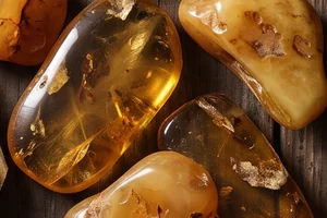
The ingredients.


An imagined setting.
A contemporary interpretation,
with references kept beside the study.
From the board
Save the study.
The pins that lead to this page, ready to save to your own boards.
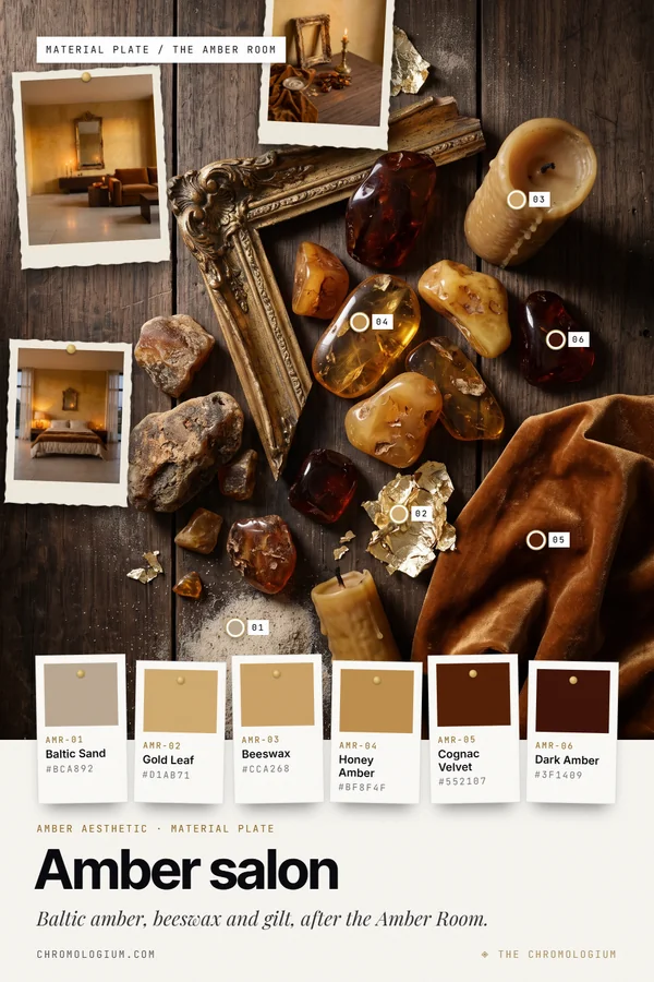
Take away
Take the study with you.
Sources & interpretation
A contemporary room and specimen arrangement inspired by Baltic amber and the Amber Room at the Catherine Palace. The rooms are newly authored and do not reproduce the historical interior. Colors are authored from styled arrangements.
The palette follows the authored material references in this collection. Room, object and material imagery were created for this study. These are imagined settings, with no affiliation to the fictional interface brands.
The controls explore screen composition, not physical pigment recipes or material measurements. Image rights · Image permissions