From Astrolabe to Token
Nomography, Slide Rules, and Proportional Geometry in Modern Design Systems
A design token is not an isolated variable; it is a point on a continuous multi-dimensional nomogram. When we design systems as alignment charts rather than static dictionaries, proportions remain coherent across any scale.
Read the abstract
While building token architectures, I realized we were treating design tokens like static values when they are really multi-dimensional mathematical relationships. Long before microprocessors, engineers solved complex multi-variable equations using nomograms—graphical alignment charts where laying a straightedge across graduated scales solved multi-dimensional physical problems at a glance. By reviving Maurice d'Ocagne's 1899 nomography, this monograph reframes design tokens as living geometric nomograms that preserve harmonic proportion across typography, space, and color.
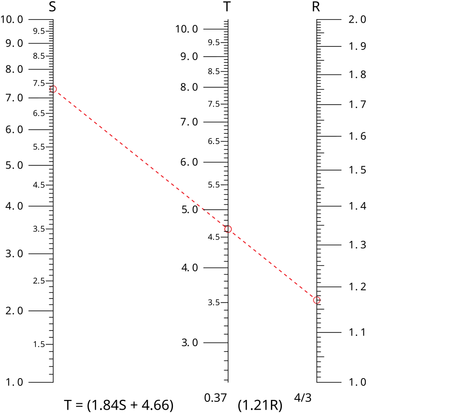
Inspect the archival plate
1. The Discovery: Tokens as Relationships, Not Values
While building design token architectures across large-scale design systems, I kept running into a frustration that everyone in software seemed resigned to accept. We would spend months authoring thousands of CSS custom properties: `--space-1`, `--space-2`, `--font-size-sm`, `--font-size-md`, `--color-primary-100` through `900`. Then a designer would adjust the base body size for mobile screens, or a brand refresh would alter the primary hue, and the entire edifice would shatter into manual overrides. Why? Because we were treating design tokens as static buckets for values, rather than as mathematical relationships.
A token is never an isolated number. A line-height is meaningless without the column measure and type scale it balances. A spacing step is meaningless without the baseline rhythm of the prose. A color step is meaningless without the perceptual lightness of the substrate beneath it. By storing them as discrete variables in a JSON dictionary, we had stripped away the invisible mathematical geometry connecting them. We were doing static lookups where we should have been doing nomography.
That was the moment I turned to Maurice d'Ocagne. In 1899, the French mathematician published 'Traité de Nomographie,' formalizing the science of calculating complex multi-variable functions through geometrical alignment charts. In a nomogram, three or more calibrated scales are arranged across a plane. Lay a straightedge across known points on scales A and B, and the line instantly intersects the exact computed value on scale C—without solving an algebraic equation. For a century, naval engineers, ballisticians, and aviators calculated multi-variable physics in seconds using nomograms. They had turned mathematical relationships into a visible physical landscape.
☞Nomograms did not merely solve equations; they made the entire mathematical continuum visible as a physical landscape.
2. The Canonical Line: Tschichold, Vignelli, and Geometric Harmony
The nomographic mentality has long animated the greatest architectural and typographical treatises. In 'The Form of the Book' (1991), Jan Tschichold revealed the golden canons of medieval manuscript design: precise geometric ratios (such as the 2:3 page ratio with text blocks bounded by diagonal harmonies) that govern layout and margins with mathematical inevitability. The margins were not arbitrary padding; they were computed by the geometry of the sheet.
Massimo Vignelli (2010) applied the same nomographic discipline to modern industrial communication in 'The Vignelli Canon.' Vignelli's grid was not a restrictive cage; it was an alignment chart ensuring that every headline, photograph, and white space stood in harmonic proportion to the whole. A change in one axis informed the posture of every other element.
A small instrument of proportion
Move the ratio and watch a base unit generate type and spacing. The ruler and the reading sample use the same numbers.
A base of sixteen. Space to read. Room for judgement.
Proportional scale alignment linking type, space, and luminance.
| Modular Type Base | 16px (1.000 rem) |
| Harmonic Major Third | r = 1.250 scale factor |
| Golden Ratio Spacing | φ = 1.618 geometric intervals |
| OkLCH Gamut Bound | C ≤ 0.28 P3 gamut clamp |
3. Design Tokens as Living Nomograms
When we reconstruct design tokens as an integrated nomogram, the architecture shifts from static declaration to fluid equilibrium:
Fluid Typography as a Nomographic Scale: Adjusting `--ds-font-size-base` automatically recomputes `--ds-line-height-body` and `--ds-spacing-flow` along a calibrated logarithmic curve that maintains optical density across viewport widths.
Chromatic Alignment: Selecting a primary hue in OKLCH automatically recalculates accessible foreground and background contrast pairs across light and dark substrates along an invariant perceptual axis.
By conceiving tokens as alignment charts rather than static dictionaries, we elevate the design system from a trivial lookup table into a precision mathematical instrument for thought.
Put the argument to work.
Begin with a readable body size, then use a ratio to establish a few related headings and spaces. Test the result with real titles and narrow screens.
A useful boundary. A proportional ruler is a starting point, not a guarantee of good typography. Long words, language, and font metrics still need judgement.
Continue in the laboratorySources & further reading.
The books and papers behind the argument, with curatorial notes and references formatted in APA 7th edition. The citation style identifies the source; it does not claim external peer review.
d'Ocagne, M. (1899). Traité de nomographie: Théorie des abaques, applications pratiques. Gauthier-Villars.
Why it belongs here The foundational historical treatise that established the mathematical theory and practical construction of nomograms and alignment charts.
Vignelli, M. (2010). The Vignelli canon. Lars Müller Publishers.
Why it belongs here Modernist manifesto outlining the essential principles of semantic clarity, geometric grids, modular ratios, and typographic discipline.
Tschichold, J. (1991). The form of the book: Essays on the morality of good design (H. McKeown, Trans.). Hartley & Marks Publishers.
Why it belongs here Classic exploration of book geometry, medieval manuscript canons, golden section page divisions, and the ethical responsibility of the typographer.
Archival Cross-References
Related Lexicon Definitions
Related Design Atlas Cartography
France
Art Nouveau / Rationalist Modernism — Ornament is not crime when it emerges from structural necessity; the line itself is the architecture.
Explore Country Atlas →Switzerland
International Typographic Style & Zumthorian Phenomenology — Structure without excess; grid without rigidity; the material itself is the message.
Explore Country Atlas →Archival Inquiries: From Astrolabe to Token
Bespoke recursive search tree answering core questions on From Astrolabe to Token.