 JPNAsia
Japan
Ma (間) — Negative Space
Along the grain.
Hinoki cypress & washi paper
Notice how a directional surface gives even a quiet composition a sense of movement.
Between a veil and a finish.
Two different crafts ask two different questions of a surface: what can pass through it, and what does it hold?
Paper-making and lacquer practices / JapanA practice has a context.
UNESCO describes hand-made washi as a living practice involving paper-mulberry fibres, bamboo screens and knowledge passed through families and preservation associations. Kurotani's workshop describes its continuing hand-made paper practice. Urushi belongs to a separate craft history: the V&A presents contemporary lacquer as a diverse field shaped by exchanges across Asia.
Begin with a distinction.
Washi and urushi are separate craft practices. The references above describe their context; this drawing is our interface interpretation, not a reconstruction of either material.
Let context sit behind.
A supporting sheet can carry the secondary information. Its separation gives the eye a clue about the relationship, without asking the reader to decipher another competing surface.
Keep the reading surface clear.
The foreground holds the words that matter first. Now test how little separation you need in the study below, and keep your reason with the exported result.
Room between things.
Give information layers distinct jobs. Keep this passage legible while the surrounding composition changes.
Read the design decision
Here, a translucent middle sheet becomes supporting context; an opaque foreground becomes the reading surface. Change the separation and notice which information feels primary. This is our spatial metaphor, not an optical model of paper or lacquer.
Give information layers distinct jobs.
Keep the headline on the opaque sheet. Use the rear sheets only for context. Compare 0 px with 28 px, then choose the smallest separation that makes the hierarchy clear.
At what point does separation help you read the hierarchy rather than merely decorate it?
- Documented
- The linked records support the craft and object context above.
- Modeled
- Procedural screen geometry. No measured optical or geological coefficients.
- Interpreted
- Here, a translucent middle sheet becomes supporting context; an opaque foreground becomes the reading surface. Change the separation and notice which information feels primary. This is our spatial metaphor, not an optical model of paper or lacquer.
Keep the reason with the result.
Name the craft and the makers you learn from. Washi and urushi are distinct practices, not interchangeable signals of a single Japanese aesthetic. Consult material-specific sources before borrowing motifs or making historical claims.
Material & Chromatic Spectrum
Calibrated OkLCH color science mapped from historical mineral pigments, architectural substrates, and intaglio inks.
Hinomaru Crimson
#BC002D
oklch(0.48 0.22 25)
The colour stays fixed as its surroundings change.
Dynamic Component Diorama
Real-time rendering of interactive UI primitives styled with Japan's sovereign design tokens.
Ma (間) — Negative Space
Tactile surface responding with 0.28 optical friction and overdamped (quiet) kinetics.
From Physical Lineage to Digital Space
“Emptiness is not absence; it is the interval that gives meaning to form.”
In Japanese spatial architecture, form is defined not by physical enclosures, but by the intervals (ma) between elements. From the modular tatami grid (3:6 Ken proportion) of Katsura Villa to the subtle translucency of shoji screens, this lineage directly prefigures contemporary fluid container architecture, asymmetric UI balance, and the philosophy of low-contrast cognitive calm in digital interfaces.
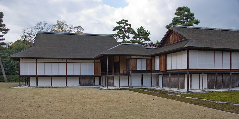
Katsura Imperial Villa
The supreme example of Japanese spatial design — modular tatami proportions, shoji translucency, and engineered negative space that influenced every modernist who encountered it.
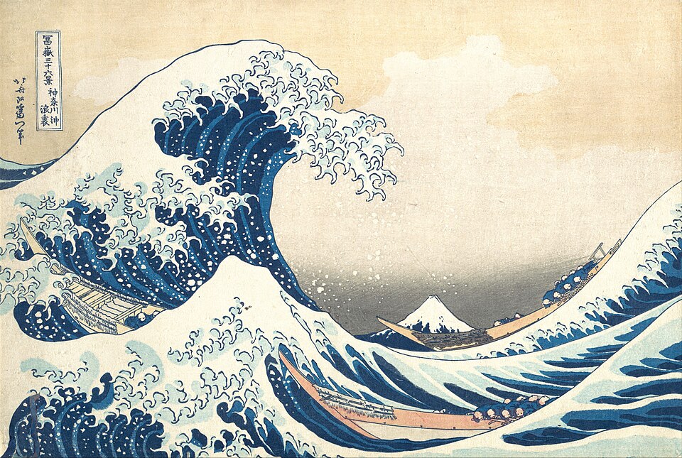
The Great Wave off Kanagawa
The primary compositional study embodying Japan's national color philosophy, surface chemistry, and aesthetic tension.
Japan in the Global Material Cartography
Spatial provenance, trade route vectors, solar diurnal phase, and localized craft beacons across Japan.
Regional Craft Hubs & Historical Cities
Granular material lineages, landmark architecture, and specialized regional craft centers across Japan.
The historical heart of Japanese spatial restraint, where layered urushi finishes and transmissive shoji paper established the aesthetics of shadow and negative space (Ma).
Hyper-dense architectural metabolisms where brutalist concrete infrastructures meet ultra-fluid digital and optical interfaces.
99% of Japan's gold leaf is produced here, beaten to 0.0001mm thickness to reflect atmospheric light without physical weight.
Monumental timber engineering utilizing interlocking mortise-and-tenon joints (kigumi) that absorb seismic shock through elastic friction.
Canal storehouses preserved with namako white plaster grids and fermentation indigo dyeing on heavy shuttle-loom cotton.
Tropical island masonry using fossilized coral limestone walls that dissipate typhoon winds while nurturing indigenous vegetative mosses.
Sensory Specifications & Surface Friction
CULTURAL ACOUSTIC LINEAGE & PROVENANCE
Japan's acoustic heritage spans the high-frequency jingle of Shinto Suzu bells (used to purify sacred space and summon the kami), subterranean Suikinkutsu water harps buried in tea gardens, and monumental bronze Bonshō bells struck with wooden beams to produce slow, pulsating harmonic beating (Uneri). Modern Japan pioneered civic earcons through Eki-melo station departure melodies across Tokyo's rail networks, preserved under the national '100 Soundscapes of Japan' register.
PSYCHOACOUSTIC & COGNITIVE PROFILE
High-register pure sine tone with gentle exponential decay, inducing cognitive stillness, mental clarity, and heightened spatial awareness.
DIGITAL UI TRANSLATION SPEC
Synthesized live via the browser's Web Audio API with exponential gain decay and fifth-harmonic overtone dispersion to provide tactile, non-speech micro-interaction feedback.
Connected Systems & Lexicon Axioms
“Japan: Design Provenance & Material Spectrum.” The Chromologium — Design Atlas, 2026. chromologium.com/atlas/japan
Follow the surface.
Another place to explore grain & direction. These connections group the archive by material, alongside its geographic routes.
Related Sovereign Traditions






Cartographic Inquiries: Japan
Architectural traditions, material physics, acoustic earcons, and living design tokens of Japan.