Drawer I · Vellum & Chalk / F.01
Iris.
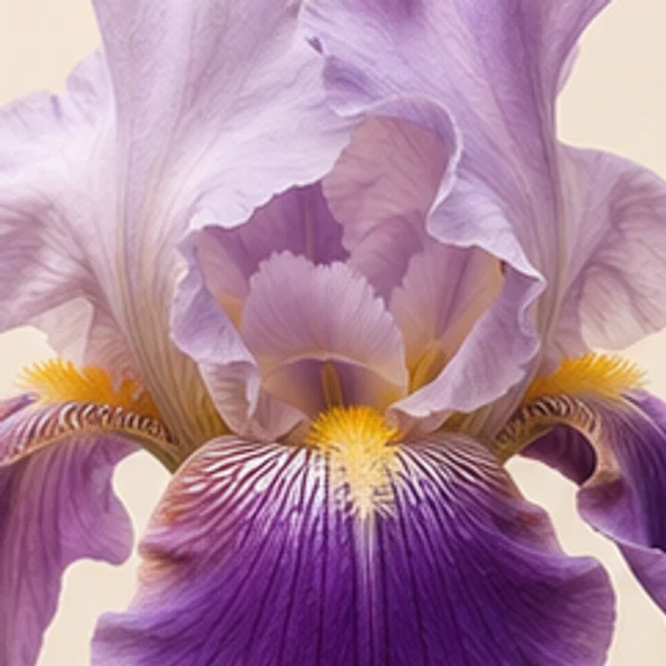
A pale edge. A violet fold. A thread of gold.
What are we preserving: a colour, a relationship, or a moment?
Bearded garden iris-inspired editorial forms; no cultivar identification. Six illustrated colour forms plus stage studies.

01 / Observe
Colour held in a fold.
Authored screen palette sampled from the Violet & cream illustration and named in perceptual OKLCH space; click any swatch to copy its hex value.
Three places to look
The three upright petals are called standards. Their raised surfaces offer a different plane to the light from the falls below.
The three outer segments are called falls. Their spreading or downward position makes the edge, fold and overlap useful places to compare colour.
A bearded iris carries a row of small hairs along each fall. Read this as a textured accent, rather than a deposit of pollen.
02 / Colour forms
The same flower, another relationship.
Keep the composition still. Change the colour relationship.
Violet & cream
Fade and press return to the default colour form. These are imagined stages, not a recorded time series.

In A (Violet & cream), field #f2e4d7 and ink #56215e read at 9.5:1 text contrast; in B (Ivory), field #f1e3d3 and ink #9f7e2a read at 3.0:1.
Both columns use the same proportions and role positions. The six values are sampled from each editorial illustration; they are not measured flower pigments.
03 / Colour & time
What survives the bloom?
A flower and its image have different material lives. In Vincent van Gogh’s Irises, painted in 1889, the violet that the artist described has become bluer. Getty’s analysis found evidence of geranium lake, a red pigment susceptible to light. As that red component faded, the relationship between the painted colours changed.
Begin this study with the flower’s organisation. The upright standards and spreading falls offer different planes to the light. A beard of small hairs occupies a limited area while contributing a distinct texture and colour. Follow the pale edge into a deeper fold, then look again from a distance. Which relationship survives when the detail becomes too small to see?
Our material translation keeps a generous pale field, a darker structural tone, and a small warm interruption. Veined marble, amethyst mohair, burl walnut, and amber Murano glass give those roles different surfaces. Their proportions are editorial choices. The painting’s history asks us to keep another thing beside them: an account of the source, the conditions of looking, and the decisions made while carrying colour forward.
- Getty — Getty investigates color change of Van Gogh’s Irises
- American Iris Society — Growing Iris
- Royal Horticultural Society — Bearded Iris
What are we preserving: a colour, a relationship, or a moment?
Select a stage to inspect its sampled OKLCH lightness and chroma shift. Bloom, fade and press are editorial studies of changing appearance for the default form, not a recorded botanical time series.
04 / From flower to material
Iris, translated into surface.
An imagined architectural salon and tactile material study of the default violet & cream form.


- 01Calacatta Viola marble
- Cream stone threaded with deep violet veining.
#eadfd4 - 02Amethyst silk mohair
- Dense pile gives the dark violet fold tactile weight.
#5c2763 - 03Amber Murano glass
- A glowing honey-gold interruption echoing the beard.
#c88728 - 04Burl walnut & brass
- Swirled architectural grain and warm unlacquered metal.
#6d482d
05 / Try the palette
Carry it into your own work.
Give each colour a role.
Assign a field, reading ink and accent. Both the composition preview and the A/B comparison update together.
Ratios compare the chosen field and ink only. Other states and components need their own checks.
Set the proportions.
Shares rebalance to 100%. They describe palette allocation, not pigment mixing.
An exercise in looking
A quieter
kind of colour.
A generous field, a deliberate accent, and enough space to see the relationship between them.
01 / Observe
Look for the edge.
02 / Translate
Keep the relationship.
Foliage, seedheads & vessels
Companion bridge tones
Test a stem, dried pod, or vessel finish as the live accent beside iris, or copy its hex.
Keep the encounter / Violet & cream
Keep the encounter.
Save this selection, its proportions and your curatorial note—or export a vertical 2:3 Moody Folio Pin with circular hairline-rimmed medallions for boards and decks.
Moody Folio Pin Studio (1000 × 1500 .png)
Renders the active Iris specimen in Specimen & Medallions layout with circular hairline-rimmed medallions, perceptual OKLCH coordinates, and Chromologium colophon at 2:3 ratio.
Notes stay in your saved study and downloaded files. Shared links contain visual settings only.
Across the Chromologium
Follow the inquiry beyond the herbarium.
Connect floral appearance to lexicon essays, historical pigment monographs, design systems, and live optical tools preloaded with iris.
Patina & senescence
Follow how living sepals, unlacquered brass, and pressed petals shift chroma over time.
Lexicon · Epistemic scopeProvenance & evidence
Why Chromologium separates cited botanical anatomy from editorial colour interpretation.
Lexicon · Material carryoverSurface translation
How proportion survives when a petal fold becomes silk velvet, veined stone, or paper.
Archive · Pigment historyPigment monographs
Compare botanical lakes, mineral earths, and historical colourants beside floral palettes.
Lab · Structural lightOptics & scattering
Carry your selected screen swatch into a glass-dispersion comparison. This experiment does not model flower tissue.
Lab · Perceptual spaceFormulation workbench
Test sampled hex values for perceptual OKLCH spacing, balance, and contrast behaviour.
Sources & interpretation
Keep the source beside the colour.
Bearded garden iris-inspired editorial forms; no cultivar identification. Colours are sampled from editorial illustrations, not measured living flowers. Bloom, fade and press are imagined stages, not a documented time series. The room and material plate translate the default form; they do not change with the colour selector.
F.01 · Iris — botanical and optical reading
Publication credit: The Chromologium. Image rights & permissions · Image and palette record