Drawer II · Obsidian & Velvet / F.08
Pansy.
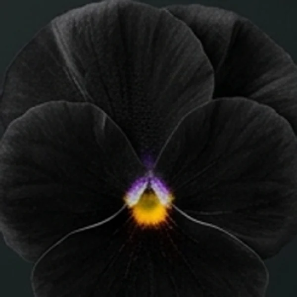
Conical velvet cells trapping light around a gold eye.
Why does a matte petal look deeper than polished stone of the same hue?
Viola × wittrockiana-inspired editorial forms on a dark slate ground; no cultivar identification. Six illustrated colour forms plus stage studies.

01 / Observe
Velvet as a light trap.
Authored screen palette sampled from the Carbon velvet illustration and named in perceptual OKLCH space; click any swatch to copy its hex value.
Three places to look
Two broad upper petals overlap behind the lateral pair, presenting the largest uninterrupted velvet plane.
Fine tufts and dark radiating veins flank the throat, bridging the outer field and central eye.
A compact yellow-and-amber mark on the lowest petal provides high-luminance punctuation inside the dark face.
02 / Colour forms
The same flower, another relationship.
Keep the composition still. Change the colour relationship.
Carbon velvet
Fade and press return to the default colour form. These are imagined stages, not a recorded time series.

In A (Carbon velvet), field #070707 and ink #3f3e32 read at 1.9:1 text contrast; in B (Mulberry wine), field #1e060e and ink #b39b3d read at 7.1:1.
Both columns use the same proportions and role positions. The six values are sampled from each editorial illustration; they are not measured flower pigments.
03 / Colour & time
What survives the bloom?
Plant optics researchers at Cambridge have shown that conical epidermal cells on petals such as Viola focus incoming light into pigment-rich vacuoles while scattering less light back to the surface. What we call floral velvet is an optical geometry before it is a colour name: micro-relief deepens saturation and suppresses glare.
Look straight into the flower’s bilateral face. Two overlapping upper petals establish a broad dark hood, two lateral petals carry whiskers or picotee margins, and the lowest petal funnels toward a tiny saffron-gold throat. That glowing aperture occupies barely two percent of the surface yet anchors the entire dark field.
Carry that ratio directly into an interior or interface study. Let carbon-black velvet, honed Belgian bluestone, and ebonized walnut absorb ambient glare, then place a single saffron silk or amber Murano accent where attention must land first.
- Glover, B. J. & Whitney, H. M. — Structural colour and iridescence in plants: the poorly studied relations of pigment colour
- Royal Horticultural Society — Pansies and violas
Why does a matte petal look deeper than polished stone of the same hue?
Select a stage to inspect its sampled OKLCH lightness and chroma shift. Bloom, fade and press are editorial studies of changing appearance for the default form, not a recorded botanical time series.
04 / From flower to material
Pansy, translated into surface.
An imagined architectural salon and tactile material study of the default carbon velvet form.


- 01Carbon silk velvet
- Light-trapping black pile mirroring conical petal cells.
#1d1720 - 02Saffron silk satin
- Luminous gold accent drawn from the tiny throat eye.
#dfa228 - 03Honed Belgian bluestone
- Matte charcoal limestone holding low-glare shadow.
#2c3133 - 04Mulberry mohair & brass
- Plush wine undertone and crisp metallic inlay.
#59223c
05 / Try the palette
Carry it into your own work.
Give each colour a role.
Assign a field, reading ink and accent. Both the composition preview and the A/B comparison update together.
Ratios compare the chosen field and ink only. Other states and components need their own checks.
Set the proportions.
Shares rebalance to 100%. They describe palette allocation, not pigment mixing.
An exercise in looking
A quieter
kind of colour.
A generous field, a deliberate accent, and enough space to see the relationship between them.
01 / Observe
Look for the edge.
02 / Translate
Keep the relationship.
Foliage, seedheads & vessels
Companion bridge tones
Test a stem, dried pod, or vessel finish as the live accent beside pansy, or copy its hex.
Keep the encounter / Carbon velvet
Keep the encounter.
Save this selection, its proportions and your curatorial note—or export a vertical 2:3 Moody Folio Pin with circular hairline-rimmed medallions for boards and decks.
Moody Folio Pin Studio (1000 × 1500 .png)
Renders the active Pansy specimen in Specimen & Medallions layout with circular hairline-rimmed medallions, perceptual OKLCH coordinates, and Chromologium colophon at 2:3 ratio.
Notes stay in your saved study and downloaded files. Shared links contain visual settings only.
Across the Chromologium
Follow the inquiry beyond the herbarium.
Connect floral appearance to lexicon essays, historical pigment monographs, design systems, and live optical tools preloaded with pansy.
Patina & senescence
Follow how living sepals, unlacquered brass, and pressed petals shift chroma over time.
Lexicon · Epistemic scopeProvenance & evidence
Why Chromologium separates cited botanical anatomy from editorial colour interpretation.
Lexicon · Material carryoverSurface translation
How proportion survives when a petal fold becomes silk velvet, veined stone, or paper.
Archive · Pigment historyPigment monographs
Compare botanical lakes, mineral earths, and historical colourants beside floral palettes.
Lab · Structural lightOptics & scattering
Carry your selected screen swatch into a glass-dispersion comparison. This experiment does not model flower tissue.
Lab · Perceptual spaceFormulation workbench
Test sampled hex values for perceptual OKLCH spacing, balance, and contrast behaviour.
Sources & interpretation
Keep the source beside the colour.
Viola × wittrockiana-inspired editorial forms on a dark slate ground; no cultivar identification. Colours are sampled from editorial illustrations, not measured living flowers. Bloom, fade and press are imagined stages, not a documented time series. The room and material plate translate the default form; they do not change with the colour selector.
F.08 · Pansy — botanical and optical reading
Publication credit: The Chromologium. Image rights & permissions · Image and palette record